Rembrandt: The late works National Gallery London to 18 January
This is an assemblage of supreme masterpieces, but it somehow doesn't quite cohere as an exhibition. I think the curators deliberately tried to avoid the attribution controversies that have dominated Rembrandt scholarship for decades. I'm particularly interested in those controversies, but I can see why they want to step back and focus on his greatest, undoubted achievements. The paintings here are all securely Rembrandts (although I'm not sure about this drawing). But the problem is that it's so overwhelming. It's ridiculous that 'pilgrimage pictures' that I've traveled hundreds of miles to see are here in merely supporting roles. It means that phenomenal pictures are stuck in corners, and it's just impossible fully to appreciate all that's on show.
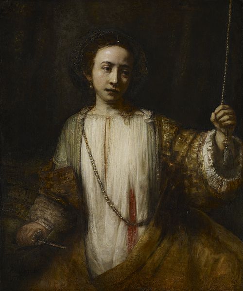
One pilgrimage picture is this Lucretia (above). I made a special trip to Minneapolis just to see that painting, and Poussin's Germanicus. It's a wonderful museum with lots else that I enjoyed seeing, but those two were the justification for a special trip, which the Telegraph reviewer thought a secondary painting! That is, to be blunt, a crazy view. But it illustrates the danger of overwhelming the visitor with masterpieces. I was really looking forward to a direct comparison with the Washington version, also in the show, which is another outstanding picture that I've seen many times. The Rembrandt Corpus speculates that the Washington version may be a variant by Aert de Gelder (vol V, p. 269), which I find wildly unlikely. But it's hard to compare them because the exhibition has weirdly hung them as far apart as possible, in the second room and the final room. Such a wasted opportunity!
It's interesting to see familiar pictures in new surroundings. When I first saw the Washington Lucretia I thought it was bigger than I'd expected. Here it looks just right again, shown against large figure paintings rather than portraits. The impasto is flatter than I'd remembered too, which might also be because the average condition at the Washington National Gallery isn't great (so many ruined when they were scrubbed up for the American art market). The final room where it hangs includes the Kassel Jacob Blessing and the Louvre's Bathsheba. It's literally too much to absorb after seeing so many other great pictures; you just have to leave some for another time. It's not a large exhibition, but the greatness of the pictures is disproportionately draining (in a good way).
At the last minute the NG announced the loan of The Conspiracy of the Batavians under Claudius Civilis, implausibly implying that it was being negotiated for years but only finally released just before opening. I suspect the real reason is it was as a replacement for the great Portrait of Jan Six, which was withdrawn at the last minute for mysterious reasons. It seems to have played havoc with the display. The Claudius Civilis is well presented in the second room, but the room of portraits is now dreadfully crowded and badly displayed. Four portraits are crammed cheek-by-jowel along one wall, with another hung awkwardly between the door and the corner of the adjacent wall, its image reflected on the glass of Catrina Hooghsaet. The Trip/Geer portraits from the NG are on another wall, but they look much better in their usual location upstairs in daylight and with space around them.
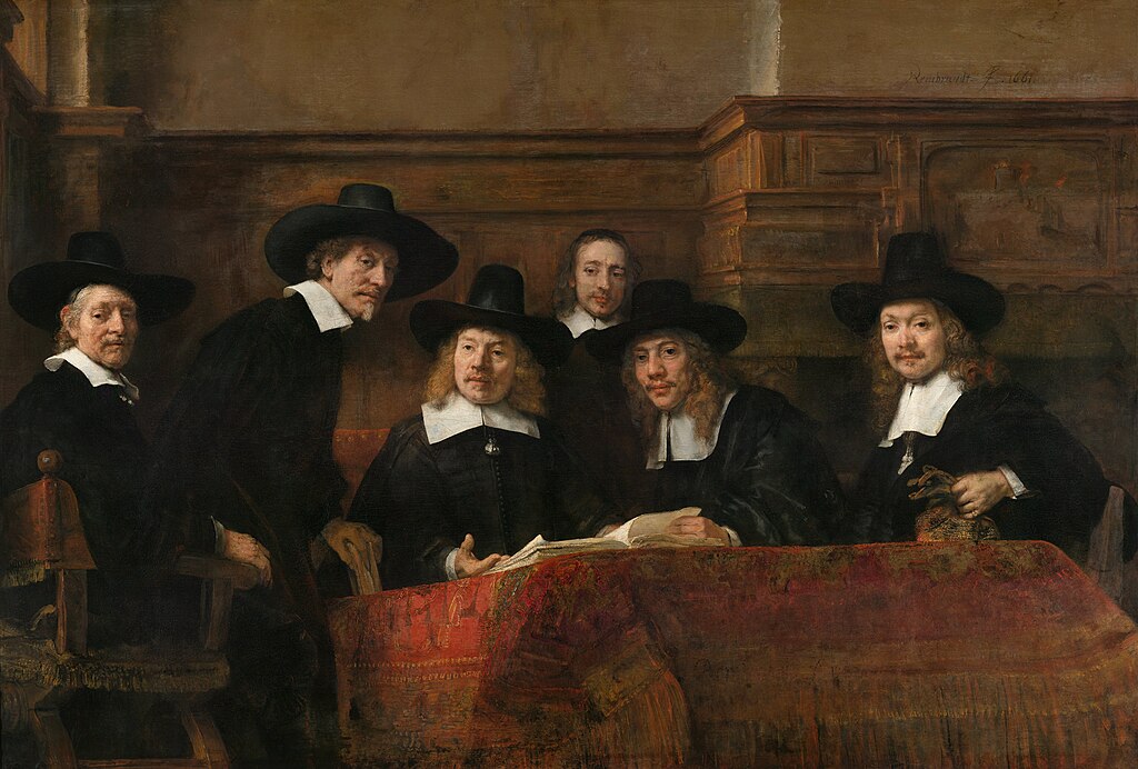
You really need space to walk around Rembrandt portraits. You can see why most clearly with the Syndics of the Drapers' Guild (top). It's meant to be seen from below, which corrects for the immense hanging tablecloth that's so spectacularly painted. But it's also meant to be read from either side. Try standing first to the left, and then to the right. In each position it looks like you're standing exactly where it's meant to be seen, with the figures oriented towards you and looking at you. It's a terrific illusionistic feat. The Trip/Geer portraits create the same effect, although it's harder to appreciate in this cramped room. And you get it in the Washington Self Portrait, but not in all of his portraits. In the case of the Syndics I'm sure he carefully considered exactly how it would be seen, but wonder how much he was thinking about the precise position that his other pictures would be hung, or if he just enjoyed experimenting with different effects. It's a shame that you can't appreciate it properly in the densely hung room of the exhibition.
The artificial light in the Sainsbury Wing basement is never satisfactory, but it's effects are sometimes overstated. Seeing pictures you know well in a different light is also revealing, though I'd always prefer daylight where possible. However, a few pictures in this show suffer especially from bad lighting. The Washington Self Portrait - one of his very greatest - is affected by excessive glare that makes the impasto seem too prominent, the most pronounced example of a common problem with pictures that have high impasto. It ought to be possible to soften the effect by adjusting its spotlight. And the big equestrian portrait is hard to see against the glare of a spotlight in a space that's too tight.
The catalogue is a collection of essays that aren't especially novel, without individual entries for exhibits. The checklist at the back is hard to use, and it's hard to tell immediately which illustrations are actually in the show. We're constantly being told how long it takes to organise an exhibition like this (this one was over five years or nearly a decade, depending on the telling). It ought to have been time to write something amazing. Other museums manage it. The Met, the Prado and the Städel have all produced exemplary catalogues recently. But the NG's succession of flimsy and unsatisfactory exhibition catalogues is in stark contrast to the standards of excellence set both by its peers and by its own series of catalogues of their permanent collection. Many NG curators are esteemed scholars with excellent records of research and publication, but they seem to feel a need to dumb down for their own exhibitions.
 |
| Picture: National Gallery |
An example of the problem is the discussion of the Portrait of Frederik Rihel on Horseback (above), the NG's own equestrian portrait that's been undergoing conservation for years. It's long been considered at least in large part a studio production. Josua Bruyn, former head of the Rembrandt Research Project, even identified the hand of the 'Master of the Rihel Horse', a putative studio hand. It is now listed in the catalogue as wholly Rembrandt, with just a few offhand remarks about attribution ("Although the painting of the horse has on occasion been dismissed as the work of another hand, the sketchiness of the form may be Rembrandt's deliberate attempt to divert attention to Rihel's face and splendid costume", p. 124). Bruyn's extreme parsimony in Rembrandt connoisseurship has been widely rejected, but to dismiss well founded and well argued claims as 'dismissal' and not even refer to his article in a footnote is too glib.
To rub the point in the breathtakingly brilliant The Return of the Prodigal Son in the Hermitage is illustrated in the catalogue as Rembrandt and Workshop. It's a very large picture that almost certainly did involve some degree of workshop participation, but it's still conventionally listed as simply Rembrandt. By implication (but only by implication) the NG is trying to assert a very special autograph status for its large Rihel portrait. I understand that they don't want this to be yet another exhibition about attribution controversies, but it seems like they want to have their cake and eat it, by avoiding the controversy but still advancing controversial new assertions about attribution. Their views gain attention and credibility by association with a major exhibition, but that doesn't excuse the responsibility to establish new and controversial claims.
There are many supreme masterpieces in this show, and I can see why the critics have gushed with praise. But critical engagement with an exhibition requires more than enthusing over the genius of an artist who is universally recognised as one of the very greatest. Elements of the display and cataloguing don't serve the artist well.
No comments:
Post a Comment