Tuesday 29 January 2013

Prado Acquisitions


The Prado website announces the donation of a rare group of Spanish gothic paintings.  Looks like a spectacular acquisition, and there are impressively comprehensive details in English, but it doesn't seem to say when they will be on display.  I hope I can see them when I go to Late Van Dyck next month.

Monday 28 January 2013

Do they mean me?

Picture: Amazon
Observer editorial on the Manet show: "The advent of a blockbuster exhibition offers as much diversion for people who like being grumpy as it does for the art lover. So the delivery of a crateful of more than 50 of Édouard Manet's portraits at the Royal Academy of Arts in London this weekend has naturally been trailed with complaints about high ticket prices, populism and potential overcrowding".  It concludes, "When the circus comes to town, it is sometimes worth queuing up with your fellows, rather than simply grumbling about all the noise."
 
I find the stigmatisation of dissent as 'grumpiness' objectionable.  It's  symptomatic of the sycophantic strain in arts journalism that they depict debate as a clash between fun-lovers and miserablists.  It would be unthinkable to reduce a debate on any other social or political issue to that level - can you imagine ridiculing critics of education or health policy as merely 'grumpy'?  This editorial reveals low expectations of culture when it expects us to jump for joy at an exhibition simply because it juxtaposes some nice paintings in front of a big crowd. 

Sunday 27 January 2013

Manet Blockbuster

Picture: British Museum
On the opening day of the Royal Academy Manet show, the Guardian hosted a discussion on the merits of blockbusters, loaded with cliches and specious arguments.  The show at the RA is described as a once-in-a-lifetime opportunity ... after all, it's almost two years since the last Manet blockbuster.  The craziest argument (against tough competition) is the claim that, "To create a blockbuster exhibition is quite a political statement, it says something broader than just 'Manet: a great artist'. It says – to a government that couldn't care less about the arts – that people love culture."*  I just don't know what to say to that.
 
Then there's the claim that, "If you go to a blockbuster you shouldn't necessarily think it's all about the art – it's about the crowd, too."  So you pay the RA £15 for the privilege of hanging out in a scrum?  You can do that on the London Underground, still for slightly less money than the RA charges. 
 
I like Manet and I live in London, but I don't think I'll go.  The RA puts on some of the crassest crowd-pleasers and draws the biggest crowds.  You never see very much.  I queued up for opening time to get a few quiet minutes at a recent exhibition, but the galleries were already mobbed with well-heeled invitees to private early-doors viewings.  I'm especially appalled that they're now offering a less crowded Sunday night viewing ('Enhance your visit') at £30 a head - double the normal rate - including a drink and an audio guide.  It would be worth paying to get a quiet view, but I don't believe that they will keep numbers sufficiently low, I want to see art not have a drink and I don't want an audio guide.  Above all I find it disgusting that they knowingly sell far more tickets than can be compatible with anyone seeing anything during the normal time slots.
 
* Thanks to Gareth Harris for flagging this quotation on Twitter, @garethhar

Philistines in Northampton

Picture: Northampton Borough Council
Horrid tale of deaccession plans in Northampton.  When the council heard that an ancient Egyptian statue was worth two million quid, it took it off display and put into storage at an undisclosed location pending sale "to a museum with more of a focus on Egyptology" according to an earlier BBC story.  Now they just talk of it meeting its reserve.  They want to 'reinvest' the cash in local history - a narrow and philistine proposal that is likely to mean £2m worth of storyboards and interactive displays.  How condescending to assume that local citizens will care only about their own backyard, that human civilisation in its widest sense is irrelevant to Northampton.
 
Jonathan Jones has written an excellent article in response, rightly criticising the parochialism of wanting to focus only on the story of Northampton - a story of "decline in intellectual ambition, cultural seriousness and global consciousness".

Wednesday 23 January 2013

Overheard in the print room

Picture: BM
The British Museum must be the most open print room in the world.  Anyone with ID can just turn up and request anything, except for just a single restricted item (the Jacopo Bellini album).  I've recently spent three days there looking at Raphael drawings, but this was the first time that I saw more 'casual' visitors.  I was really impressed by the helpfulness of the staff, but I couldn't help be amused by some of what I overheard.  One visitor seemed to have wandered in by accident, and didn't have any idea what she wanted to see.  She was offered some 'greatest hits' ... maybe you'd like to see some Michelangelo?  She demurred!  Without batting an eyelid, the assistant offered some Pre-Raphaelites.  That turned out to be just the ticket.   
 
Although I'm grateful for unimpeded access, I confess to a frisson of fear when I see piles of Leonardo and Michelangelo freely handed out to any neophyte. 

More on Indemnities

There has been an interesting follow-up on government idemnity schemes over at Art History News
 
I'm also now on Twitter - Michael Savage@GrumpyArt 

Sunday 20 January 2013

A problematic drawing


Picture: Ashmolean
The most sensitive connoisseurs not only hold different views on this drawing; they espouse those views with utter certainty, and incredulity that disagreement is possible.  It's a drawing of Charity related to the fresco to the right of Pope Urban I in the Sala di Costantino in the Vatican (see image below), and it's either by Raphael, or a copy by a good artist from his immediate circle.  I saw it at the Ashmolean in Oxford on Saturday. 
 
The mount labels it "? Raphael", and the Ashmolean website lists it as copy after Raphael, but it is in a box with authentic Raphaels.  The 1956 (reprinted 1972) catalogue by the excellent Karl Parker states that "there can be no doubt at all that it is a copy" (no. 665, p. 352).  Parker was a perceptive scholar and is an excellent guide to Raphael, but he was abstemious in attribution.  In the catalogue of the 1983 Raphael drawings exhibition at the British Museum, J.A. Gere and Nicholas Turner conclude that it is a copy by Penni.
 
On the other hand, Paul Joannides states that the attribution "is controversial, but needlessly so, for its inventiveness, both of arrangement and drawing style, is quite beyond any of Raphael's pupils" (The Drawings of Raphael, University of California Press 1983 p. 124 - cat. 453 and plate 46).  Joannides is probably the most eminent scholar of Raphael drawings, and I have found him an indispensable guide.  But I think he's wrong on this one. 
 
The woman's face is picked out with shading that closely imitates Raphael's style, but lacks his subtlety.  The drapery over the legs is not well related to the rest of the drawing, which becomes particularly apparent when you view it upside down, to get a sense of the tonal relationships.  Gere and Turner are right to criticise inconsistency of touch, with excessively dark shadows.  The elbows in particular lack Raphael's ability to capture light and shade.  Even in the reproduction above you can see the dark lump marking the elbow of the suckling child on the left.

Joannides is impressed with the foreshortening.  I'm not.  The arm of the child on the right seems almost foreshortened in reverse.  The forearm is excessive large and prominent, although it recedes from the picture plane.  It's noteworthy that this is a divergence from the completed fresco (below), where it continues straight rather than twisting down.  The contrapposto of this figure is also more awkward in the drawing.
 
Condition was not discussed by the sources I cite above.  There is some wear, particularly in the standing child.  It is at least plausible that this is a Raphael re-worked by an assistant.  Indeed, the very quality of finish speaks against Raphael's authorship; it reads more as a highly polished work of art in its own right rather than a working study, and Raphael's drawings seem always to be working studies.  However, there is insufficient variety of style and handling to conclude that two artists of markedly different ability worked on this sheet, and I don't think there is sufficient evidence to attribute even tentatively to Raphael.   
 
It's easier to make the case against this being by Raphael than to make the positive case for another attribution.  The attribution to Giulio Romano has generally been dismissed, partly because the drawing is so close to Raphael, and Giulio was a more distinctive personality.  He continued to be a very prolific draughtsman after Raphael's death, but abandoned chalk medium - maybe because he couldn't meet Raphael's standard. To my eyes, the handling of the face in particular is close to Giulio.  It seems to me plausible to speculate that this was an example of Giulio following Raphael unusually closely, but that must remain mere speculation; there is no strong visual evidence for his authorship.  The attribution to Penni is perhaps more likely, but this drawing seems to me to good to be Penni's.  Parker's 'After Raphael' seems right.

More Raphael at Oxford

Picture: Ashmolean
I've had two more fabulous days viewing Raphael drawings at the Ashmolean.  It's the world's best collection of drawings by the greatest draughtsman who ever lived, including really great drawings from every period. 
Picture: Ashmolean
First I saw a group from the end of his Florentine period to his first years in Rome. The drapery studies were a revelation - an outstanding group in superb condition. The range of techniques on the Study of Drapery for a Standing Figure in the Disputa is striking, and hard to appreciate in reproduction (but provided above anyway). The Four Heads and a Right Hand: studies for the Disputa is a fine drawing, but I suspect the study of the hand has been re-worked. The area is generally rubbed, and there is a repaired tear, but parts of it are sharply - but ineffectively - defined. Comparison with the Leonardesque sheet with studies after the Battle of Anghiari is instructive, because there he has precisely and beautifully defined the fingers down to the cuticles on the nails. We shouldn't expect exact replication of effect, but the quality of the fingers, particularly the nail on the middle finger, is not high.  I've been struck generally by the paucity of information that catalogues provide on the condition of drawings, so I'm making a particular effort to learn to identify damage, repair and re-working.  
 
This trip was a half day, then I cycled back to London - causing me to regret the purchase of Too Many Books from the Oxfam nearby.  But I returned a fortnight later for a full day, justifying an over-priced return train journey because it was snowing (wimpish, I know).
 

The Combat of Nude Men makes a powerful initial impression, and it was chosen for the front cover of the catalogue of the 1983 Raphael Drawings exhibition that brought together virtually all Raphael drawings in British collections.  But somehow those spindly legs and mannered bodies didn't work for me.  Its authenticity is unquestionable, but the anatomy of the men standing left and right is unsatisfying. 
 

On the other hand, A Nude Man Sitting on a Stone is one of my favourites, another of the Chigi Chapel studies that so impressed me at the Frankfurt exhibition.  It's discussed rather dismissively by Joannides, who describes it as 'brittle' and lacking 'atmospheric continuity', and the 1983 exhibition only showed its verso (another fine drawing containing rapid studies in different positions, reminiscent of Leonardo and anticipating Veronese).  I thought it a brilliantly dramatic study, and I valued it in its own terms, achieving a different effect from the other more atmospheric studies.  The sense of rippling muscles is conveyed much more effectively than in the more pedantic anatomy Combat of Nude Men.  The hatching is surprisingly sculptural, particularly in the right leg. 
 
Next time I will spend more time looking at drawings from Raphael's studio and circle. 

Art and the economy

Picture: Christie's
The Financial Times reports that the art market is ignoring the prevailing economic doom.  But maybe it's more accurate to say that the art market is reflecting prevailing economic doom.  The wealthy elite that buys art is having a good crisis. The very rich still have plenty of money, but the key factor is that they have fewer oppotunities to get great returns on investment.   So it makes economic sense to increase consumption, and buy more art.  The post-war economic boom was a time when the art market was relatively weak. It only started to take off in the 1960s and 1970s, after the period when returns on investment were highest. 
 
Of course a healthy market also needs supply, which in the case of the art market generally means that other rich people must be willing to sell.  That's why times of regionalised upheaval have been so good for the art market - when there's been a group of keen sellers, and another group of ready buyers (e.g. French Revolution, English Civil War).  Today demand has created its own supply by bidding up the works of contemporary artists. 


Friday 18 January 2013

Bad Acquisitions


Picture: GalleristNY.com
New acquisitions are always exciting.  For all that I pretend to hate novelty (which I define as more or less anything that happened after about 1820), I still skip through the galleries when I hear of a new loan or acquisition.  Given high prices and small budgets, acquisitions are carefully considered and usually deserve the inevitable plaudits.  But some acquisitions are ill-judged, and have a negative effect on the whole collection.  I don't think there's enough critical commentary about these bad acquisitions.
 
My first nomination is this fine still life by Spaendonck that has been given to the Frick Collection in New York.  It's a perfectly nice painting, but not really consistent with the quality of the Frick.  One of Henry Clay Frick's earliest old master acquisitions was a still life of fruit by Jan van Os, but he didn't include it in his bequest.  I can't believe that this painting is much better.  It will be hard for the Frick ever again to acquire anything of the standard of their supreme masterpieces, but they have still picked up some fine things that complement the collection - like the wonderful Liotard still life donated by Heinemann.  The Spaendonck doesn't make the cut. 
 
A few years ago the Albright-Knox Art Gallery in Buffalo NY sold off a load of old stuff, including the superb Roman bronze Artemis and the Stag, below (which I saw when it was subsequently on loan to the Met in New York). 
 
Picture: Arts Journal
 
They were raising money to buy contemporary art, including Tracy Emin's Only God Knows I'm Good (below).  I leave you to judge for yourselves.
 
Picture: Albright-Knox
 
Now a controversial nomination to end with.  The National Galleries of London and Edinburgh jointly bought two of the greatest paintings still in private hands - indeed, two of the absolute highlights of western art - Titian's Diana and Actaeon and Diana and Callisto.  Their quality and importance is irreproachable; my beef is with the way they were bought.  First there was an undignified roadshow as these large and fragile paintings were carted around the world to drum up funding.  Then there is the permanent impermanence of joint ownership, meaning that they will be subject to the stress of being packed up and shifted hundreds of miles every few years, in perpetuity.  Sharing the burden of very large purchases has become established practice.  I find it deplorable.    


Tuesday 15 January 2013

Degas and Ingres

Picture: NG
I recently noticed that the National Gallery is hanging the early Degas Young Spartans Exercising next to Ingres in the room of earlier nineteenth century art, rather than with the impressionists.  That makes a lot of sense, particularly given that the Ingres next to it  (Pindar and Ictinus, above) was owned by Degas and bought by the National Gallery from his studio sale.  The slightly odd thing is that the wall text makes no reference to that.  It's clearly an intentional hang, but it isn't explained.  The NG generally errs on the side of brevity with its wall text, which is probably safer - we go to see paintings, not read essays.  But sometimes a bit more explanation would be useful.

John House's Library

Photo: Courtauld
John House, the eminent scholar of nineteenth century French art, died early last year.  When I was getting my lunch in Spitalfields Market today, I found a stall selling off part of his library for a pound or two a book!  The stallholder said that he'd just bought a couple of boxes from a library of about 4.000 volumes.  I got his father's school Latin prize (Walter Pater's Appreciations, with an Essay on Style), a 1940s pamphlet on Manet's Olympia, a handful of exhibition catalogues and some old art history and theory books like Hans Jauss's rather formidable-sounding Towards an Aesthetic of Literary Reception.  I love to unearth old books like these, bringing to life historic debates and giving a misty glipse of old exhibitions. 

Sunday 13 January 2013

A day at the Louvre


Picture: MS

I just made it to Paris before the end of the Late Raphael exhibition, which I'll review more fully when I've had chance to digest it.  I got fully ten hours at the museum doing it as a daytrip on Eurostar - hurrah for late night openings!  The afternoon was spent in the print room looking at some more Raphael drawings.  The picture above is the view from my desk - it's a massive, magnificent room.  It was no problem getting an appointment, but I struggled a bit with the meaning of the 'red items' that could be seen only once.  Turns out it means that you can only request them once, ever - they keep a record of which drawings you've looked at, and on subsequent visits you can't request any 'red' items that you've seen before. 
 
I saw the best of the late Raphael drawings that weren't on display in the exhibition, including the Study for an Apostle for the Transfiguration (detail below), which was included in the exhibition in Madrid, but not Paris.  Seeing it in natural light in the print room gave a better appreciation of the immensely subtle shading than would have been possible in the artificial light of the exhibition.  I'd read the catalogue of Late Raphael before going and cross-checked the drawings I wanted to see, but to no avail - the catalogue reflected the Prado version of the show, and didn't include large swathes of the Paris exhibition, including a number of drawings that I fruitlessly requested in the study room.
Picture: MS
I didn't have time for much except Raphael, but I briefly saw the exhibitions of Giulio Romano drawings (excellent) and Luca Penni (so-so), both scheduled to complement Late Raphael.  On the way to Penni, I stopped off to see Poussin.  One thing I love about Poussin is that he's so unpopular - even when the rest of the museum is heaving, Poussin rooms always seem to be havens of tranquillity.  I needed that as a break from the scrum at Late Raphael. 
 
The damage done by the inexplicable, inexcusable, stupid Louvre Lens project was in evidence everywhere.  Jonathan Jones had a good article on it here.  The hang in the Large French Paintings room (below) is unbalanced by the removal of Delacroix's Liberty Leading the People (how can this be permitted to leave the Louvre?  It is the Louvre!). 
 
Incredibly, Raphael's Baldassare Castiglione was taken out of the Late Raphael exhibition to go to Lens.  Many museums have surrendered their most important works for this landmark exhibition, but the Louvre cut short its own loans because the absurd Lens project had to have everything immediately.


There were lots of conspicuous gaps, well-documented at The Art Tribune, which gives us the apposite term The Gruyere Museum.  I dread the next development - the Louvre Abu Dhabi.


Dresden Closed


Picture: Wikipedia
The Dresden Gemaldegalerie is closed for construction until March 26.  Very annoying when an entire museum is closed, but at least it's only a few months.  The Cleveland Museum of Art closed for almost three years, and the Rijksmusuem has been largely closed for a decade.  The Royal Museum of Fine Arts in Antwerp and The Mauritshuis in The Hague are both currently closed for long-term building projects.  It's hard to imagine what kind of improved visitor services could justify depriving the world of these collections for such a long time; cramped and crowded 'highlights' displays just don't compensate.  The Rijksmuseum building has now been closed for nearly a tenth of its life.  Sometimes those in charge seem to forget that people come to their institutions see paintings by great artists rather than building projects by Very Important Museum Directors. 

Saturday 12 January 2013

Titian!

Picture: Guardian
I saw the newly attributed Titian at the National Gallery today.  I hadn't expected much from the pictures, but I think it might be right.  The condition is compromised; the weave of the canvas is very prominent from relining, and there is a lot of abrasion.  I think that accounts for the flatness of the face, which actually has quite a presence despite damage.  The black clothing is undifferentiated and doesn't convey volume well, but again this reflects damage.  The area that I find most disconcerting is the arm, which is awkwardly placed.  It's hung to the left of the celebrated Portrait of a Young Man on loan from the Earl of Halifax, and the latter painting (also an early work) is far superior.  But Titian's paintings do vary rather in quality, partly from workshop participation, and partly because he seems to have had his off days.  The fur is very impressively painted and the impasto has survived surprising well there.  Despite certain deficiencies, I don't think the attribution is unreasonable. 

Tuesday 8 January 2013

New Titian?

Picture: Guardian
The Guardian reports on a Titian rediscovery at the NG, followed up at Art History News (which points out that it's actually rather old news anyway).  I haven't seen it yet, so I'll refrain from commenting on the attribution, but a couple of things struck me about the story.
 
First, there is nothing on the NG press page.  They have given this as an exclusive to Jonathan Jones, who got a meeting with the Director and then wrote a gushing article about it.  That kind of media favouritism is very bad form.  Art journalism is already far too incestuous and uncritical. 
 
Second, I rate Jonathan Jones as one of the best in the business, but he says some really stupid things.  I just cannot imagine what makes him insist on the superiority of the NG's Titian collection - it's not even relevant to the story.  On the other hand, I was impressed by the quality of the commentary by readers, who make some astutely critical points.
 
Finally I'm concerned by Nicholas Penny's reported dislike of the term 'attributed', which he considers 'scholarly waffle'.  Waffle is unwelcome, but there's nothing wrong with being scholarly.  And I think the term 'attributed' is indispensable.  It admits to a degree of uncertainty that is often unavoidable.  Better that the NG is open about areas of scholarly debate rather than tries to impose certainty where there is none.   

Perverse Incentives

Photo: National Gallery
The Art Newspaper reports that the government provided free insurance for loans of works of art worth £8.6bn last year.  It is a shameful and stupid subsidy that incentivises perverse behaviour. 
 
This insurance isn't free.  There are costly claims for damage, and there is always the risk of a catastrophically high claim if something goes horribly wrong.  Governments shouldn't be in the business of providing services that they don't understand and can be more efficiently supplied by the private sector.  Insurance is a complex business, and a worst-case outcome (fire at the Leonardo show) could put a meaningful dent in state finances at a time when it's especially unaffordable.  I'm all in favour of government subsidising the arts, but this is an arbitrary subsidy that encourages institutions to borrow the costliest works because they never bear the full cost.
 
The dreadful story of the damaged Miro at the Tate is a salutary warning of the real harm that can be caused, which no amount of cash can put right.  It's not just spectacular instances of damage that are of concern, but the ongoing stresses caused by packing and unpacking delicate works of art and moving them between different environments.  The state shouldn't be encouraging this by picking up a big part of the tab. 
 
The Art Newspaper estimates that commercial insurance would have cost about £15 per visitor to the Van Gogh exhibition at the Royal Academy (which I heard was too crowded for any of the 411,000 visitors to have seen much anyway).  The implication is that it's a Good Thing because it allowed the exhibition to go ahead with ticket prices at a reasonable level (less than half the cost if insurance were purchased commercially).  But why - especially in times of austerity - is the government providing a £15 a head subsidy to the well-heeled visitors to the RA?  And is this really the best way for the government to subsidise the arts at a time when the National Gallery cannot even afford to pay enough guards to cover all of its rooms?
 
Excellent journalism from The Art Newspaper.  Stupid behaviour by the state. 

Desiderata

Photo: Wikipaintings

Fantastic Ingres drawing coming up later this month at Christies in New York, which I saw on view with the Old Master sales in London a few weeks ago.  I also like the Parmigianino from the same collection, formerly at Chatsworth.  The Old Master paintings sales look strong to me, but my taste isn't always the market's taste.  I'm not overly fond of Caravaggio, but the still life from his circle at Sotheby's is very impressive.  The rediscovered Memling Christ Blessing looks good too.  I saw another version of it at the Norton Simon Museum last year.  The $1m-$1.5m estimate looks low to me, but I usually get these things wrong. 

Christie's best lots are in the separate Renaissance sale, with some good early Italian works, an exquisite Fra Bartolommeo and an early Raphael drawing.  My favourite is the Rockefeller Botticelli.  The highest estimate is for a rediscovered Bronzino.  I've only seen the reproduction, but I'm not convinced.  At the very least the condition seems to me rather compromised, particularly in the face, and it appears selectively cleaned.  The treatment of the clothing seems more summary than in other painting of Bronzino's, where he revels in depicting different textures and patterns.  The face also seems strangely constructed, with a lop-sided nose.  I wonder if it will sell. 

Tuesday 1 January 2013

Raphael's Pope Julius II ... and Not Raphael's Pope Julius II

Photo: National Gallery
The painting above in London's National Gallery is generally regarded as the original of Raphael's Portrait of Pope Julius II, one of the most powerful and innovative renaissance portraits.  The Staedel in Frankfurt recently acquired another version, which they claim to be partly by Raphael (and studio).  It was widely reported at the time, but the media notices were mostly brief and uncritical of the attribution.  Bloggers Hasan Niyazi and Bendor Grosvenor provided more useful commentary.  I saw the Staedel's acquisition in Frankfurt recently, and I wasn't impressed.  It's a mediocre painting.  I've since made a close comparison with the NG version, and consulted the NG's dossier and other documentation on the painting.  My analysis of the shortcomings of the Frankfurt version is followed below by some comments on the London version.

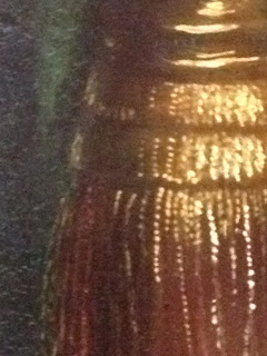
The less skilful artistry in the Frankfurt version is immediately apparent if we look at the gilt finials on the chair.  The NG version is superbly impastoed, with a range of subtle effects that have been used to identify a precise location in the Papal apartments, based on the reflection of windows.  Artist Samuel Palmer was possibly discussing the NG version when he wrote of a painting on display at Burlington House (where it may have been on loan), "I think the Pope Julius, II which hangs aloft, is a genuine Raffaelle; if a duplicate, yet unmistakably of his own handiwork. The tassels for the chair are impastoed like Rembrandt. I have seen it close, and once began a copy of it" (photocopy in the NG Archive from the Life and Letters of Samuel Palmer, 1 Jan 1871 to Leonard Rowe Valpy).

The Frankfurt version is strikingly crude, with thick undifferentiated lines indicating reflected light: 

Photo: MS
Photo: MS


Turning to the hands, which Bendor Grosvenor noted as weak, look at how the little finger continues along a different line after the ring: 

Photo: MS
The grey mark may indicate bad restoration, but even giving it the benefit of the doubt, the stones in the rings are notably simpler than those in the NG version, with cruder reflections.  Roger Jones and Nicholas Penny note that, "Julius was keenly interested in the petrological enhancement of the Maiestas Papilis" (Raphael, Yale 1983: 158 - a lovely turn of phrase) and the sumptious depiction of his rings in the NG's painting is far more impressive than Frankfurt's.

The Pope's left hand is just as bad; the ring finger and little finger seem disembodied, not attached to the same hand as the other fingers: 

Photo: MS

The anatomy here is just wrong, implying an impossibly wide knuckle.  Raphael wasn't consistently perfect, and we should be cautious of leaping to conclusion from occasional errors.  The hands on some of Raphael's early predellas are a bit crude, and even in the late and brilliant drawing of Saint Peter and Saint John in the Ashmolean there is a major error in Saint John's right index finger.  But the mistakes in the Frankfurt painting are just too serious and too conspicuous to be plausible in a painting in which Raphael was personally involved.  When we step back from the details to look at the craftsmanship of the whole our perception of weakness is reinforced.

In the NG version the face is modelled, whereas the Frankfurt version (below) has a hard outline.  You can see clearly a shadow to the right of the profile that could be a pentimento, but the shadowy line is very crude and shouldn't be taken as evidence of a Raphael. The NG version is one of the most 'painterly' of Raphaels.  Cecil Gould writes that "when he painted the Julius portrait Raphael seems to have been exploring new techniques, and to have been moving, fairly tentatively on his standards, from a draughtsmanly way of painting towards a more painterly one." (Cecil Gould Raphael's Portrait of Pope Julius II London: National Gallery 1970 p. 11)  The hard modelling of the Frankfurt version indicates a copyist who drew an outline and then coloured it in. 

Photo: MS
The painting was often copied, and the National Gallery's dossier has details of numerous versions, including one in Berlin that is better than Frankfurt's.  The two most widely discussed versions are one in the Uffizi and one in the Pitti; Three Pipe Problem discusses their histories.  The best evidence for Raphael's involvement in the Frankfurt version is from technical examination revealing certain changes made to the composition.  But that doesn't prove that the changes were made by Raphael.  From the visual evidence I cannot accept this as being even partly by Raphael.   But enough of the copies; I have a few more observations on the real thing.

Rediscovery
The National Gallery's version was acquired with its founding collection, that of John Julius Angerstein.  It was subsequently demoted to a copy, with a version in the Uffizi regarded as original.  The wall text at the National Gallery states that it was recognised as the original in 1970, but art historians had recognised its quality by at least 1969, when Konrad Oberhuber requested that it be X-rayed. 

My copy of Cecil Gould's pamphlet has a pasted-in article by Tom Davies from the Sunday Times (26 July 1970) reporting that Luciano Berti, director of the Uffizi, stated that it should have been obvious since 1923 that the NG version was the original, and noting that both Conrad (sic) Oberhuber and John Shearman had identified it as the original in the 1960s.  It has the wonderfully supercilious response from Gould: "They were all working on hunches, and you get the wildest hunches in the art world.  Anyway I must insist that we are in charge of the National Gallery and it is not up to outsiders to suggest that we look at one particular painting or another."  This is quite inconsistent with Gould's ready acknowledgement of Konrad Oberhuber's insight (note 25 in Gould's pamphlet), and his additional note that Oskar Fischel had also identified the NG version as the original in private correspondence.

Related drawings
There are two related drawings.  The red chalk sketch in the Devonshire Collection at Chatsworth is generally - and I think rightly - regarded as a studio copy (e.g. Jaffe in the catalogue of the Devonshire drawings, Carol Plazzotta in the Raphael: From Urbino to Rome exhibition catalogue - where I saw the original), but considered authentic by Joannides, among others.  A cartoon in the Corsini collection in Rome is not generally considered to be by Raphael, although Beck was sympathetic to the attribution. 

Condition
The NG version is generally described as being in excellent condition.  Gould notes that the original bright colours were revealed in restoration, but Jill Dunkerton and Ashok Roy rightly recognise that historic over-cleaning have left the green background much brighter than originally intended.  A careful pencil copy by Henry Bone from 1811 shows fragments of the keys in the background, which had been over-painted by Raphael.  The over-cleaning that revealed these elements must therefore have taken place before 1811, and the over-painting later than that.

Dunkerton's summary of the condition is available on the NG's Raphael Project.  She states that, "there are no major losses but there are many scattered retouchings."  This seems a bit disingenuous, because there are some fairly large areas of restoration visible even to the naked eye, particularly a large patch immediately to the right of the Pope's face.  This area can be seen in the photo taken after cleaning but before restoration. 

The arms of the chair have been substantially lost through over-cleaning, and now lack definition.  Henry Bone's drawing shows them in a rather better state than today, and the Frankfurt version is also clearer.  They seem quite freely to have been reconstructed by the NG following the 1969 cleaning.  The planes were more distinct before cleaning, and even in pictures taken after cleaning and before restoration.

 Dunkerton states that "The areas of flesh painting are in exceptionally good condition, the only significant area of damage being a small vertical scratch in the sitter's forehead", but the NG tends to describe anything better than a total wreck as 'excellent' (it's all comparative, and the NG collection as a whole has suffered especially from several devastating campaigns of aggressively harsh 'cleaning').  The 'small' scratch is actually quite large, as can be seen by the naked eye, and is evident in the after cleaning, before restoration photograph available on the Raphael Project.  Gould notes that a couple of areas of over-paint were removed, from the mouth and cheek.  I think there is some loss of modelling, with rather stark transitions from light to shade.  There are other losses readily apparent, such as one to the left of the eyes.  The middle, ring and little fingers of the Pope's left hand also seem particularly compromised by harsh cleaning, especially at the ends.

One of the most serious and obvious areas of damage caused by the 1969 cleaning is in the Pope's beard, particularly on his left.  You can clearly see whiskers in the pictures taken before cleaning, which were entirely scrubbed away.  It is of course possible that these were later additions, but it's more likely the result of excessively harsh cleaning.  Despite the ravages of time and the NG conservation department, it is still one of the better preserved Raphaels and a powerful, innovative portrait of undoubted authenticity. 

Raphael at the Ashmolean

Photo: All About Drawing
I recently spent a day looking at Raphael drawings at the Ashmolean.  The great highlight of the Ashmolean is the collection of drawings by Raphael and Michelangelo, and they allow you to see only six of each on one visit.  This seems eminently reasonable to me; it promotes conservation and forces you to look slowly.  I was here for Raphael only this time, so they were a bit flexible.  In the end I saw seven Raphaels, and then looked at some drawings from his circle to develop my appreciation of the different styles in his entourage.
 
I particularly wanted to see the late drawings, including the incomparable study for the Transfiguration (above) in preparation for seeing the Late Raphael exhibition in Paris later this month.  Raphael drew in preparation for painting, not as an independent art form, but this is a drawing of astonishing beauty. 
 
Raphael's drawings show a huge range of styles and media.  The Jehovah in a Flamng Cloud Attended by Angels creates a poor first impression.  The flames and clouds seem quite crude, but we should remember that Raphael wasn't overly concerned with the final appearance of the drawing; he was solving problems for a painting.  Looking closer at the figures, particularly the finely drawn angels, it is clearly a Raphael.
 
I struggle more with the well-known drawing of Two Male Nudes for the Battle of Constantine.  Parts of it are very fine, but the lack of modelling in the back of the right hand figure doesn't meet Raphael's standards, in my view.  There is an interesting analysis in the catalogue of the 1983 exhibition of Raphael drawings in the British Museum where it is concluded that it is by Raphael, because the invention in clearly his, it cannot be argued as a copy by another artist in his circle, and parts (e.g. the knee) are very finely drawn.
 
The drawings by his school are less well-known are rarely seen.  I was particularly taken by a fine copy of a drawing by Giulio Romano in the Uffizi of the Virgin and Attendants in 'Spasimo di Sicilia'.  It is clear that it's a copy - the shading suggests that it's copying a relief rather than capturing the volume of the figures.  The shading between figures doesn't distinguish the forms effectively, and the outlines are drawn too harshly relative to the shading, but it still makes a good impression for an anonomous copy. 

I'm going back for more next weekend.