Wednesday 24 September 2014

National Gallery Membership

Membership pack
Picture: National Gallery
I've just become a member of the National Gallery. Some months ago the National Gallery abolished exhibition season tickets, promising to replace them with a nebulous 'friends' scheme. The details have finally been announced and, credit where it's due, it looks good. There will still be unlimited exhibition entry, which is a great relief. And a free tote bag (above). Yippee! It will actually save me money, so I do hope it doesn't turn out to reduce revenue for the gallery. I'll happily donate back the money I save if they ban photography.  

The only disappointment is the thick dollop of guff accompanying the announcement. Nicholas Penny is quoted as saying that the scheme "allows us to understand what our visitors want and to provide an exceptional visitor experience for every single person who walks through our doors." I don't believe that anyone of Penny's intelligence and eloquence could write such errant nonsense. How does a £50 a year subscription give the NG any greater understanding of its visitors, let alone enable provision of 'an exceptional visitor experience' for everyone. Will it reduce overcrowding or stop flash photography in the galleries?

The NG has recently been obsessing about 'audience engagement', more than a decade after it became fashionable. It's ironic because it is one of the most imperious and disengaged institutions I know. They recently overturned their photography ban without consultation and without announcement. There was a lively global debate about the wisdom of the change, but the NG itself took no part in it. E-mails go unanswered. I recently queried the glazing of some Rembrandt portraits that had returned from an exhibition. The glazing was duly removed after I'd got in touch, but I got no acknowledgement. They recently put out a tweet about the Rembrandt exhibition that was manifestly incorrect. It's impressive to be wrong in just 140 characters when writing about the NG's biggest exhibition. But there was no response and no correction. 

I don't mind being ignored. I'm not seeking a 'relationship' with the gallery, and if I'm honest I rather like the old-fashioned haughtiness. Usually the curators really do know best. What I object to is firstly that the curators have been sidelined by 'experts' in marketing and communication, who put out utter guff. And second that they persist in telling us how much they want to 'engage' the audience and have a 'dialogue' with us, though that 'dialogue' goes no further than soliciting and repeating mindless gushing praise. 

Feel free to continue ignoring my tweets and e-mails, dear NG. File them away with the green biro letters if you must. But do stop with the 'engaging the audience' nonsense if all you're going to do is re-tweet enthusiastic praise.

Monday 22 September 2014

Green

Picture: Amazon
Michel Pastoureau Green: The history of a color Translated by Jody Gladding, Princeton University Press 2014 £24.95

This enjoyable and wide-ranging cultural history of the colour green brims with intriguing insights and gives a nicely oblique slice of art history. It avoids technical and scientific questions about colour reception almost entirely. This is a cultural, social and symbolic history of green, which establishes its changing and contingent status and associations. It was only in the nineteenth century that the distinction between primary and secondary colours was definitively established; until then green took its place as an equal of red, yellow and blue. In medieval times green was the colour of water; blue took over later. But in the romantic period it gained new association as the colour of nature and of freedom. 

Art figures large in Pastoureau's account, and his telling of the difficulties in creating an acceptable green pigment are fascinating. I hadn't realised, for example, how rare it was to create green by mixing yellow and blue. There are no recipes for mixing blue and yellow to make green from antiquity to the early middle ages, and it doesn't become well-known until the eighteenth century. Even then, Oudry rails against Royal Academicians who mix colours rather than using traditional greens, regarding it as a deviant process. But those traditional greens were problematic too:
"Over the course of the centuries, European painting had little luck with green pigments: plant greens did not hold up, earth greens did not cover well, malachite greens were expensive, those with a natural ultramarine base even more so, copper greens were corrosive, toxic, and turned black or brown over time, and greens with a Prussian blue base faded and turned grayish or yellowish. From the sixteenth to the nineteenth centuries, all the great painters complained of the greens that were available and, like Veronese, dreamed of 'green pigments as good in quality as the reds'." (p. 187-90).
Pastoureau eschews the timid hedging of much academic writing, and the grand sweep of its narrative is commendable and enjoyable. But it must be read cautiously. His grandiose judgments sometimes lack both evidence and nuance: "The seventeenth century was a dark, often gloomy, sometimes very black age; the eighteenth century, on the other hand, was bright and colorful, vivid and rainbow-hued" (p. 167). Of course there's some truth to that, but it's stated so baldly and so absolutely as to be bunkum. He later asserts that green was rarely used for everyday objects or for décor and furnishings until the 1950s, but there are plenty of Robert Adam drawings that show green colour schemes, to give just one counter-example.  I also noticed that the illustration of Poussin's Stormy Landscape with Pyramus and Thisbe is a detail, but is not identified as such (p. 145).

A particularly strange claim is that, "Calvinist painters, who loathed polychromy, who sought the somber tones and vibratory effects of grisaille, granted green a greater role than Catholic painters did. Not only great artists like Franz Hals or Rembrandt but also the minor masters of northern Europe turned to landscape painting" (p. 141). There are plenty of luscious Flemish landscapes of the same period by Catholic artists that are as green as they come. And lots of those Calvinist landscapes were dour and brown (lots of Jan van Goyens, for example, or early Cuyps). But to use Rembrandt and Hals as examples of great landscape painters is extraordinary. Rembrandt did paint a few landscapes, but none is particularly green. And Hals painted no pure landscapes at all.

Still, there's lots else that is fascinating. I loved the detail of an altarpiece by Lorenzo Lotto with the feet of St Anthony the Monk in green stockings, showing how he "tried to convey with [his] pigments the instability of the green colorants used by dyers and to emphasize how their use was limited to the least valued pieces of clothing" (p. 114). One reason for this was that they dyers' guilds restricted their members to only certain colours and fabrics, so blue and yellow pigments would not have been available in the same shop for mixing to make green. The greens that were available were poor-quality natural green dyes. And I loved that the book covers Egyptian statues, medieval manuscripts, traffic lights, flags, Jane Fonda and Babar the Elephant. Pastoureau riles the pedant in me, but I still enjoyed this book more than a dozen dry and careful tomes that run fearfully from synthesis and judgment. 

Friday 19 September 2014

Don't let pictures clutter your house!

George Nelson & Henry Wright Tomorrow's House: A complete guide for the home-builder Simon & Schuster 1945

I picked up this hybrid how-to book/manifesto for modernism at a London flea market because it had some good pictures of modernist houses. But there's some wonderfully ridiculous accompanying text that mixes chummy helpfulness with supercilious bossiness, a sort of Alain de Botton of its time. There's a whole section on pictures, which I'm sharing because it's so hilariously ridiculous. It's also rather revealing of a certain strain of authoritarian modernism prevalent at the time. Read with horror:
"Pictures on the wall are another, and a particularly irritating, way of cluttering up interiors. The pictures in most houses are so appallingly ugly or commonplace that it is impossible to understand how they got there in the first place. ... A picture is not a decoration. It represents in a limited area some experience an artist has had which, when communicated to other people, gives them a certain amount of pleasure and a better understanding of the world around them. In this sense a picture is not entirely unlike a book. But who would sit and read the same book over and over and over again day in and year out?" 
Pictures, just irritating clutter! They tells us, "anyone with eyes in his head and a minimum of honesty must confess that any picture, however fine, becomes boring if looked at for very long." The solution? Storage cabinets! You can keep "a dozen or a hundred favorite pictures" in a storage unit and rotate them. 
"Whether they are originals or reproductions, incidentally, doesn't matter a bit, except to those snobs who are unable to appreciate art except in terms of how much it costs. The reproductions on the market today, so many of which are the same size as the original and very faithful in their rendering of color and even of texture, are just as good from the viewpoint of the average man as the originals. This is indicated clearly enough by the fact that you can't tell half the time whether you are looking at an original or reproduction until you are about six inches away from it - and who wants to look at a picture at a distance of six inches?" 
And you don't need to worry about storing frames. They can stay on the wall - just change the pictures! "With four frames of different sizes ... you could change your pictures whenever you wanted to, and in about the same way that museums have always done it." Yeah, that's how they do it ... leave the frames on the wall and swap the canvases around from time to time.

The Alain de Botton bit comes in with the contextualising: "We are not interested in passing on home decorating advice - useful as such an activity may be. the purpose of this book is to build up an attitude towards the house and all of its parts, an attitude which will help produce a living design adapted in every way to the physical and emotional requirements of the family." So there!

It's all quite amusing, and we can look back on it as harmless fun. But if there's a lesson for today, it's that we should be careful of being too absolutist about new fashions. That glib attribution of snobbery to those with different views is all too familiar today, too. And I suspect many of our fads will come to seem just as ridiculous. 

Tuesday 16 September 2014

Exhibitions, missable and unmissable

Jupiter and Antiope
Picture: Metropolitan Museum of Art
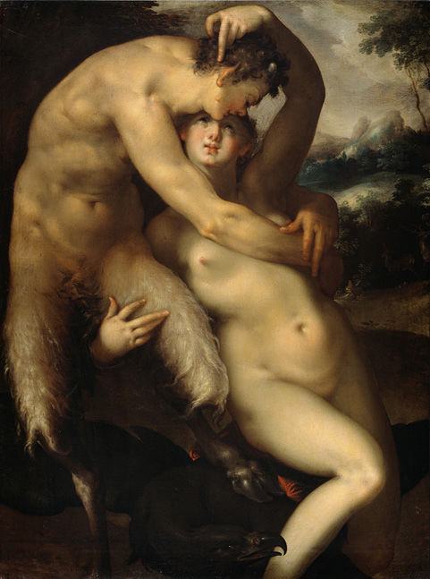
The most exciting upcoming exhibition this season is Bartholomeus Spranger: Splendor and Eroticism in Imperial Prague at the Met in New York. Spranger isn't a household name, and he isn't one of the very greatest artists. But this show is much more worthwhile than a routine 'big name' blockbuster because it draws attention to an artist who is too often neglected. Spranger is not well represented in major museums, and he's a bit out of the central narrative of art history (eccentric Bohemian mannerists are denied their week's lecture in most survey courses, more's the pity). The Met has a great record of mounting shows like this, usually accompanied by brilliant catalogues. I'm making a special trip to New York to see it. And as an added treat, there's the Leonard Lauder collection of cubist art and Grand Design: Pieter Coecke van Aelst and Renaissance Tapestry. This is what exhibitions should be about - fresh light on original and interesting subjects. I can't wait!

Meanwhile in London there's a tedious roster of rather predictable blockbuster exhibitions opening this autumn. Most are obvious shows of artists who have been exhibited exhaustively and exhaustingly, but are well enough known to draw crowds. 

The Royal Academy has had some great recent exhibitions like Chiaroscuro Woodcuts, and the highlight of this season in London is their Moroni show. There are an awful lot of Moroni portraits at the National Gallery (they even once considered selling some), but I'm looking forward to a rounded presentation of this talented artist. But the RA has also hosted some of the flimsiest recent shows, which don't pretend to be anything more than entertainment. Catalogues have been a travesty - some colour pictures with captions, plus a few brief essays by celebrities. I'm already put-off by the excessive and daft publicity for Moroni, which presents him as a precursor to Caravaggio and Manet. Oh puhleeze.

They've out-done themselves in the promotional material for Rubens, which re-assures a public unschooled in the classics that "the show would make them not worry about details they did not understand". Curator Van Hout just wants to "cheer the public up". That's the most shamefully dumbed-down publicity I've seen for a major show. Yes, exhibitions are there to be enjoyed. But surely at least part of the point is to challenge and educate too. A more focused exhibition of Rubens' tapestries at the Getty looks more worthwhile. Manageable size and meaningful focus. And they do good catalogues at the Getty.

Then there's Late Turner (again) and another Constable show at the V&A. The pairing is supposed to allow us to assess their relative merits, which is a rather obvious conceit. Turner is clearly the better painter (although I must confess to preferring Constable). There aren't many great British artists, so they just get exhibited over and over again in predictable ways. Late Turner especially will be mobbed, I'm sure. I'd like to see it, but will pass on the crowds. 
Picture: MS
Then there's Rembrandt: The Late Works, another obvious topic and a guaranteed blockbuster. The term 'blockbuster' used to be used to deride exhibitions, using a word from the entertainment business to rebuke museums for failing to provide anything more worthy. Now it's adopted proudly; the NG boasts that this will be a blockbuster, meaning that we should go to marvel at the huge crowds rather than the great pictures.  

The earliest stirring of my interest in art was reading a book on Rembrandt in my junior school library. I remember marveling at The Blinding of Samson, which I've since seen several times in Frankfurt. And we had a print of The Man with a Golden Helmet, then thought to be by Rembrandt, in the school's corridor. I'd love to see this exhibition, but I'm not sure I'll be able to go at all. The busiest shows are literally un-seeable. I once traveled specially from Edinburgh, at a cost I could barely afford at the time, to see the El Greco exhibition at the National Gallery. I left after about ten minutes, because every picture was surrounded by a crowd three or four deep. You could just about catch a glimpse of the top of large pictures, then shuffle to the front and see a bit more a few minutes later. Now that I live in London, I have been able to buy season tickets and visit each exhibition several times to see a little bit on each visit. Now they've stopped offering season tickets, and there's no news on their replacement. They promise a 'friends' scheme, but no information has yet been provided and requests go unanswered (perhaps because they've got rid of their information department). Meanwhile timed entry slots begin to sell out.

It would be arrogant to make any claims about my knowledge or appreciation of Rembrandt, but I can confidently say that few people can have studied him as intently as me. I have seen almost all of his pictures, making special trips to Minneapolis, Moscow and St Petersburg. I traveled to Holland simply to see Jan Six, which I made an appointment to see at the Six House in Amsterdam. I've read all that I can find about Rembrandt over a period of decades, and I've traveled to exhibitions of his work. The picture above is a shelfie of most of my Rembrandt books. But despite living in London, it seems likely that I will miss this major exhibition of his work. If you want more than a quick glimpse through a crowd, then I'm afraid this won't be for you. One of the pictures from Australia is one of the last Rembrandts that I haven't yet seen, but it's just not worth struggling to glimpse it through a crowd at the NG. Looking at art is supposed to be a pleasure, but going to these blockbusters is a painful chore.

Of course exhibitions shouldn't be only for people like me. But at the moment the cater generously to favoured professionals, with private out-of-hours tours in ideal conditions. You'd be surprised just how many of the people enthusing about the current crop of blockbusters will have seen them privately. And they do all they can to entice people with limited interest, trying to boost footfall and engage new audiences. But once you have become interested and you seek greater engagement, you are taken for granted. The main thing they offered us was the season ticket, which has now been taken away. Can it really be their intention that people like me shouldn't visit this exhibition? Let's see if they ever respond to me on the season ticket replacement they have promised.

Sunday 7 September 2014

Happy Malcolm Rogers Day, Boston!

Picture: MFA Boston via Tyler Green
Malcolm Rogers, director of the Boston Museum of Fine Arts, is retiring after twenty years and the mayor has announced that today is Malcolm Rogers Day. The lovefest is doubly inappropriate. 

It's inappropriate for a museum to idolise its own employees. The MFA has been more excited about its boss than its artwork, tweeting with gushing enthusiasm. But the staff ought properly to be behind the scenes. Promote the collection, promote the exhibitions. But puffing up your own staff stinks.

But it's also inappropriate because Malcolm Rogers is one of the worst and most damaging museum directors in recent history. He has done immense harm to the MFA and set worrying precedents for other museums. He has been at the forefront of 'monetising' art collections. That means he rents out Boston's greatest masterpieces to for-profit companies to turn a quick buck. Appalling risks are taken shipping large canvases around the world on a regular basis to be shown in expensive exhibitions with no scholarly justification. Dance at Bougival by Renoir has been on loan for a third of the past four years, reports the Boston Globe.   

The Globe's report is damning. At one point, all of the MFA's Cézannes, five of its six Manets, both of its Van Gogh portraits plus pictures by Renoir, Velazquez, Rembrandt, Degas and Picasso were being rented out at the same time. Ten of their 37 Monets have been rented out for more than three years between 2006 and 2013 and most of the others have been on extended loan. And one of their greatest pictures, Gauguin's huge masterpiece Where do we come from, who are we, where are we going, which had been considered too fragile to travel, has now been to four different venues for fourteen months.* Nothing is sacred. 

Malcolm Rogers himself got to pose with the dancing girls (above) when he rented the highlights of Boston's impressionist pictures to Bellagio. He is reveling in his role as cultural diplomat and curatorial entrepreneur. But while they paintings were in Vegas, the power failed for three and a half days in the blazing desert heat, reports Tyler Green. Moving pictures is always risky, but the risks are even greater when renting out to profit-making companies with an obvious incentive to cut costs and take risks. 

While depriving Boston of its best pictures, Rogers has promoted shallow populist exhibitions of fast cars, fashion and jewelry that have no place in a serious museum, however entertaining they may be. Three trustees have resigned, one explicitly citing concerns about Rogers' art rental business. Today we should be thankful for his over-due departure, not celebrating his disastrous tenure. 

Happy Malcolm Rogers day, folks.

*Updated: I'm reliably informed that the Gauguin is relatively stable and that several of the loans of that picture were to serious exhibitions rather than rentals. However, I would still be cautious of ever lending a picture so crucial to the institution, and I'd consider any large canvas to be especially vulnerable to travel.

The BP Portrait Award

Gina and Cristiano by Isabella Watling, 2013 © Isabella Watlin
Picture: NPG
The annual BP Portrait Award has always one of the best shows in London, and it's been getting even better. The selection in the past couple of years has been more diverse and more to my taste. A few years ago it was rather slavishly following the fashion for photorealism. And fashion is the right word for much contemporary art - all branding and bling. The best portraits are stylish rather than fashionable. They reflect their times and react to new stimuli, but also embody a longer tradition. That's not to say that this year's entries were bland or uniform. Far from it; there is variety and diversity aplenty. There are some good photorealist paintings, but they no longer dominate the show. More pleasing to me was the diversity of ways that portraitists were drawing on art history.

When I saw Gina and Christiano by Isabella Watling, above, I immediately knew that she'd trained in Florence. She studied at the Charles Cecil Studios, which teaches a particularly recognisable style. Think John Singer Sargent and Carolus Duran. Lots of people think that's a strike against them, but many of these portraits are excellent. The greatest old masters turned out apprentices painting in the same style; they were supposed to be able to contribute to the master's output. I can look at these stylish portraits all day, but I'm soon bored by the ersatz originality of attention-seeking fashionistas. Watling's ambitious painting is quite splendid. And I was particularly taken by the wonderful dog. 
Picture: Patrik Graham
Patrik Graham is another artist who trained in Florence. His portrait Engels, above, is an accomplished classical painting, and a strikingly original image. Gareth Reid trained in Florence too. He contributed Northern Bather, another brilliant classically-inspired picture, drawing more on the clarity and light of early Renaissance artists like Piero della Francesca and also, I thought, reminiscent of classic early twentieth century art. These pictures seem never to win prizes, which is a shame. Judging panels want novelty, which seems to me as blinkered as the nineteenth century academic insistence on conformity. That said, I thought this year's winner Man with a Plaid Blanket by Thomas Ganter was very good, though I didn't care for the aggressively foreshortened legs that looked like a wide-angle lens shot.

Natalia Dik's Mother and Child is a superb harmony of yellows, but it doesn't reproduce well. You need to go and see it for yourself, but it really is one of the best things in the show. Next year the BP Portrait Award is allowing entries via photographs of paintings rather than sending originals. That's the right decision, making it easier and cheaper to enter. But I do worry that pictures like Dik's will suffer if they are reviewed only as photographs. And I fear that it may also favour more anecdotal portraits that are closer to illustration than to portraiture, because they often seem more striking in reproduction than in real life.  
Picture
Picture: Sophie Ploeg
Travel award winner, Sophie Ploeg, was one of my favourites last year so I was delighted to see the fruits of her travels in this year's show. The theme is lace. She used the travel award to study old lace and its depiction in art, and incorporated old lace in her own paintings that are on display at this year's exhibition.

This wonderful child portrait is part of her 'Four Ages of Woman' series. Child paintings often veer between twee sentimentality or merely small versions of adults. This one captures the tension between a child's vulnerability and unconfidence on the one hand and her incipient independence and individuality on the other. These elegant, classic pictures draw thoughtfully on art history without being pastiches.

I was also delighted that she's written a short book about her year's traveling and painting, combining art history with an account of her own artistic practice. There's lots of interesting background and useful bibliography, and comparative detail photos from artists like Isaack Luttichuys, Rembrandt and Frans Hals, which give a fresh perspective on their different talents. In future I'll certainly look more closely at lace in seventeenth century portraits.

BP Portrait Award, National Portrait Gallery to 21 September, Sunderland Museum 4 October to 16 November and Scottish National Portrait Gallery 28 November to 12 April

Sandy Nairne et al BP Portrait Award 2014 National Portrait Gallery 2014 £9.99

Sophie Ploeg The Lace Trail: Fabric and Lace in Early 17th Century Portraiture. An Interpretation in Paint Blurb 2014 £30