 |
| Picture: Amazon |
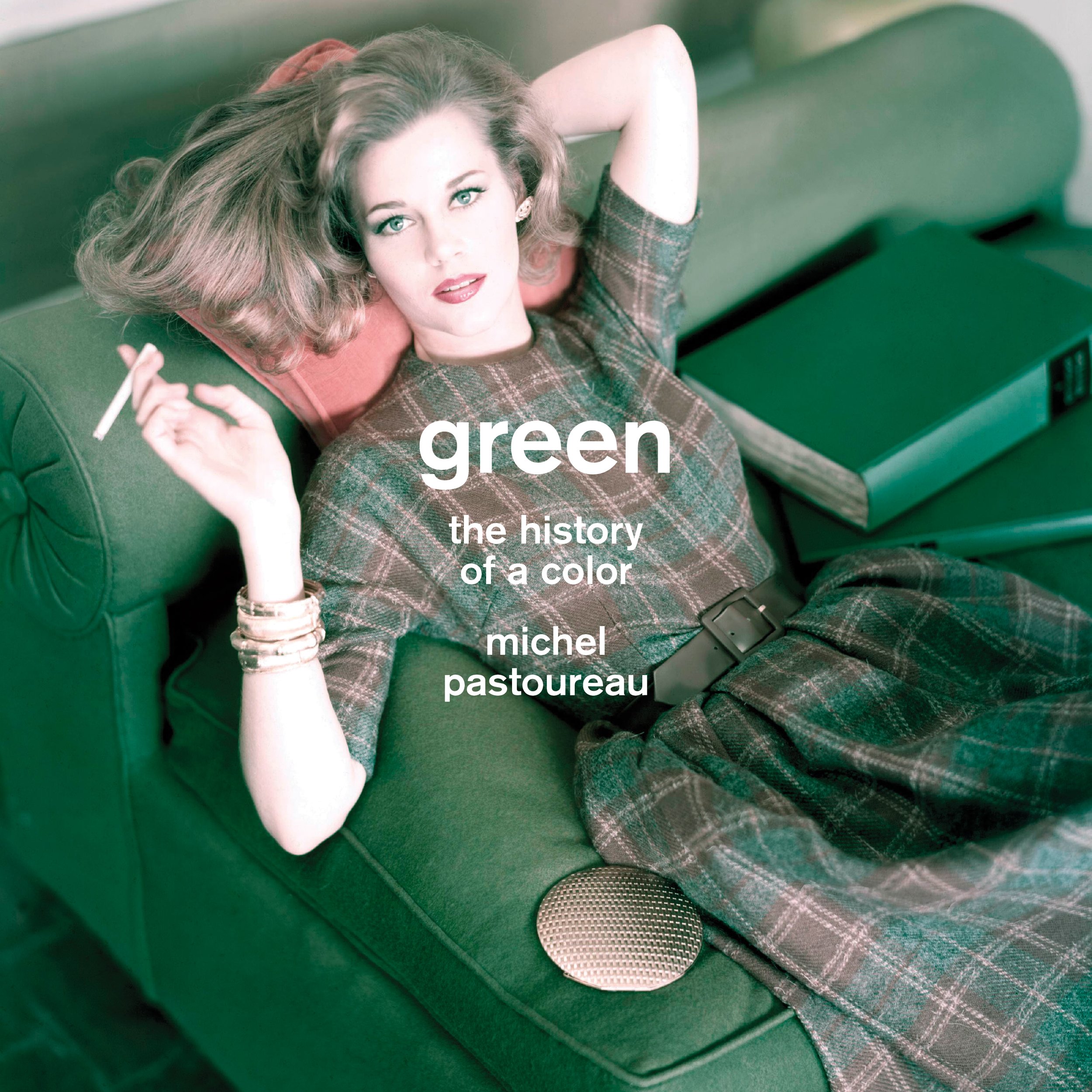
This enjoyable and wide-ranging cultural history of the colour green brims with intriguing insights and gives a nicely oblique slice of art history. It avoids technical and scientific questions about colour reception almost entirely. This is a cultural, social and symbolic history of green, which establishes its changing and contingent status and associations. It was only in the nineteenth century that the distinction between primary and secondary colours was definitively established; until then green took its place as an equal of red, yellow and blue. In medieval times green was the colour of water; blue took over later. But in the romantic period it gained new association as the colour of nature and of freedom.
Art figures large in Pastoureau's account, and his telling of the difficulties in creating an acceptable green pigment are fascinating. I hadn't realised, for example, how rare it was to create green by mixing yellow and blue. There are no recipes for mixing blue and yellow to make green from antiquity to the early middle ages, and it doesn't become well-known until the eighteenth century. Even then, Oudry rails against Royal Academicians who mix colours rather than using traditional greens, regarding it as a deviant process. But those traditional greens were problematic too:
"Over the course of the centuries, European painting had little luck with green pigments: plant greens did not hold up, earth greens did not cover well, malachite greens were expensive, those with a natural ultramarine base even more so, copper greens were corrosive, toxic, and turned black or brown over time, and greens with a Prussian blue base faded and turned grayish or yellowish. From the sixteenth to the nineteenth centuries, all the great painters complained of the greens that were available and, like Veronese, dreamed of 'green pigments as good in quality as the reds'." (p. 187-90).
Pastoureau eschews the timid hedging of much academic writing, and the grand sweep of its narrative is commendable and enjoyable. But it must be read cautiously. His grandiose judgments sometimes lack both evidence and nuance: "The seventeenth century was a dark, often gloomy, sometimes very black age; the eighteenth century, on the other hand, was bright and colorful, vivid and rainbow-hued" (p. 167). Of course there's some truth to that, but it's stated so baldly and so absolutely as to be bunkum. He later asserts that green was rarely used for everyday objects or for décor and furnishings until the 1950s, but there are plenty of Robert Adam drawings that show green colour schemes, to give just one counter-example. I also noticed that the illustration of Poussin's Stormy Landscape with Pyramus and Thisbe is a detail, but is not identified as such (p. 145).
A particularly strange claim is that, "Calvinist painters, who loathed polychromy, who sought the somber tones and vibratory effects of grisaille, granted green a greater role than Catholic painters did. Not only great artists like Franz Hals or Rembrandt but also the minor masters of northern Europe turned to landscape painting" (p. 141). There are plenty of luscious Flemish landscapes of the same period by Catholic artists that are as green as they come. And lots of those Calvinist landscapes were dour and brown (lots of Jan van Goyens, for example, or early Cuyps). But to use Rembrandt and Hals as examples of great landscape painters is extraordinary. Rembrandt did paint a few landscapes, but none is particularly green. And Hals painted no pure landscapes at all.
Still, there's lots else that is fascinating. I loved the detail of an altarpiece by Lorenzo Lotto with the feet of St Anthony the Monk in green stockings, showing how he "tried to convey with [his] pigments the instability of the green colorants used by dyers and to emphasize how their use was limited to the least valued pieces of clothing" (p. 114). One reason for this was that they dyers' guilds restricted their members to only certain colours and fabrics, so blue and yellow pigments would not have been available in the same shop for mixing to make green. The greens that were available were poor-quality natural green dyes. And I loved that the book covers Egyptian statues, medieval manuscripts, traffic lights, flags, Jane Fonda and Babar the Elephant. Pastoureau riles the pedant in me, but I still enjoyed this book more than a dozen dry and careful tomes that run fearfully from synthesis and judgment.
This comment has been removed by the author.
ReplyDeleteSometimes one comes across small hillocks of unnecessary books. Some impatient and fertile souls keep adding to this over-production and there is no stopping.Book on green seems that way.Sure-if you are glib enough and French enough it would turn out "enjoyable" but it will take its place right by the "Baptist Nudes" or " Toenails of note".
ReplyDeleteI do like your remark in defence of Flemish landscapes and the highest examples of them are ,I believe the two or three sylvan landscapes by Rubens.What dynamic paintings!
I guess I might be more French than I thought (beside very fond of green), the idea behind this book fascinates me! And all the trivia about pigments and the "deviant" practice of mixing yellow and blue!... very cool.
DeleteI don't think this was an unnecessary book. I thought the topic interesting and I like this kind of oblique take on the familiar. But it was also rather flawed. Still, I prefer this kind of eccentric book over dull and dutiful takes on familiar topics by careful but boring Anglo-American scholars (not tarring all with that brush, before anyone is offended!).
Delete