 |
| Picture: Winchester Cathedral |
Yesterday I went to Tate Britain for the new exhibition Art Under Attack: Histories of British Iconoclasm, and while I was there I caught the Lowry show just before it closes.
Iconoclasm is worth a trip to see the English religious art that was desecrated in the reformation, a tantalising hint of what's been lost. The sculpture fragments from Winchester Cathedral are terrific; the picture above is of one not in the exhibition. But the show loses focus and becomes simply daft when it starts to imply that desecrating art can be a creative act. Jonathan Jones wrote an insightful critique of their 'studious ambivalence' towards more recent acts of destruction.
Carl André's Equivalent VIII (the bricks) is included because a visitor threw vegetable dye over it, a moronic gesture best ignored rather than memorialised in an exhibition. I was amused by the wall text, which described it as 'admired by some and misunderstood by others', as if that exhausts the range of responses. You'll have to put me down as 'misunderstanding' then.
It gets worse when we reach contemporary art (doesn't it always?). Here in its unedited glory is the wall text for three of the Chapmans' No Longer Loved series:
These reworked historical portraits are part of a series in production since 2006. The artists purchase historic portraits and paint over their subjects to portray them in states of decomposition. The sitters are 'no longer loved' because their portraits have been sold and reworked. The Chapmans describe their response as one that 'improves' or 'rectifies' the work, an action that subverts traditional portraiture's aim to capture the likeness of the sitter in life. It also questions the pretensions of historic painted portraits made to immortalise the elite, who still die like everyone else.
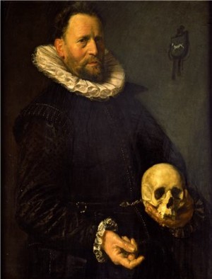
Despite the inverted commas, I think we're supposed to agree that the Chapmans have improved these old pictures with their juvenile repainting. The text is pompous and ridiculous. And it shows a shallow grasp of art history in its implication that the Chapmans are the first artists to reflect on mortality - any guesses about what the skull in the portrait below might refer to?
 |
| Picture: Barber Insittute |
Lowry was worse than I'd feared, and I was never much of a fan. I went straight to the end to see the large late pictures that critics had enthused over. Industrial Landscape 1955 (below) is described as "the most formal and geometric of the five panoramas, but in many ways the wildest and grimmest. The sky is a glacial tour de force." Really? The sky seemed to me an ugly, thickly-painted mess.
 |
| Picture: Tate |
Far from the pinnacle of his art, I thought the large paintings made his inadequacies most obvious: his weak perspective (especially aerial perspective); undifferentiated application of paint that fails to convey variety of texture (compare his snow scenes to Monet's in the National Gallery) and weak composition (compare Bruegel's landscapes on a similar scale in Vienna, Prague and New York).
Brian Sewell's short review is more insightful than the whole catalogue plus wall text. Neither Lowry's pictures nor his biography can sustain the weight of interpretation offered by some critics. John Berger's claim that this parochial tory was criticising imperialism is ludicrous, and the Berger quotation in the wall text is itself anachronistic (implicitly referring to the Gallagher-Robinson thesis then in vogue).
For all that, I still have a soft spot for some of Lowry's smaller, wittier pictures. They're not high art, but shorn of the professors' pomposity they can be enjoyed as folksy souvenirs of Britain's industrial past.
No comments:
Post a Comment