Showing posts with label Exhibitions. Show all posts

Tuesday, 11 April 2017

'Michelangelo & Sebastiano' at the National Gallery


Michelangelo & Sebastiano National Gallery London to 25 June

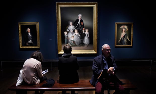
Sebastiano del Piombo’s great fortune was to be taken under Michelangelo’s wing. But that was his great misfortune too, for he has lingered in Michelangelo's shadow. This scholarly and delightful exhibition traces their relationship, showing the confluence of Michelangelo's genius for composition and Sebastiano's mastery of colour and quirky inventiveness, Michelangelo's supreme command of anatomy and Sebastiano's talents as portraitist.

In the early Judgment of Solomon you get a sense of Sebastiano's soaring ambition, a large complex composition that he couldn’t quite resolve and abandoned unfinished. His encounter with Michelangelo in Rome was fortuitous. Sebastiano got compositional ideas from Michelangelo, Michelangelo got his ideals taken forward in the intensely competitive marketplace that Raphael was starting to dominate. 

The mix of sublime masterpieces and sometimes faltering trials is compelling. Sometimes you get both together. The Viterbo Pieta (top) is an inventive and moving masterpiece, but who can believe in that masculine mother? A friend said you expect chest hairs to sprout from her robe. The walnut frame was specially made for the exhibition by the National Gallery's Head of Framing, Peter Schade. He also made the new and spectacular frame for the NG's 'first' picture, the great Raising of Lazarus, below in its new frame.


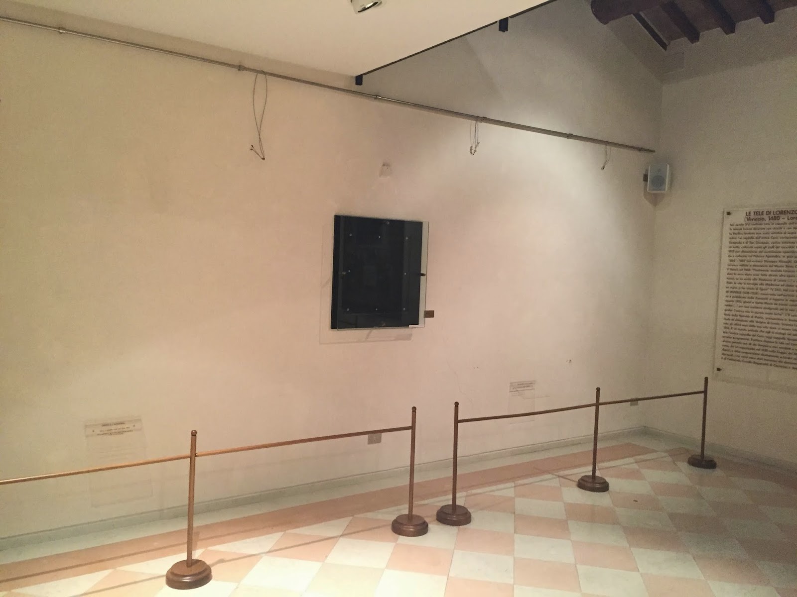
For me the sculptures were the high point and the low point. The plaster cast of Michelangelo's Pieta gives a better feeling for it than the original in Rome, hidden behind inches of glass. The two versions of The Risen Christ, one a cast, are intensely moving, and seen together with Michelangelo's drawings is an unforgettably powerful visual experience. The low point is seeing the Royal Academy's Taddei Tondo imprisoned in a box (below). It's an utterly unsympathetic and depressing display. Better if it weren't there at all.


The selection and display is surprising. Artists' letters are interesting for content rather than form, but this show includes original missives taking space that could have been given to drawings. Sebastiano's portraits have least connection to Michelangelo, but there are some fine examples included. It's wonderful to see them, and the Clement VII is a masterpiece, but they confuse the focus of the exhibition. Worst of all, the National Gallery has been hornswoggled into showing  a purported portrait of Michelangelo that might be an outright fake. It's a recent attribution shown as 'Probably by Sebastiano' (what's wrong with the word 'attributed'?). The condition is poor, and so is the anatomy. There's a better Sebastiano on loan from Longford Castle in the main galleries, in a little focus exhibition of works related to the exhibition. Discoveries seem new and exciting, but selection should be driven by quality rather than celebrity.

Both artists benefited from collaboration, which this exhibition shows brilliantly. But who can stand comparison to a genius like Michelangelo? Inevitably Sebastiano is diminished by juxtaposition. Sebastiano was a wonderful draughtsman, but he seems almost feeble set against some of Michelangelo’s greatest hits. A show that ought to have rehabilitated Sebastiano has pushed him further into the shadows. And that is my main reservation about this exhibition. Conceiving of the show as ‘Michelangelo & Sebastiano’ keys into our worst expectations of exhibitions: ‘unmissable’ blockbuster (‘Michelangelo – so famous he was even a Ninja Turtle!), or else as competition (who’s the best? As if that could be in doubt).

If you know anything about Sebastiano, it's that he was Michelangelo's ally against Raphael. I just wish the exhibition had been oriented more explicitly to the wider context. La Madonna del Velo is an obvious response to Raphael, as the catalogue notes, and the portraits seem indebted to Raphael too. It wasn't simply a time of Renaissance rivalry. Personal rivalries make compelling stories, but in the long run the creative mix of ideas was more important. And beneath that unbelievable triad of Michelangelo, Leonardo and Raphael were dozens of lesser artists who deserve more attention. Some are distinctive and well understood, like Sebastiano, but others are still hard to isolate like Gianfrancesco Penni. 

Commercial reality and cultural expectations conspire to push museums towards simple formulae. A lot of critics have failed to grasp the show, seemingly disappointed that Michelangelo is encumbered by the little guy. But museums of the National Gallery's stature ought to be able to take more risks. How wonderful it would be to see the little guys together, to see how the second tier drew on the breakthroughs of the High Renaissance and try to get closer to some of mysterious students and followers. In the meantime we just have to make the effort to appreciate Sebastiano in his own terms, as well as enjoying some of the absolute pinnacles of human culture in this show.

Sunday, 8 May 2016

Who will review the reviewers? Thoughts on Giorgione

In the Age of Giorgione Royal Academy London to 5 June

The word 'Age' is a warning sign in exhibition titles. It means 'we couldn't borrow the things we wanted, so we've blurred the edges a bit'. Blurring boundaries can be interesting and context is good, but it feels like they just gave up on this show when they couldn't get the big loans. They've stretched poor Giorgione to breaking point with mad attributions. The catalogue lacks conviction, just listing the views of other art historians next to the appalling grainy reproductions. And the display is filled out with a jumble of mostly early sixteenth century Venetian pictures of often questionable relevance.

It makes me yearn for Brian Sewell, who would have skewered it. 

Instead we have Laura Cumming in the Observer describing it as "something close to a miracle", and claiming that it includes a dozen Giorgiones. Two separate reviews in the Telegraph by Louisa Buck and Mark Hudson claim it includes seven out of 'ten or so' authentic Giorgiones. The New York Times's former art correspondent got in trouble for plagiarising Wikipedia. These critics don't even google. The FT is maddest of the lot, illustrating its review with one of the most implausible Giorgiones, claiming that the old dullard Cariani is the star of the show and describing the most mendacious curation as 'honest'. Even the smart reviewers have been too polite. A splendid, smart piece by Charles Hope casts a sceptical eye on the definition of this most enigmatic artist. Hope's essay is subtle; he isn't criticising connoisseurship, but implying preference for caution in face of uncertainty. I favour his epistemic stance, but he failed to give the show the kicking it so richly deserves.

Before I kick, I must urge you to see this show. There are some exceptional pictures here, and it does provide some valuable comparisons. It's worth travelling a long way just to see the Terris Portrait, top, which is one of the only secure Giorgiones on display. I've seen it at its home in San Diego, but it looks much better here, flanked by two Dürer portraits painted in Venice at the same time. It's a fantastic painting that's hard to appreciate in reproductions, with a monumental presence far disproportionate to its size. Confronting this picture in the first room really shows why Giorgione was so highly esteemed. 

I saw the Glasgow Christ and the Adulteress as more Titian-like than I'd previously appreciated; the current consensus for Titian now seems right to me. The wispy adulteress falling into the picture from the right looks especially Giorgionesque. But the dynamism, the gestures and the integration of figures is all Titian. It's worn and cut down, and even harder to appreciate on a tiny scale, but the composition is remarkably sophisticated. The catalogue describes it simply as diagonal, but it's more complex than that. There's nothing like it in Giorgione, who was more about mood than drama.

Another picture that I reassessed was the Cornbury Park Altarpiece by Bellini, which was one of my favourite pictures in my home town museum. Seeing it in a different context helped me appreciate better its weaknesses, and I absolutely disagree with the catalogue's assertion that, "the quality of the painting is so high that the contribution of the workshop, should it exist, is almost impossible to detect". On the contrary, different styles are readily recongnisable. The saints' heads are exceptionally Dürer-esque, the donor Memling-like and the Madonna and Child very typical of Bellini's workshop, and not of the highest quality. 

I like two Sebastianos that I'd never seen before, Birth of Adonis and Death of Adonis from La Spezia. The technique is unusual; they seem to have been painted quickly and broadly, which in this case seems not to be the result of bad restoration. The catalogue speculates that they may have been cassone panels, but they seem intended to be seen from below. Perhaps they once formed part of a frieze, hung high where that marvelous sky would have looked magnificent, but finely painted detail would be invisible. 

Consideration of condition must be at the heart of this show, and it's central to forming a view of Giorgione. A lot of the pictures are severely abraded, and some seem much repainted. Only a handful appear well-preserved, including a wonderful Lorenzo Lotto from the Louvre and a Virgin and Child with St Catherine and Saint John the Baptist only 'attributed' to Sebastiano del Piombo, but which seems quite right to me. The Venetian use of thin glazes renders them vulnerable to harsh cleaning, and maybe the soft contours appeared dirty to some early owners. But I wonder if there isn't also a selection bias here. The more badly they are scrubbed, the more they look like they might once have been by Giorgione. Some of these ghostly relics are now impossible to assess.

The connoisseurial potential of the show—trying to discern Giorgione's hand from others who painted in his style—is undermined by the sheer raving lunacy of the attributions. Giorgione is a controversial artist, and many pictures have been attributed to him over the years. But there are controversial pictures, and there are outright impossibilities. I'm not even convinced that all the pictures 'attributed to Giorgione' here are even Venetian, or of the right period. Two stood out as especially outrageous. 

A picture tentatively identified as David Between Saul and Jonathan is singled out for criticism in Charles Hope's essay. The attribution was originally made in a certificate bought and paid for by a previous owner. The modern equivalent of the 'certificate of authenticity' is the exhibition catalogue. It won't shift the view that this isn't by Giorgione, but inclusion at the RA lends it undeserved legitimacy. Maybe some one will buy it because they think it might be right, like the silly new 'Leonardos' that turn up from time to time, sometimes selling for high prices. It's evidently not Giorgione, and the prevarication of the catalogue entry makes it clear the curators don't think so either.

The second shocking misattribution is the Virgin and Child in a Landscape from the Hermitage, which is one of the only pictures given fully to Giorgione. It isn't. And I don't believe the curators think it is, either. It seems to have been substantially repainted at a later date, but there is nothing here to indicate it was ever by Giorgione. The Hermitage insisted that their Madonna Litta was given in full to Leonardo in the recent London exhibition, although few believe it is. I suspect this was another stipulation by the dogmatic anti-intellectuals there. But why on earth did the RA agree? The picture is trivial, and unnecessary to the show. The Hermitage gains, because they can cite another source seeming to endorse another of their extravagant claims. But the RA just looks meek and corrupt.

It's not the only picture whose inclusion in the show is perplexing. Cariani is a very different artist from Giorgione, and a rather repetitive painter. Yet there are six of them here. And some of the Sebastianos and Titians were oddly selected, some brought across continents when there are better examples five minutes down the road at the National Gallery. 

This is an obviously problematic show. I don't know the politics of the RA, but it seemed they themselves don't really believe in it. They have skimped on the catalogue, eschewed all commentary on the wall labels and avoided expression of opinion. I don't know where responsibility lies, whether with the powers-that-be at the RA or the curators who arranged this exhibition. But having seen the show, I am quite certain which critics deserve censure. 


Monday, 9 November 2015

Exhibitions in London

Picture: Guardian
The only current exhibition that I'm inspired to review at length is the NG's Botticini's Palmieri Altarpiece, to follow. In the meantime, some thoughts on 'the rest'.

Goya: The Portraits National Gallery to January 16

Another rather formulaic idea for a guaranteed 'blockbuster': assemble pictures by the same famous artist around a particular theme and wait for the crowds. I haven’t even bought the catalogue, because recent offerings have been so feeble and yet again there’s no actual catalogue. You have to be really dedicated to see an NG blockbuster, because it’s just never quiet. Even at opening time the galleries are mobbed by people who’ve been at private views. The picture above is cruelly tempting: imagine twenty people between the bench and the pictures and you'll get a better idea. It’s interesting how much difference it makes. I recall the Family of the Infanta Don Luis when it was on extended loan at the NG some years ago, and it made a terrific impression on me. Seeing it behind thirty people deadened it. No point.

I was interested in the critical response. Fawning adulation from all the right-on critics in the main newspapers, but some intelligent criticism from Neil Jeffares. But must one be a great painter to be a great artist? I'm not so sure. Goya certainly had his weaknesses; just look at all those superficial hands. And some of the pictures in this show are absolute dogs. But others are, to me, quite wonderful. In the last room there are some especially feeble late works, but you can compare them to the superb Don Tiburcio (and look how cunningly he hides the hands!). I actually like many of the pictures a good deal, but we should take his critics seriously, and acknowledge his flaws. Indeed, a show focused on what's good and what's bad in Goya would have been much more interesting.

Ai Weiwei Royal Academy to 13 December

Wow, this is bad. This splendid Spectator article put it better than I could. But even people who recognise the art as execrable fawn over his politics. Actually Weiwei’s politics are as limp as his art. Banal, obvious and (from a western perspective) utterly safe. 

Jean-Etienne Liotard Royal Academy to 31 January

The Royal Academy puts on some of the best shows in London in its tiny little top floor galleries, whereas its grand blockbusters in the big rooms on the main floor are usually duds. The catalogue for Liotard is excellent, and I'd love to have written about the exhibition. I needed to see it a second time, and took a day off work to get there first thing and enjoy it quietly for a good block of time, but I was turned away at the door because my Friends card had expired and they haven't yet sent me a new one. I don't have many days off work, and to have wasted one of them because of such a stupidly bureaucratic response is utterly infuriating. It looks wonderful, so I hope you have more luck than me.
 
Picture: MS

Best thing I’ve seen in London. Really excellent and rarely-seen things, including a stunning Lelio Orsi and a Bernard van Orley (above) that I’ve coveted since seeing it in an auction catalogue about two decades ago. I didn’t know it would be in the show, and it was a wonderful surprise to see it.  A couple of superior Cranachs and a Spranger that I’d seen in New York were the other highlights for me, but there was a strong group of nineteenth century pictures too. I enjoyed this more than most of the big exhibitions. Really worth a look if you get the chance.


Bringing together drawings from wildly different traditions simply because they use the same medium seemed a weak theme for an exhibition, but this show is convincing. Rather than attempt a comprehensive narrative, it is separated into four relatively self-contained and coherent sections: the Italian Renaissance, Northern Renaissance, Dutch mannerism (stretching to other northern seventeenth century sheets), and the twentieth century. There are some sublime masterpieces here, and the connections and distinctions are revealing. The twentieth century section lacks the peaks of the other sections of the show, but there are still some fine drawings by artists that deserve to be better known. 

The show is well organised and the wall text is excellent, but unfortunately the display in London had some serious drawbacks. The early Italian drawings were wrecked by the reflection from a video loop, imposing moving images among the Raphaels. There's really no excuse these days for having an Open University style film showing in the gallery, when it could be put on YouTube for people to consult at home. And some of the northern mannerists were invisible, because they were so far back in vitrines. It didn’t matter as much with the rest of the exhibition, but some of the mannerist sheets are minutely detailed and demand close study. 

Even if you can't see the exhibition, I really commend the excellent catalogue. I especially hope it's read at the National Gallery. The Liotard and Metalpoint catalogues are both models they should follow.

Wednesday, 16 September 2015

Something is missing from a great show of ancient bronzes...

Picture: Amazon
Jens M. Daenher & Kenneth Lapatin (eds) Power and Pathos: Bronze sculpture of the Hellenistic World J. Paul Getty Museum 2015 £42.91

I'm sorry I won't be able to see this show, currently at the Getty, but the wonderful catalogue is some consolation. This is what an exhibition catalogue should be: erudite essays, comprehensive entries for all exhibits, proper detail on condition and provenance, and great illustrations. I find these sculptures thrilling. Even if you know nothing of their context, they are immensely powerful works of art. But there is an extra frisson from sensing a connection with an ancient civilization far removed from ours, but feels so accessible through these universal masterpieces. If I have one criticism of the catalogue it's that this sense of wonder is dulled by a sometimes ponderous writing style. Oh, to see the exhibition in the flesh!

Most ancient bronzes have been melted down for scrap, but the precious survivals reveal them as a pinnacle of art history. Power and Pathos brings together some of the greatest. Some were discovered in the renaissance, and some may even have been handed down the generations from antiquity. A surprising number have been found quite recently, and the exhibition is an opportunity to assess them in the context of more familiar sculptures. But one of the greatest recent discoveries is missing. 
Picture: Cleveland Museum of Art 
The Apollo Sauroktonos only emerged in 2004 when it was bought by Cleveland Museum of Art. They say it may be a sole surviving bronze by Praxiteles, one of the greatest ancient sculptors. The catalogue gives short shrift to the idea it's by Praxiteles himself; there's just not enough evidence for that claim. But it's not actually in the exhibition, so we lose the chance to compare it with the canon of ancient bronzes. Sculptures have been brought from all over Europe for this show, but the Apollo Sauroktonos hasn't made it from Cleveland to Los Angeles. 
 
It's a controversial sculpture. It was bought from a dealer that has broken the law in the US and Egypt, and its provenance is vague. Most suspicious of all is Cleveland's own secrecy; it refused to allow an academic access to its files on the sculpture. But technical evidence indicates that it was excavated a long time ago, and no specific claims have been made for restitution. That didn't stop the Greek government leaning on the Louvre and demanding its exclusion from an exhibition on Praxiteles. I don't know if specific threats were made over the Power and Pathos exhibition, but the chilling effect of Greece's threat to the Louvre may have been sufficient. 
 
Looting of antiquities is an especially pernicious crime. It is so much more than property theft; it permanently deprives humanity of irrecoverable evidence of our history. Context is vitally important. But our rightful outrage at looting shouldn't stop us asking: does stigmatisation of antiquities without provenance stop looting? And what should we do with all the antiquities that lack provenance? Should they be hidden from view, never sold or loaned?
 
The debate has been distorted by moral and political grandstanding. Countries demanding restitution are not innocent victims heroically seeking to protect art and history. Italy wants to hoard everything found on its territory, but fails to protect and display what it has. Greece has made no claim for the Cleveland sculpture, yet it uses its power to stop its exhibition. Antiquities without provenance are being treated as 'dirty', as if the objects themselves have bad juju. Superstitious thinking doesn't stop looting. It stops scholarship.

That said, the Cleveland Museum of Art has behaved despicably. If the sculpture is clean, why are they so secretive? My request for information was simply ignored, and scholarly requests for access have been denied. That's not the behaviour of a serious scholarly institution with nothing to hide. Maybe they deserve to be called out and ostracised, their requests for loans boycotted. That seems like cutting off our nose to spite our face, but if peer institutions think the acquisition was unethical they should come out and say so. Instead everything is done in secret. Greece acts behind the scenes, threatening to deny loans if anyone borrows the Apollo. Other museums are too timid to criticise either the Greek government or the Cleveland curators. And the Cleveland Museum of Art keeps its lips sealed. Whatever your views on the antiquities trade, secrecy won't do anything to advance the debate.

Tuesday, 25 August 2015

Punching Pictures

A close-up view of the puncture in the canvas.

A child has fallen against a picture on exhibition in Taiwan, but there's something fishy about the whole incident. Bendor Grosvenor raises a number of concerns in an excellent post (if any lawyers are reading, I disagree utterly...). Even the footage of the fall itself doesn't look quite right to me; it smells like a publicity stunt. But it prompted a number of thoughts.
  • Why is this such a huge news story? I think partly because we're conscious of the vulnerability of heritage, and how easily the irreplaceable can be destroyed. But there's also been an outpouring of sympathy for the child; people are scared they too might accidentally damage something, like the irrational fear of falling from a tall building. A weird article by Jonathan Jones seems to say, "ho-hum, accidents happen". 
  • In reality people don't just fall against pictures. But they are fragile, and the constant packing, moving and unpacking is taking its toll on the world's best pictures, which seem always to be ferried between exhibitions.
  • AHN rightly notes that the picture's owner and exhibition organiser ought to have every interest in preventing publicity. I wonder how many incidents get covered up, especially of damage in transit. Everyone concerned has an interest in hushing up incidents. I suspect that more pictures are damaged than we realise.
  • The insurance valuation is crazy. This is nowhere near a $1.5m picture. But insurance valuations are often puffed up for exhibition shows, as a sop to lenders. In the UK insurance costs are absorbed by a government indemnity scheme, so museums have no incentive to ensure a fair valuation. The indemnity scheme is a daft subsidy that should be removed; there are better things to spend scarce government funds on.
  • The security was absurd. The child was allowed to wander around holding a drink, the rope barrier was redundant and the platform in front just acted as trip hazard. None of this is unusual, even in major museums. Guards are so scared of causing offence that they rarely speak out. Sometimes museums themselves seem the people least concerned about preservation.
  • I have a problem with the idea of museum exhibitions being run for profit - hiring out pictures instead of judging loan requests on their merits. But some are at least serious and well organised. Others are utterly trash, and they seem to be proliferating. I went to a Goya exhibition at the Pinacoteque de Paris where almost none of the pictures labeled Goya was actually by him. But the Bowes Museum lent them an absolute masterpiece unquestionably by Goya, without even charging a fee. Museums need to smarten up; the Bowes were taken for chumps, and seemed to have no idea what they were lending to. Museums need to smarten up about loan requests, and the Bowes curators and trustees were grossly negligent in lending such a masterpiece.
  • The same show at the Pinacoteque had just two guards in a whole parade of little galleries. One was on duty in the gift shop. It's revealing of priorities, and shows what happens when profit maximisation drives everything. 
  • The incident coincided with the utterly tragic destruction of Palmyra. You can't equate an accident with wanton wholesale destruction. But for all the rightful outrage at ISIS, we seem blind to the incremental damage and dreadful risks incurred in the global merry-go-round of exhibitions. We should take more responsibility for the protection of our own cultural heritage, which we actually have control over, as we weep impotently for destruction in Palmyra. 

Sunday, 9 August 2015

'Drawn from the Antique' at the Soane Museum

Picture: Soane
Drawn from the Antique: Artists & the classical ideal Soane Museum, London to 26 September

Artists were spontaneously drawn to ancient sculpture, and there are very early examples of renaissance artists copying Roman statues. By the eighteenth and nineteenth century, copying casts of ancient sculpture was an essential step in academic artistic training, a part of a curriculum that ossified and sometimes became a little pedantic. The picture above can be taken as a wry comment on 'high' art. It's a self-portrait by William Daniels, adopting the persona of an image seller with a bust of Shakespeare, casts of ancient statues, and a brightly coloured parrot. 

The Soane's exhibition on the theme of artists' copying of ancient sculpture could have been a little arid, but quirky exhibits like this make it an absolute delight. There are some really top-notch exhibits, but even the best works are of a type rarely seen in London - a superb drawing by the northern mannerist Goltzius, and a sadly damaged picture by the scarce and fabulous Michael Sweerts. Most of the exhibits aren't famous at all. Some are anonymous, and others are by quite minor masters. But all are interesting. 'Greatest hits' shows can be overwhelming, and are rarely revealing. It's the chance to see something different that marks out the best exhibitions.

The exhibition is sophisticated as well as quirky, apparent above all in the outstanding catalogue, which is one of the best produced for a show in London. The introductory essay by Adriano Aymonino lays out the history of painters' engagement with ancient sculpture with a rare combination of erudition and brevity. It's almost a stand-alone monograph, strong on critical history and art history. It mercifully avoids the pitfalls of excessive theory, to which the theme lends itself: a
rtists' relationships with classical sculpture passing from spontaneous to institutionalisation to reflexive critique. Pah! Glad to read some solid art history instead, and this essay makes me eager for Aymonino's forthcoming book on the collecting and patronage of the first Duke and Duchess of Northumberland. 

Something that bothered me in the exhibition was the preponderance of loans from Katrin Bellinger, a prominent dealer in old master drawings. Bellinger is a highly respected connoisseur-dealer whose shows I've always enjoyed, but there is still the perennial potential for conflict of interest in taking loans from dealers, when they are seeking validation for attributions and exposure for their stock. My concerns were assuaged by the catalogue's explanation that the exhibition is in part intended as a show of her private collection, which focuses on depictions of artists at work. In a sense the theme of the exhibition is one of the themes of Bellinger's well-chosen collection, so the combination worked.

London attracts plenty of blockbuster exhibitions, but recently most have been disappointing; obvious selections of 'greatest hits', flimsy catalogues, dumbed-down presentation. The best shows have been at the smaller museums, particularly the Courtauld and the Soane. The Soane in particular has taken risks with some rather offbeat exhibitions. Not all have appealed to me, but they have all been consistent with the ethos of this most idiosyncratic museum. An instructive contrast is the Jacquemart-André in Paris, which tries to shoe-horn miniature blockbusters into its small spaces, often disappointing and often invariably overwhelming the intimate space. 
This tiny show is much the most rewarding I've seen recently. And even if you can't make it in person, do try to read the catalogue

Saturday, 18 July 2015

Listening to the pictures: Sound in museums

Picture: Wikipedia
This picture has haunted me since I first saw it some years ago in Utrecht's Catherijneconvent. It's a tiny painting that hung in a darkened cloister, a sublime masterpiece that jumped out from the other fine medieval pictures in that lovely little museum. I'd known it from illustrations, but it hadn't prepared me for the really emotional experience of seeing the original. I went back recently specifically to see this one picture, after seeing the Wtewael show nearby. It was one of the most awful experiences I've ever had at a museum. The picture is now in the middle of a brightly lit gallery, with a loud musical soundtrack booming out from a speaker above it. Music from different periods plays on a short loop. It simply ruins the experience, and makes it impossible to appreciate the picture. Even with fingers in ears, the music is unavoidable. This deeply emotional and profoundly sorrowful picture is wrecked and trivialised when booming mood music is imposed on it. The subtlety of Geergen's vision is overwritten by the curators' crass muzak selection.

Music creates a particular mood. Advertisers and marketers deliberately use music to establish brand image and persuade you to spend money. It's their prerogative to impose a uniform experience on consumers. But pictures are naturally more open-ended. My experience of the Man of Sorrows is likely to be different from yours. But the imposition of a specific soundtrack closes down those experiences, enforcing uniformity. It's utterly inimical to the way I want to see art. Yet museums are introducing sound and video more and more into the staid galleries of old masters. The Met has an especially ridiculous audio visual display around the great Adam sculpture that they smashed a few years ago. It was apparently championed by their director, scholar-turned-impresario Thomas Campbell, and curator Luke Syson, notorious for his role on the committee overseeing the disastrous restoration of Leonardo's Virgin and Child with St Anne.

Now the National Gallery has an entire exhibition of 'sound art', in which 'sound artists' are invited to respond to pictures in the collection. It is feeble, as astute critics have recognised. The display of Antonello's St Jerome also includes a model of his study with a hilly landscape, which looks a lot like a craft project I did at school when I was six or seven years old. The musical choices are painfully obvious, and this ticketed exhibition deprives visitors of great pictures like Holbein's Ambassadors

The defensive publicity material tells us that the National Gallery is meant to be an inspiration to all kinds of artists, not just visual. Indeed. But that doesn't mean that the NG is obliged to show the fruits of that inspiration, no matter how badly they've withered. Nature, too, is an inspiration to poets and artists. But we can appreciate the lake district without have romantic poetry broadcast from the hilltops. And in the case of the NG's exhibition, it's more William McGonagall than William Wordsworth.

So why the desire to include sound in museums? The most hilarious comment I've seen is from Sandra Beate Reimann, who curated a sound show at the Tinguely Museum: "Our culture, since Plato, has focused on the primacy of the eye as a means of understanding the world. In the past year we've seen a trend to go wider and bring in other senses." Wow. Just wow. It tells us so much about the self-regard of contemporary art, and its utter lack of historic sense that anyone could try to divide the history of human culture into 'all history from Plato to 2014' and '2014 to 2015'. Of course anyone with an iota of historical awareness knows there's a rich history of exploring the world through different senses, and of reflecting critically upon it. We might reasonably wonder what Reimann can add to our culture given her profound ignorance of its history.

The curators at the Met and the National Gallery aren't ignorant of history. They are learned scholars expert in art history and skilled in sharing their knowledge with a lay public. Yet they seem defensive about their own expertise. Rather than tell us about great works of art, they defer to idiot popularisers who claim implausibly to have special insight into modern audiences and modern art (you know, the great advances of the past 365 days that Reimann enthuses over). The curators' knowledge is for nothing if they can't tell these people to shove off. These intrusive and stupid musical shows are not only without merit, they rob us of the chance to enjoy our own experience of truly great art.


Sunday, 17 May 2015

Rijksmuseum to public: "If you don't like it, buy your own Rembrandt"

Picture: MS
It's a cliché that blockbusters are overcrowded, but Late Rembrandt at the Rijksmuseum was the worst I can recall. It's more spaced out than the London leg of the show, but that extra space isn't to give the pictures room to breathe. It's to cram in the maximum number of people. There were far, far more people per picture than in London (which was also badly crowded). The room above has just three pictures in it. There were rarely fewer than a dozen people in front of each of them. 

There have been many complaints. A Dutch newspaper headed its report of the show with a visitor quote, "I could have punched someone". Director Wim Pijbes responded to criticism by saying that if you want a contemplative experience you should buy your own Rembrandt. That must be the most disgusting thing I've heard from a museum. When Anatole France said, "The law, in its majestic majesty, forbids rich and poor  equally from sleeping under bridges" it was satire, criticising the economic inequality that mocks formal equality. Pijbes offers a grotesque perversion of this, offered not as criticism but as fact. He implies that the democratic experience must be raucous and crowded, describing the 'great buzz' at the show.

But of course Pijbes, art historian and museum curator, recognises the pleasure of looking at pictures rather than jostling with 'buzzy' crowds, and another comment he made last week is revealing. He explained that the reason the Rijksmuseum closes so early (5pm) is to give them time to set up for the 500 or so private evening functions they host each year. The contemplative experience is so valuable and so desirable that they can charge a fortune for it, reserving it only for the rich.

Meanwhile those of us stuck in the third class carriage get an experience that is deliberately degraded. Not only must we contend with crowds. Flash photography is permitted at the Rijksmuseum, including at their special exhibitions. The official regulations still say no flash, but there are no signs up and people were freely using flash in front of guards. There are also red focus dots on many modern cameras that linger on the surface of the pictures you're struggling to see. Between the red spots and the bright flashes, pictures were arbitrarily illuminated several times a minute. Here's a two minute clip of the Washington Self Portrait. People are more willing to move aside to let people take pictures than to allow people to look at pictures, so it's easier to snap pictures than to look at them. It helps move people through more quickly and more predictably, but trying to focus on looking at anything is impossible. 

Museum overcrowding is a problem with no easy solution. Some want to build more extensions, but even if there's more room to show Troost people will still crowd around Vermeer. It's the same handful of famous masterpieces that draws the crowds; as the Rembrandt show illustrates, the extra space in the Amsterdam leg just meant even greater overcrowding. But the answer can't be to reject a contemplative experience (actually never mind a contemplative experience; I'll settle for just being able to see the pictures). Treating people like cattle and encouraging a more superficial engagement for the masses and charging through the nose actually to see things is an absolute perversion of what museums ought to be, and a degrading way to show great art. Pijbes' vile elitism adds insult to the injury of the Late Rembrandt experience.

Sunday, 5 April 2015

What ails Italy?

I love Italy, really I do. Great food, great art, great landscape. Transport is fantastic; well-maintained roads (well, better than UK or US), cheap, regular and reliable trains. But the experience of trying to see art in Italy is so needlessly fraught. I look forward to writing some upbeat blog posts about the wonderful things I saw on a recent trip to the Adriatic coast, but first I must vent. 
At Ancona the museum greeted me with this permanent-looking sign. The wonderful collection of Crivelli, Lotto and Titian is closed; who knows where the pictures are during the 'work in progress'. Websites are almost non-existent and usually useless; you can never check these things in advance. But closure is common - short term or long term, vicarious or strategic, partial or complete. In Bologna an entire wing of the museum was closed. A preposterous local exhibition of art 'from Cimabue to Morandi' had claimed the museum's greatest masterpiece, a Raphael altarpiece that ought never to be lent, but this is at least its third trip in the past two years alone. 

The Adriatic coast is a place of artistic pilgrimage for Lorenzo Lotto. Many of his works are in small and remote hill towns, and he was a major reason for my own visit. The biggest concentration is in Loreto, where he died. They have nine, usually on display in this room. Only one was on display when I visited.

The other artist I wanted to see was Piero della Francesca. I'd been planning for years to do the next leg of the Piero Trail, which I'd previously had to postpone at the last minute when I discovered a key picture was on loan in America. I was especially delighted to see two great masterpieces in Urbino, in a beautiful place in gorgeous hill town set in stunning countryside. What could possibly go wrong? Well, this:

The picture is unframed, behind an ugly glass panel under a harsh spotlight. Alas, this is common practice in Italian museums. Pictures are lit up like displays in a department store. And the lack of frames is lamentable. One of the most wonderful things about Italy is context - you get to works of art in historic settings, often part of collections of local art that give a much greater feel for regional genius than you get in a 'highlights' display in the great universal museums. But it seems they almost purposely rebel against that, seeking to show pictures shorn of context, presented as icons against a bare wall. 

Many museums are open only a few hours a day, sometimes just a morning, often with a break of two or three hours at lunchtime. Sometimes they will let you stay after closing time, which is wonderful. But it makes the logistics of visiting quite a challenge. The obvious response is that more funding is needed. But I'm not sure that's true; one are is grossly over-funded. There is never a lack of funding for major restoration projects, many of which are dreadful. 

In Rimini they are systematically wrecking their art collection. Conservators (I use the word loosely) are stripping down anything they think is repaint. Most museums have long since moved away from such drastic and irreversible action, which risks removing original paint in error. Instead of recreating what's lost, the Rimini restorers are replacing lost paint with hatching, to ensure we can tell what is original and what is restored. In some cases it works, particularly where large losses would require significant recreation. But the point is to avoid visual distraction. In Rimini it's done dreadfully and it's hugely visually distracting. Look at this detail from a Crucifixion attributed to Giovanni da Bologna, restored in 2013. An original fragment looks like it's been stuck on a piece of cheap furniture. The remaining paint seems to float on ugly and intrusively coloured background.  

They are so proud of their work on an altarpiece by Guiliano da Rimini of the Coronation of the Virgin with Saints that there's a 'before' photo shown next to it. Trouble is, it looked better before. Now the picture is ambiguous; is the hatching in the picture below covering an area of lost gilding or lost landscape? From a distance you can't tell; the contours are ambiguous. Originally the gold ground established a clear delineation between painted scene and background; now it's a blur. Instead of seeing a damaged but coherent work of art, we are invited to contemplate little isolated souvenirs of original paint. 

The saddest part of my trip was seeing the amazing frescoes by Salimbeni in Urbino. They are currently being restored, and I watched as a plasterer arrived with a big trowel and started throwing on plaster. As he worked it into the edges, original plaster sprinkled off onto the floor, and his big trowel bashed against the original paint. We think of restoration as a careful, clinical process. This was more like butchery. And in a few decades, the work will be re-done, the new plaster hacked out again, and a bit more of the original will be lost.

Italian museums seem too often to be run for the benefit of their conservators who get to play around with pictures to their heart's content. There is no money for basic things like keeping the doors open, providing guards, adequate lighting, decent display or a website. But they will fund an endless cycle of drastic restoration.

Rather than address existing problems, Italy is adding new ones. It seems keen to introduce the worst elements of modern museum practice. An ominous new sign hung at the entrance to the Museo Civici in Pesaro:
THE NEW CIVIC MUSEUMS AT PALAZZO MOSCA ARE PROPOSING TO BE THE STRONG DYNAMIC DRIVING FORCE BEHIND THE CULTURAL LIFE OF PESARO IN ADDITION TO FULFILLING THEIR INITIAL FUNCTION OF CONSERVING, VALUING AND EXHIBITING WORKS, THE MUSEUMS ARE PROMOTERS AND PRODUCERS OF NEW INITIATIVES LINKED BOTH TO LOCAL MUSEUMS AS WELL AS OTHER AREAS AND CONTEXTS.
MUCH SPACE IS DEDICATED TO CONTEMPORARY ART, NEW TECHNIQUES AND ARTISTIC EXPRESSIONS. THE AIM OF THIS SIGNIFICANT PROJECT OF RENEWAL IS TO ENCOURAGE MEMBERS OF THE PUBLIC TO GET INVOLVED WITH THE LIFE OF THE MUSEUM, ESPECIALLY THE YOUNG GENERATIONS, AND TO PROVIDE THE WHOLE COMMUNITY WITH LONGTERM STIMULI AND MANY REASONS TO VISIT THE GALLERIES.
THIS CHANGE IS THE RESULT OF A HAPPY COLLABORATION BETWEEN PUBLIC AND PRIVATE INDIVIDUALS AND HAS BENEFITTED (sic) FROM  THE HELP OF PEOPLE WHO HAVE CONTRIBUTED THEIR PARTICULAR EXPERTISE.
THE MUNICIPAL ADMINISTRATION, WHOSE DUTY IT IS TO LOOK AFTER THE MUSEUM'S LEGACY AND VALUE THE COLLECTION IS COLLABORATING WITH SYSTEMA MUSEO, A LEADING FORCE IN THE PLANNING OF NEW FUNCTIONS FOR MUSEUMS. WHAT EMERGES THEREFORE IS A NEW MANAGEMENT MODEL CAPABLE OF CIRCULATING RESOURCES IN WHAT CONTINUES TO BE THE HEART OF EVERY MUSEUM, ITS ARTISTIC HERITAGE. (sic, passim!)
Everything about this is ominous. The meaningless guff, the self-promotion by the consultants ('Systema Museo'), and the commonplace belief that to be relevant art must be contemporary. In Bologna one room was closed. You couldn't get in to see the detached frescoes. But you could peer through a doorway at this trite scene of 'Tahir Square':
Relevant and worthy, no doubt. But also obvious, trivial, artless. It's horrible that Italian museums are following common practice elsewhere and using old masters as mere foil for contemporary trivia.

Next week, I'll write about the good things I saw. But sadly there was much to lament.

Thursday, 26 March 2015

Wtewael exhibition in Utrecht


Pleasure and Piety: The art of Joachim Wtewael Centraal Museum Utrecht to 25 May (then to Washington DC and Houston)

These two small paintings on copper both show Vulcan catching his girl Venus in flagrante with Mars. They're both exquisite and explicit little masterpieces brimming with those wonderfully contorted mannerist figures that Joachim Wtewael famous for. But what a different mood he creates. In the first version, from the Mauritshuis, there's a sense of foreboding. Venus guiltily averts her gaze. Mars points an accusing finger, but his expression belies his anxiety. This is Serious Stuff indeed. The later version in the Getty is more warmly coloured, and terror gives way to glee. Mars slaps his face ('doh!'), Venus looks away wearily ('what a fine mess you've gotten us into'). Everyone else seems to be enjoying their embarrassment. It's wonderful to see these two pictures together in the first major exhibition of this fascinating artist. 

Joachim Wtewael was a big cheese in early seventeenth century Utrecht. He was a successful businessman and investor, and he was allied with the more conservative Calvinists. Imagine that - the more conservative Calvinists! But I think the Getty's Mars and Venus Surprised by Vulcan gives better insight into his outlook on life than his political alliances. Love and Lust is the exhibition's title in Dutch, and I like it better than Pleasure and Piety. Even in the religious pictures, I see lust more than piety.

Wtewael was also a success as an artist, though he didn't need the money and kept many of his own paintings. But after his death he fell from favour and he was little known. He became fashionable again in the 1980s and 1990s, when many of the pictures in this show were acquired by American museums. It was part of a general revival of interest in Northern mannerism, which had been neglected as either a footnote to Italian mannerism or a prologue to the Dutch golden age. The exhibition explains Wtewael mainly in a northern context, emphasising his learning from Prague court artist Bartholomeus Spranger and borrowing from prints by Hendrik Goltzius. But I wonder how much was taken more directly from the high renaissance, which he would have experienced on his travels in France and Italy. Dramatic poses and extreme foreshortening reveal ambition to incorporate the highest achievements of Renaissance art. It doesn't quite work; Wtewael doesn't have the solid grounding of the Italians, nor their knowledge of anatomy. Biceps twist like dough rather than flex as muscles, and all his figures seem to have the same oddly textured torsos.

I can understand why some people don't like him, but I love his crazy vision, those wonderfully contorted poses and choreographed masses of figures, the rich range of colouring from pastel shades to vibrant acidic contrasts depending on the mood. He had an instinct for drama, but also a great sense of fun.
  
Photo    Photo
He loved animals; cats and dogs abound. On the left is a delightful donkey from the Wedding of Peleus and Thetis, and right is a cat from Caritas, which is with Johnny van Haeften. He clearly lacked Leonardo's interest in precise observation of nature if he thought that's how cats drink, but this is very early for such characterful animals. Walt Disney avant la lettre.

    Photo
Although he could paint for his own amusement, his pictures are really varied. I'd thought his good works were the early ones, but it's not as simple as that. Even the earliest pictures vary in quality. The Wedding of Peleus and Thetis hangs next to The Wedding of Cupid and Psyche. Both are from about the same date, and both are fine pictures, but the Peleus and Thetis is far superior. The portraits are competent but unexciting. The kitchen scenes are derivative, and The Fruit and Vegetable Seller (above) is particularly weak. I thought maybe a Peter Wtewael, or at any rate a collaboration. The background scene (detail above) is quite crudely painted, and far removed from Joachim's refinement. It's attributed in full in both the exhibition catalogue and Anne Lowenthal's catalogue raisonné; perhaps they assume the broad technique is because it was intended to be hung high as an overmantel, and perhaps they are right. The kitchen scenes aren't great, but they show that the frequent assertion that Wtewael didn't engage with naturalism isn't quite true.

I was glad to see the full range of Wtewael's work in this show. The extraordinary quality and inventiveness of his best pictures is all the more striking against his more routine and derivative works. The catalogue is excellent, with short but intelligent and informative essays, thorough catalogue entries and good reproductions. The catalogue speculates about the role of his studio in producing copies and variants, and I'd love to have seen some possible examples alongside authentic works to get a sense of the studio's operation. I'd like to have seen more of the drawings too; the selection in the show is meagre, which is especially disappointing after reading Stijn Alpers's great chapter in the catalogue, which suggests that a lot of the attributed works might be workshop replicas. It would have been good to see some of those comparisons for ourselves.

There will be more drawings and more paintings on the US leg of the show. Weirdly a third version of Mars and Venus Surprised by Vulcan will be in both US venues, but not in Utrecht - despite the fact that it currently hangs in Amsterdam. I don't know what they were thinking in disallowing us that comparison; maybe a misplaced concern for symmetry in the display? It surely can't be a conservation issue if it's able to travel to the US. But my more profound reservation about the Utrecht exhibition was the truly dreadful staging, which is possible the worst I've ever seen.
Photo
The lighting created shadows from the frames that obscured material parts of Wtewael's small pictures. In this on the figures point towards a head that can't be seen. This photograph actually lightens the obscured section, which is invisible in the exhibition.
Photo
Even my favourite, the Wedding of Peleus and Thetis was partly obscured. Here's a detail from the shadows, showing how much is hidden:
Photo
It amazes me that pictures can be sent across the globe so they can be seen together, only for the effect to be ruined by thoughtless presentation.
Another picture is spoiled by a big lump of dirt inside the glass vitrine. The thing that makes me really angry about details like this is not only that it so impinges on our ability to appreciate the art, but also that so many museums will strip a painting down and re-do it if there's so much as a speck of discoloured retouching. They'll restore at great cost and risk and often causing irreversible damage, all in the name of making the picture look better. But then they won't spend five minutes cleaning the glass in front of it.

I made a special daytrip to Utrecht to see this show, taking time off work to fly to Amsterdam and get the train to Utrecht. Not only that, I had to endure passport control at Standsted Airport (if you've been, you'll know what I'm talking about). All that to see this exhibition. And yet the organisers couldn't be bothered to take five minutes to clean the glass sufficiently for a key exhibit to be seen unobscured.

Wednesday, 4 March 2015

Sargent at the National Portrait Gallery

Picture: Des Moines Art Center
Sargent: Portraits of Artists and Friends National Portrait Gallery London to 25 May

Marie-Louise Pailleron stares straight out at us in this arresting portrait, sitting rigidly with her legs pointed straight out at us. Or does she? If you can get to see the original, currently in the Sargent show in London, try standing to the side. Wherever you stand, she seems to be pointed towards you and staring at you, as if every vantage point is the 'right' vantage point. It's an astonishing feat of illusionism, and it's surely deliberate. Sargent took over eighty sittings to paint Marie-Louise, and we know he ardently studied old masters who captured similar effects.

Once you notice the effect, you start to see ambiguity in the way the dress is draped over her knees, adding to the uncanny overall effect. It adds a note of dynamism to a picture that at first glance seems rigidly static. The expressions are also ambiguous: sullen, bored, menacing? Or just resigned to their fate of dozens and dozens of sittings with Mr Sargent? The picture reproduces badly, losing not only dynamism but also colour. The reds in the background are much richer in the original, and the rug more legible.

We're more accustomed to seeing pictures reproduced in a book or on a screen than in real life, and it influences the way we look at paintings. In museums, people tend to stand directly in front of each picture; few move around to see it from different angles. Some pictures were meant to be seen from below: grand still lifes of hunting trophies meant to be hung above other pictures, and pictures intended for particular positions in churches or civic buildings. Tour guides direct everyone to the anamorphic skull in Holbein's Ambassadors, but it's a notable exception. I'm convinced that some artists thought carefully about how pictures would appear from the side, Rembrandt in particular, but we're no longer attuned to look for it because we look at pictures as if they're illustrations in a book rather than objects hung on walls. It's clear to me that Sargent is drawing on this tradition, and succeeding brilliantly. 

It's especially hard to appreciate in this exhibition, because they've hung it in a corner, so you have to strain to see it from the left. I find it hard to understand why they'd make such a weird choice, concealing one of the most striking and impressive features of this picture. Here are some speculative explanations:
  • Like the 'white/gold dress', I'm seeing something others can't. I think it's unlikely, because when I've pointed this feature to others they've been able to see what I'm describing. Unless they're just humouring me; that happens a lot.
  • The curators haven't noticed, in which case they've misunderstood this picture.
  • The curators have noticed, but don't think it's important enough to mention in the catalogue or allow people to see. The exhibition emphasises his modernity, so maybe they want to downplay art historical continuity.
  • Perhaps they anticipate that the exhibition will be too crowded for people to move around the picture, so they are encouraging people to take a snapshot view and move on rather than try to negotiate the crowds to see the different aspects of this picture.
Unless the first explanation holds, the hanging reflects badly on the curators.

I'd been warned that this exhibition is overcrowded even by the claustrophobic standards of London blockbusters, but I wanted to go specifically to see this portrait, the only major Sargent in the show that I haven' seen before, and one I'm unlikely to see outside an exhibition as it's owned by the Des Moines Art Center in Idaho. You can only see it if you go at opening time, but it's worth it. I was also impressed by the small, informal portraits of Robert Louis Stevenson. But overall I came away appreciating Sargent less. He created some consummate masterpieces, especially early in his career. His later work is consistently good, but rarely great; it doesn't excite me like the Pailleron children, or the splendid Dr Pozzi at Home, hung in the same room. Many Sargent portraits don't stand out from those of his good contemporaries who are less known and less shown.

Sargent is a crowd-pleaser, so he gets exhibited again and again. The pretext for this show is that his portraits of artists and friends give a different perspective on his art. I didn't see that, and the catalogue entries sometimes strain to justify the connection. Some are rich commissioners who happen to have a personal connection to Sargent, others are not really 'artists' (Wertheimer was a wealthy dealer, for example, though he commissioned Sargent prolifically). I couldn't see a common theme in the pictures selected for this exhibition that you wouldn't see in a broader retrospective of Sargent. Some of his portraits of artists and friends are dashing and original, but so are some of his portraits of strangers outside the art world. And not everything in this show is original or great.

The catalogue claims that the exhibition "challenges the conventional view of John Singer Sargent as a bravura painter of the old school, of limited imagination and originality". But it's utter nonsense to claim that as the 'conventional view', and in seeking to distance itself from that straw man they're in danger of overlooking points of continuity - as with the Pailleron child portrait I discuss above. They're so keen to emphasise a story that they lose balance and nuance. Sargent was both a bravura painter of the old school who appreciated and learned from the old masters, and he was an imaginative and original painter in the milieu of modernists. You don't have to choose between tradition and imagination.

It's sad that museums keep re-doing the same stable of predictable popular artists, each time pretending they've found a new angle. There are so many excellent portraitists of the period who are relatively neglected. How about a Boldini show instead, for example? It's the people who organise exhibitions in major museums who really show limited imagination and originality.


Sunday, 1 March 2015

Art destroyed in Glasgow

Picture: Herald
A work of art on loan in Glasgow has been destroyed by a faulty humidification plant that was provided by a third party contractor. It was on loan from the National Galleries of Scotland, which perpetually rents out large parts of its collection on global tours with no larger scholarly or aesthetic purpose beyond raising cash. It was on loan to 'Glasgow Life', the group of apparatchiks responsible for Glasgow's museums, who recently rubbished NG director Nicholas Penny's concerns about loan risks when they got Sir William Burrell's will overturned so they can rent out his collection on a grand global tour too. 

This tragic story is full of lessons: lessons about the risks to works of art on loan, the risk of trusting Glasgow Life with anything and the dangers of using third party contractors. But the National Galleries of Scotland have responded with a big shoulder-shrug. 'Shit happens', seems to be the message. They acknowledge that works of art are vulnerable, but underline the importance of sharing and confirm that they'll continue merrily lending to Glasgow Life, before they can even have had the opportunity to investigate what went wrong and identified lessons to be learned. The unseemly haste with which the confirmed business-as-usual suggests a cavalier attitude to risk assessment, and a view that loans will continue irrespective of risk. It's as if a bank that lost its shirt in sub-prime mortgages were to react with a press statement underlining above all its firm ongoing commitment to issuing more sub-prime mortgages, or the passport office reacted to complaints of delays by confirming that they won't be changing any of their working practices. 

Accidents do happen, and maybe no one can reasonably be held responsible for the damage in Glasgow. But let us not overlook the enormity of this. The first and most vital job of any museum is to ensure it protects the works of art in its custody. They have failed catastrophically: a work of art has been completely destroyed, and no one seems to think any investigation is needed, or anyone needs to be held to account, or anything needs to change. That attitude is culpable. I do not trust a museum that can be so blasé, and people should be held accountable for that failure. New leadership is obviously needed, and the trustees have a responsibility to take action if existing management won't.  

There is a currently fashionable fanaticism about lending that holds it is always good and always safe to lend. What began as a reasonable and sensible attempt to assess risk and promote access to art has become atrophied into an unshakable belief in the moral rightness of always lending. The fanatics take a ferociously defensive stance against any who question their ideology. This creates its own risks, because they come to believe that any damage that does happen must be hidden or minimised lest it gives succor to their misguided critics. It's rare for news of damage to reach the public, but I've heard confidentially of other examples hushed up, and of museums lying to lenders about the protection that will be given. The lending fanatics believe original works of art are important enough that they must be transported around the world to get maximum exposure. But do they care enough to preserve them?

Friday, 5 December 2014

Art as Diplomatic Token

The river-god Ilissos. Marble statue from the West pediment of the Parthenon.
Picture: British Museum
The British Museum is lending a statue from the Parthenon to the Hermitage. It's not for an exhibition that will show it in a different context or add to our understanding. It's simply a tokenistic gesture, a single stand-alone loan for the Hermitage's birthday. Neil MacGregor writes about grand universal values, but he trivialises them by sending arbitrary loans on foreign holidays. 

But it's not quite arbitrary. There is an obvious reason for MacGregor to mention a loan of an ancient tablet to Tehran alongside a loan a work from the classic age of Greek democracy to Russia. It's a profoundly patronising gesture about civilizing 'bad' regimes. MacGregor pretentiously and wrongly describes the statue as a "stone ambassador of the Greek golden age and European ideals". Respectfully Neil, that's bollocks. It's a chance for the apparatchiks at the Hermitage to crow about their cleverness in getting the BM to hand over one of its masterpieces, but it's not going to change the course of Russian politics. The statue is a towering work of art, but it doesn't carry a message, however much you seek to impose one upon it. Describing the Cyrus Cylinder as a document "setting out the humane ideals of the ancient Persian empire" is even more willfully inaccurate and anachronistic, as if it were The Guardian avant la lettre. 

There seem to be more and more loans of the most priceless objects that are most important to museums' permanent collections, often at the expense of smaller and smarter shows of less well know works that deserve more attention. Museums have learned that one of the best ways to generate publicity is to talk about objects that have 'never before been lent', even to the point of dishonesty in the case of the National Gallery's much-vaunted loan of Rembrandt's Claudius Civilis, which has been lent more often than stated in their press release. It's especially crazy to loan one part from what should be a single work of art. The worst possible resolution of the debate about ownership of the Elgin Marbles would be to see them circulating perpetually, different bits flown off to different countries where MacGregor feels they'd benefit from the messages he'd like to send.

And more of these loans are made without meaning or context - simply 'highlight' displays that take works away from places that people expect to be able to see them without any compensating benefit of seeing them in new light. Shows of 'treasures from x collection' are now commonplace, simply taking the best pieces from museums like the National Gallery of Scotland or the Rijksmuseum and sending them on tour. The Louvre no longer exists as a single encyclopaedic museums; it's a central repository that moves masterpieces between Paris, Lens and Abu Dhabi (so far...). The point about these loans is that they have no meaning or purpose. Exhibitions should enlarge our understanding, but simply throwing together the best things that happen to have ended up in a particular place is actually impoverishing. It impoverishes the lending institution by taking its best things, and it gives a one-sided view of the collection by showing only the 'greatest hits', encouraging a mentality that values only supreme masterpieces. 

This announcement encapsulates all that's worst about our culture of exhibitions today, lending a fragile object without good justification, shorn of context, on a diplomatic rather than artistic mission that will glorify the curators rather than the creators of the work of art.