Wednesday, 14 May 2014

Art Market News, 1959

Picture: Wikipedia
Some fashionable modern art has been sold for oodles of money this week. I was more interested to find a second hand copy of Sotheby's review of its 216th season (October 1959-July 1960; they had a ten-month year in those days). That was the start of the post-war art boom, when auction prices were just recovering from the lows of the great depression. It's interesting to see what was fashionable then, but everything seems relatively cheap against the backdrop of the boom the followed, and which continues today. 

This Rembrandt now in the Norton Simon Museum  sold for just £40,000 (equivalent to £780k today*), perhaps partly because Rembrandts seemed so plentiful in that era of more generous attribution. It's still an astonishing bargain. English pictures were still expensive then, and the top old master was Gainsborough's Mr and Mrs Andrews at £130,000 (£2.5m). It was bought by the National Gallery, and it's striking how many of the more expensive lots were bought by British museums, including a Romanesque ivory to the British Museum (£9,500/£185k) and a Pittoni to the National Gallery of Scotland for £8,200 (£160k). 

Post-impressionists went for high prices, and Picasso was becoming expensive. Nicholas de Stael was fashionable, with a still life selling for £9,200 (£179k). His star has fallen, too far I think. I was impressed by the Staels I saw at the Phillips Collection in Washington DC. There were some very expensive illuminated manuscripts too, because selections from the great Dyson Perrins collection were being sold. 

Back then there was surprise that, "The demand for early Chinese porcelain is, if anything, greater even than that for the European factories of Meissen, Sevres or Chelsea" (p. 33). A set of 15 Fürstenberg Italian comedy figures sold for £15,000 (£293k) - almost half a Rembrandt! Today European porcelain is a niche interest, but the best Chinese examples are hugely expensive. And the taste now is for later Chinese porcelain - Qing bling rather than Song minimalism. 

"The demand for fine English and French furniture remains far greater than the supply", wrote Sotheby's in 1960. The reverse applies today. From the 1960s French furniture became very expensive, with collectors like Wrightsman and Niarchos and Getty competing for the best. The greatest furniture still sells high, but the middle market has collapsed today. 

The striking thing today is that the top prices are so concentrated in modern and contemporary art, and for a handful of particularly fashionable artists. There is something distasteful in the breathless commentary of some cheerleaders in the media who exult over every massive new record. My distaste is partly because I find the market's judgment so incomprehensible. I'm quite pleased when the market validates my own taste, when something I think genuinely good sells for an unexpectedly high price, or when the market recognises the quality in a work by a minor artist or an unattributed work. But the foothills of the old master sales are now far removed from the glitzy glamour of modern and contemporary.

* I've given inflation-adjusted pricesusing the Bank of England's inflation calculator. The calculator only goes to 2012, and the Sotheby's review doesn't give date of sale, so I've translated 1960 to 2012 in all cases. I've also rounded, because calculation is inexact. 

Sunday, 11 May 2014

Save the Piero della Francesca

Picture: Arte.it
Disturbing news from Italy that Piero della Francesca's fresco of The Resurrection is to be 'restored' (link in Italian, via Maaike Dirkx). Recent record of fresco restoration in Italy has been horrific. Michelangelo's Sistine Chapel ceiling and Masaccio's frescoes in the Brancacci Chapel have both been hideously botched. True fresco painting applies pigment to wet plaster, which absorbs the pigment. But fresco painting didn't stop there; details were painted on after the plaster dried, called a secco. These details have often scrubbed and scoured by insensitive recent restorations. It's tragic that so much damage has been done so recently to major works of art that had survived centuries of benign neglect.

I saw this great Piero recently in Sansepolcro. It didn't strike me that it needed any restoration. But conservators want the prestige of working on the most important works of art, rather than those that actually need conserving. So great artworks are hacked about again and again, whilst lesser works crumble for want of attention. Money is desperately needed to conserve Pompeii, and to improve access to thousands of lesser attractions in Italy. The restoration of the Piero is being sponsored by an un-named individual. The fashion for sponsoring restorations is tawdry. Some galleries have a credit line against almost every other picture to identify to sponsor of the restoration. I worry that it incentivises the conservators to make pictures look as different as possible to show the sponsors how much effect they've had. 

In finance the phrase 'this time is different' is used derisively against those who imagine that the latest bubble will end happily, unlike every bubble that has gone before. There is something similar in the world of art restoration. It is freely admitted that previous restorations were disastrous, but we are always assured that the next one will be different, because we are so much wiser. The truly wise course of action was recommended in the fifth century BC: first, do no harm. Please leave the Piero alone.

Tuesday, 29 April 2014

Recent art books: Self-portraits, Louvre, Richard Wilson

Picture: Amazon
James Hall The Self-Portrait: A cultural history Thames and Hudson 2014 £19.95

This magnificent book avoids the pitfalls of writing about this over-studied topic, eschewing trite generalisations about history, sociology and psychology and hewing closely to self-portraits themselves. The first part of the book is the best, where he pushes back the origin of the self-portrait to ancient sources and noting that "it is in the Christian Middle Ages - preoccupied with personal salvation and self-scrutiny - that we see the start of a coherent tradition of self-portraiture" (p. 17). The chapter on medieval self-portraits includes a fascinating discussion of mirrors. It's often believed that the development of the mirror was the pre-condition for Renaissance self-portraiture. Hall shows that good mirrors of polished metal were available much earlier, and he explains the intellectual history of the mirror, its symbolism and lore.

I found the later sections consistently interesting, but often more speculative. His interpretation of pictures like the Artemisia Gentileschi Self Portrait as the Allegory of Painting seemed to me to strain beyond the evidence. But Hall's thematic organisation is rewarding, pulling the emphasis away from the obvious points that are made about the status of the artist to reflect on the ironic subversion of that message by mock-heroic self portraits.  

I'm not sure the purpose of the extremely brief 'Selected Bibliography'. It includes general picture books like 500 Self Portraits, but also includes sources in French, German and Italian so it's clearly not meant for the general reader. Charles Taylor's Sources of the Self is the only general philosophical book, which is a peculiar choice. It's an important and influential book, but it's rather formidable and Taylor's nostalgic brand of Catholic communitarianism is neither mainstream nor especially relevant for art history. A more substantive bibliographic essay would have been a welcome addition, as I suspect Hall would be a good guide to the thicket of books (good, bad and, too often, indifferent) on the topics he discusses. It's also annoying to have to refer to an appendix in tiny text to get details of dimensions and location for the illustrations. On the other hand, the brief two paragraphs of acknowledgements at the end was a welcome change from the chapter-length exercises in name-dropping that have become the norm. 

This is one of those rare books that left me hankering for more, hoping for the definitive history of self-portraiture. But on reflection I'm not sure such a history is possible. Self-portraiture is a part of many different histories - history of art, history of the self, history of ideas - and has been ill-served by attempts to squeeze it into a particular schema. This particular core sample of self-portraiture is especially rewarding.
Picture: Amazon
Élisabeth Foucart-Walter, Olivier Meslay & Dominiqe Thiébaut with Guillaume Faroult Catalogue des peintures britanniques, espagnoles, germaniques, scandinaves et deiverses du musée du Louvre Gallimard 2013 £62.15

The series of catalogues of the Louvre's paintings falls somewhere between the National Gallery's Illustrated General Catalogue and its full catalogue series, and it performs neither duty well. These books provide quite poor black and white illustrations together with provenance and bibliography, plus brief commentary. They're expensive, so don't serve as a cheap reference source, but they don't have the tremendous detail and superb illustrations of the National Gallery's full catalogue series that justifies their high price.

This volume covers schools historically under-represented in the Louvre's astonishingly encycolopaedic collections, but it shows what a good job they've done of building the collection. The Danish collection now includes three Eckersbergs and three Købkes plus fine interiors by Baerentzen and Bentz. In the nineteenth century they also acquired a fine series of small landscapes by Peder Balke, an artist recently acquired by the National Gallery, and shortly to be subject of an exhibition there.

The British school is poorly represented - no Gainsborough landscape, no great Constable, no characteristic Reynolds portraits, a single Stubbs, only two Turners (good ones, but you can't appreciate his range from these). Still, some marvelous Lawrence and a fine full-length Gainsborough. This is a nice book to dip into, but I hanker for something more substantial.

Picture: Amazon
Martin Postle and Robin Simon (eds) Richard Wilson and the Transformation of European Landscape Painting Yale University Press 2014 £45

This book accompanies and exhibition, but it's more than an exhibition catalogue; it's a superb study of one of Europe's most important eighteenth century landscape artists. The exhibition catalogue is the last third of the book; two thirds is devoted to chapters on aspects of Wilson's art and its reception. The focus is firmly on the European context, and even if you're not a Wilson admirer there is much general background that is useful and interesting. I was particularly fascinated the account of the art scene in Rome in the mid-eighteenth century in the milieu of Anton Raphael Mengs and Pompeo Batoni , plus the various grand tourists passing through (chapters by Robin Simon and Jason M. Kelly). Paul Spencer-Longhurst's chapter on Wilson's historiography is also excellent, and admirably understated. His criticism of the social history that David H. Solkin read into Wilson is gently implied, and all the more effective for that. Throughout the book the focus is on art history rather than social history, which rightly redresses the balance from Solkin's scholarship. On the other hand, the connoisseur-collector Brinsley Ford's earlier work receives more favourable reception, which is also surely right.

I hope I can get to the National Museum of Wales to see the exhibition. Its catalogue is about as close to the Platonic ideal of an exhibition catalogue I've seen. The brilliant Paul Mellon Centre for Studies in British Art is establishing an online catalogue raisonné, Richard Wilson Online. It isn't online, yet, and in a rare mis-step by the Mellon Centre, RichardWilsonOnline.com is already registered by 'the renowned drummer' Richard Wilson! It's fantastic that they're sponsoring a free online catalogue, but I think something is lost without a print version too. 

Monday, 21 April 2014

Easter Reading

This Easter I avoided the crowds and curled up with my tottering pile of unread books. First installment is non-art; art reviews to follow next week, time permitting. 
Picture: Amazon

Despite the dreadful record of modern wars, violent deaths have been falling overall. Indeed, the highest rates of violent death occur in primitive societies. Political order increases the efficiency and effectiveness of warfare, but it constrains low-level violence that, left unchecked, claims more lives. That's a superficially surprising fact, but it's well established in the academic literature. This book builds quite an edifice on that observation, but it adds little to our understanding of war and peace. Thomas Hobbes put it better in 1651; this book dumbs it down and adds some data. It reads like a pitch for a TED talk, written for people who don't read much. 

Every chapter starts with an anecdote, a classic formula taught in corporate communication seminars. Some of his chapters don't lend themselves to that approach, and some of the anecdotes are ponderous and badly told. He doesn't bother with references. Direct quotations are listed at the back, but lots of other claims that needed referencing are simply asserted (such as reported murder rates across medieval Europe, p. 145). His folksy language is irritating (he doesn't read Shakespeare, he 'cracks its spine'). At one point he thinks he's testing a theory by adding the example of the Americas to that of Eurasia, increasing his sample size from one to two. He wants to borrow the authority of hard science, but he's not sure how to use it. He concludes that violence has declined because he got into fights as a kid, whereas a small group of Stamford students he chatted to one evening hadn't hit anyone. Statistics, innit? And his assessment of the relative benefits of empire is laughably simplistic (could be a bit brutal, but the British abolished widow burning). 

The last chapter collapses into utter nonsense. He jumps suddenly from considering the whole sweep of human history to considering what he's been reading in the news over the past weeks. To prove that violence is in retreat, he cites the decline in homicide in New York between 2004 and 2010. The huge increase in crime in the 1960s and 1970s isn't mentioned, but in any case these recent data don't fit his epochal frame of reference. It's a bit like pontificating about climate change based on observations about yesterday's weather. Some of the later sections are purely anecdotal, and a little odd. He thinks the European sovereign debt crisis is under control because a policy of inactivity is working. I don't even know where to begin with that claim; it makes me wonder if Morris is even reading the newspapers. 

Bold claims and big synthetic works of history often require a degree of bravery in tackling subjects outside one's own specialism. I loved Parker's Global Crisis. My objection is not to the genre, or to the scale of ambition. It is to the paucity of the result. Morris doesn't draw much on his own expertise in ancient history. He just pulls together some anecdotes and ties them together with dubious logic and bad prose. I liked his previous book Why the West Rules, for now much better. But this one is dire. 
Picture: Amazon
Robert M. Gates Duty: Memoirs of a Secretary at War WH Allen 2014 £25

This is one of the best political memoirs I've read. Reviewers have appreciated Gates's candid account of his time as Secretary of Defense under George W. Bush and Barack Obama. I also appreciated its insight into bureaucracy. Gates is above all a bureaucrat, in the best sense of the term. He was an efficient and admired administrator, and his memoirs often describe the sheer size of the organisation he ran. Gates's concern for the people he managed comes across strongly and sincerely. He fought hard for better protected vehicles and improved medical care for soldiers.

Gates's account of dealing with politicians is scathing. The only surprise is that such a discreet Secretary of Defense was so brutally honest and open in his memoirs. He describes the wallet list of pork barrel projects that everyone seemed to carry in Washington, and the desire of politicians to continue funding projects that are not required by the military but create local jobs. And he is appalled by the experience of testifying before Congress: "In the privacy of their offices, members of Congress could be calm, thoughtful, and sometimes insightful and intelligent in discussing issues. But when they went into an open hearing, and the little red light went on atop a television camera, it had the effect of a full moon on a werewolf. Many would posture and preach, with long lectures and harshly critical language; some became raving lunatics" (p. 89).

Hillary Clinton and Obama had both opposed the surge of troops in Iraq, but after Obama's election Hillary Clinton was quite open about her opposition being political, and had no compunction in acknowledging its success (p. 376). Gates is critical of Obama, questioning his commitment to the war in Afghanistan and describing his administration as micromanaging and obsessively focused on politics and spin. His distrust comes through in the debate on intervention in Libya, when he told his staff: "Don't give the White House staff and NSS too much information on the military options [...] they don't understand it, and 'experts' like Samantha Power will decide when we should move militarily" (p. 512). My shock at his openness in concealing information was tempered by my delight at his putting Samantha Power in her place.

Gates's own weakness seems to me to be the opposite; that he doesn't understand politics, in its wider sense, at all. He is of course superbly attuned to organisational politics, and he understands as well as anyone how to deal with politicians and the media. But he seems not to understand the perspective of critics. For example, he is interesting in his account of the impact of  9.11 on Bush and his advisers, which he thinks  is widely underestimated. But he goes on to say that, "Those who years later would criticize some of those actions, including the detention center at Guantanomo and interrogation techniques, could have benefited from greater perspective on both the fear and the urgency to protect the country" (p. 93). But I don't think understanding the President's state of mind would or should change anyone's mind. Indeed, having a critical distance from the psychology behind those momentous decisions seems to me crucial for mature public deliberation and critical assessment. The question is not whether Bush's concern to protect the country was sincere, but whether his actions were appropriate - and the weaselly term 'interrogation techniques' instead of the more common word 'torture' seeks to evade honest debate.

This is not a book to read for an understanding of the debate about the ethics or politics of military intervention, but its revelations should inform that debate. It's a great account of a fascinating episode in recent history.
Picture: Amazon
John Adamson The Noble Revolt: The overthrow of Charles I Weidenfeld & Nicholson 2007 £16.99

This is the pinnacle of historical writing. The Noble Revolt is a serious academic tome with nearly 200 pages of footnotes. But it's also a gripping narrative written for the general reader. Adamson is a superb writer and the seventeenth century nobles at the heart of the English Civil War come alive. He has a rare ability to address the non-specialist without condescension. 

Adamson's subject is notoriously controversial, but this is narrative rather than analytical history. He tells the story of the build up to civil war, or at least a version of that story, rather than engaging in debate with other versions of that story. Adamson's position is that the key actors were noblemen rather than commoners, that interests were more important than ideas, that religion is less important as an independent motive factor than is generally allowed, and without lapsing into determinism he believes that the English Civil War nearly began much earlier than generally credited, and was more likely to occur than is often realised. I have only a lay knowledge of English Civil War debates, and I'm sure I'm missing subtleties and nuances. Adamson does provide some analytic background and sometimes engages historians such as Conrad Russell directly, but I would have appreciated more grounding of the argument. That said, the great advantage of his approach is that his book can be read profitably and with pleasure by anyone with a general interest. It's inspired me to read more English Civil War history; I look forward to following up some of those footnotes.
Picture: MS
Millicent Rose The East End of London Cresset Press 1951, 31'6 (out of print)

This book was warmly recommended by the always-reliable Any Amount of Books on Charing Cross Road, and it was another good tip. It's an idiosyncratic old study of London's East End, written in stridently judgmental language. "Heterogeneous and for the most part ignoble", she says of Algate, now obliterated by a vast gyratory (p. 36). 'East End Georgian' is well-characterised as having details very like those in the fashionable west end, but "coarser, less ambitious workmanship ... a way of building that could be adapted to mass-production without losing its character" (p. 156). 

Rose is especially strong on East End architecture, and her forceful judgments are reliable. She was writing on the cusp of ghastly redevelopments that have spoiled swaths of London, but the East End still has some fine old buildings. It benefited from relative poverty, escaping the wholesale redevelopment and 'improvement' imposed elsewhere. When you look in an estate agent's window in the more expensive parts of London you see almost every house has been turned into an identikit soulless box with recessed lighting, walls knocked through and high-tech kitchens and bathrooms. In places like Shoreditch and Whitechapel you can still see original Georgian houses and churches, despite the efforts of recent generations of developers and planners. 

But in 1951 the worst was yet to come, hinted at in Rose's reference to the County of London Plan that determined the Lea River should be an 'industrial river' below Lea Bridge, "making it permanently fishless and hideous, and a blight to an area of which it was once the greatest beauty" (p. 247). On the cusp of the great era of local government philistinism she perceptively notes that "a speculative builder has, in some measure, to put up the houses people want; the philanthropist builds what he thinks people ought to have. I would not be understood to advocate speculative as opposed to planned building; but the efforts of charity were just as unplanned ... [the philanthropist] was a West Ender with theories, was entirely ignorant of local custom, and regarded the 'industrious poor' of Stepney and Bethnal Green as a species alien and by nature brutish, one that must be coaxed and goaded into changing its way of life" (p. 267). 

Social history is covered more anecdotally, and she betrays some odd prejudices. East Enders are described as 'inarticulate' (p. 166), and she says that the Jewish community has been neglected because she can't read Hebrew, which is rather a surprising justification given that Yiddish rather than Hebrew would have been used. She does discuss the Jewish community, albeit sometimes stereotypically. Her Jewish stereotypes are positive - she says that the Jews eat better and have more outside interests than other East Enders. I'd love to have seen more about the social and economic aspects of the East End; there is virtually nothing about pubs, for example. But for all its oddities and its prejudices, this is a splendid read, with some wonderful old photographs. Well worth picking up one of the cheap second hand copies listed on Abebooks or Amazon (or see if Any Amount of Books has another copy).

Wednesday, 16 April 2014

Exhibitions in London

Caspar David Friedrich,  Moonlit landscape, around 1808, The Morgan Library & Museum
Picture: Courtauld

This small exhibition shows watercolours from the Courtauld Instute and the Morgan Library, but these two museums have such rich holdings that it's not much of a restriction. Both are 'collections of collections' and show the taste of some refined connoisseur-collectors. The recent Scharf bequest to the Courtauld includes some particularly good English watercolours, but many of the stand-out works are from the dealer-collector E.V. Thaw, including Samuel Palmer's Oak Tree and several Friedrichs. The fine and well-chosen frames on the Thaw loans augment the works; much better than the usual plain frames on drawings and watercolours. 

The comparison of a Turner and a Friedrich (above) on the basis that both show the moon is a bit strained, but the wall text is mostly excellent. It's an accomplished and enjoyable exhibition. Do try to get there if you're in London before it closes later this month.

Diverse Manieri: Piranesi, Fantasy and Excess to 31 May 2014 Soane Museum
Small exhibitions are often the most satisfying. Curators can take more risks because the smaller shows don't bear the burden of high expectations that come with blockbusters. This whimsical Piranesi display at the Soane is only a qualified success, but it's tremendous fun and perfectly suited to the Soane. They've created some of Piranesi's fantastical decorative designs using 3D printers, showing the new objects alongside original designs. I prefer my Piranesi on the page; the imagination's the thing. You can see the limitations of the technology on its own. The best objects, like the fireplace, have been finished by hand. The 3D printing only takes you so far towards Piranesi, and I thought a skilled craftsman could have produced these objects without needing the latest technology. It's all a bit tricksy, but a nice idea and worth seeing.
?service=asset&action=show_preview&asset=19792
Picture: National Gallery of Art
Turner and the Sea National Maritime Museum to 21 April
This is not a novel or daring theme. Turner's seascapes are particularly well known, and it's rather an obvious subject for the National Maritime Museum. But this thoughtful and impressive display surpassed my expectations. It shows Turner's seascapes in the context of the old masters that inspired him, presenting a chronological display of Turner's seascapes culminating in a small display of his latest, almost abstract works. The highlight for me is the marvelous Keelman Heaving Coals in Moonlight (above) from Washington, a gritty work that I find so much more appealing that its pendant Venice: The Dogana and San Giorgio Maggiore, a superficially prettier picture. There is nothing especially revelatory in this show, but the well-chosen and sensibly displayed exhibits give a clear sense of Turner's artistic development and of his genius. It's straightforward, but very good. The substantial catalogue is also excellent.
Casa Tomada
Picture: Saatchi Gallery
These giant ants are fun, but a bit gimmicky. The hessian sacks lining another gallery look a bit like the interior of a fashionable nightclub. It's immediately impressive, but it resists engagement or deeper reflection. People say it's hard to relate to old masters, but I struggle with contemporary art. I just don't know how to go about judging what makes one artist worthy of the Saatchi, and another not. I turned to the catalogue hoping for enlightenment, but I didn't understand it and couldn't relate the words to the images. I suppose some people find that with old masters; the visual language of renaissance artists and the jargon of art historians does take some getting used to, so maybe I'm just being a bit philistine. I did like Martine Poppe's strangely veiled paintings, and Virgile Ittah's decaying wax bodies, in the same gallery on the top floor. There are some duds, and some dreadfully obvious social commentary, but lots of visual delight here too. I enjoyed the show, even if I'm not sure I understood it.

As ever I thought Sewell got it right.

Henri Matisse: The Cut-Outs Tate Modern, ended.
The show I'd love to see is the Matisse collages at Tate Modern. The critical reaction has been a bit de trop,  but how wonderful to see the giant cut-outs assembled together. But everyone who is going to see them has already been. Now that it's open to the hoi polloi there will be no chance of seeing anything; Tate is already bragging about how many people they're expecting. Small works by artists like Paul Klee are just about possible to see even in blockbusters, if you queue up and nudge along to the front of each picture. But seeing ten meter wide pictures through a crowd is ridiculous; if you're tall enough, you'll just get a glimpse of the top half. This exhibition is effective over already. I won't be going, and I recommend you save your money too. It shows again how blockbuster exhibitions are designed solely for the benefit of the art world and the very rich, for the relatively large number of people who can attend the special previews and private shows that are literally the only opportunities to see any of the art. Stick to the smaller exhibitions; they're often intrinsically better and more interesting, and you might actually see something.

The Craze for Pastel to 5 October, and others at Tate Britain
There are several shows on at Tate Britain at the moment. Neil Jeffares has the last word on the display of pastels, which I thought a wasted opportunity. The Gainsboroughs are worth seeing, but they're not really pastels. Forgotten Faces is better, a display of Edwardian stars that are now forgotten. Some are not missed; the once-celebrated Diana of the Uplands is a forgettable sub-Sargent portrait. But there are some good and delightful pictures too, like Ambrose McEvoy's The Ear-Ring. It's a good idea to rotate works from the store. Even bad pictures have their place in exhibitions like this, illustrating the history of taste and helping us develop a feel for relative quality. 

On Tate Britain as a whole, Waldemar Januszczak is right: it's a right old mess, and its director should go.

Sunday, 13 April 2014

"People Like You": Michael Rosen, the cultured bigot

Sajid Javid
We have a new Culture Secretary. I'm delighted Maria Miller has gone, though I was more outraged by her philistinism than her fraud. Her replacement is Sajid Javid, a former investment banker who entered parliament in 2010. I don't know much about him, but former Children's Laureate Michael Rosen has already made up his mind, writing a nasty open letter that tells us nothing about Sajid Javid but a great deal about Michael Rosen.

Rosen's main objection is that Javid was a banker, and therefore damned by association.* He implies that he is tainted by scandals at the firm that employed him, saying that "people like you got up to all sorts of  greedy lending and fiddling".

"People like you"? The reasoning is: "There's this thing I don't like, you were sort of associated with it, so you're a Bad Person who can't be Culture Secretary". This damning by association is nasty in its condemnation of an individual by virtue of a group he belonged to, and it's moronic in its inability to assess a person on individual merit. My sense that Michael Rosen is a moron as well as a bigot is reinforced by his crass and naive comments about the financial crisis and the economy. But you don't need to think much if you can just point fingers at baddies. 

Like many bigots, Rosen's prejudice blinds him to reality. The arts are bastions of privilege. Given low wages and high entry costs (potentially years of training, unpaid internships and very low paying entry-level jobs), it's not surprising that artists typically grew up in households that had higher incomes than doctors. Art schools are the most expensive colleges in the US, after allowing for grants. Rosen might also be surprised to learn that ethnic diversity is nearly six times higher in the City than in the arts. And of course many of the public libraries that Rosen and I both value were initially funded by Andrew Carnegie, the greedy monopoly-capitalist. 

I'm keeping an open mind about Javid. He doesn't seem to have much background in culture, but we don't expect the Health Secretary to be a doctor, or the Defence Secretary to have been a soldier. I'm more sceptical about the value of the department itself. Successive culture ministers have demanded that cultural institutions meet a succession of targets that have positively harmed the pursuit of artistic excellence - social inclusion, diversity (ooops...), and most recently economic growth. And too often money has been thrown at unworthy projects like The Public and at favoured artists who don't need the state's largess. I'm a great believer in state funding for the arts, but creating a separate ministry to dole out the cash has done more harm than good. 

* Full disclosure: I too am an evil banker, so no doubt anything I have to say can be disregarded as self-serving and philistine. 

Sunday, 6 April 2014

A day with Raphael in Chantilly

Picture: MS
Over the past couple of years I've been trying to see all of the drawings of Raphael. So far I've seen around half of the 450 or so attributed sheets, and my most recent foray was to the Musée Condé in Chantilly, which has three paintings by Raphael and up to nine drawings depending on which you accept as autograph. 
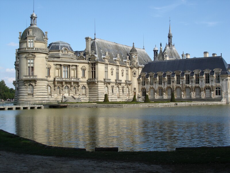
Picture: VisitFrance.com
The Musée Condé is housed in a fairy-tale chateau just outside Paris. It's largely a nineteenth century reconstruction, famous as the villain's home in the Bond movie A View to a Kill (sadly one of the weaker Bond movies). It's the collection of the Duc d'Aumale, son of Louis-Philippe and leader of the Orléans faction. He was in exile in Twickenham for many years, and he assembled an astonishing art collection with great works by Poussin, Ingres, Watteau and Sassetta as well as the Raphaels. The museum was extremely helpful and accommodating of my request to view the drawings, and I arrived an hour before official opening for my appointment in the library.

The library is outstanding, including the greatest of all French manuscripts, the Tres Riches Heurs du Duc de Berry illuminated by the Limbourg brothers. The library also houses the fabulous collection of old master drawings, including particularly strong collections of Poussin and Raphael. I was there to see the drawings by Raphael and his school. Under the terms of bequest nothing can be loaned from Chantilly, so these drawings are not as well known as more widely exhibited Raphaels. There was an exhibition at Chantilly in 1983 for the 500th anniversary of Raphael's birth, complementing the great Raphael drawing exhibitions in Paris and London. And there is an excellent catalogue of the drawings by Benjamin Peronnet, but it's available only in French, and rarely available at all. I've only seen it for sale at the Chantilly shop (where it costs nearly as much as a Raphael drawing). I deliberately avoided reading up on the Chantilly Raphaels before my trip so that my impressions could be as fresh as possible, but I found Peronnet's catalogue insightful and illuminating when I struggled through the French text on my return to London.
Picture: MS from Chantilly catalogue
Seeing these famous drawings 'in the flesh' is a quite different experience from seeing them illustrated in a book, no matter how good the reproductions. A good example is the early drawing above, which looks a bit scrappy in reproduction. It's actually huge; it took two people to bring it into the print room for me see. It's irregular, but Joannides gives dimensions for the whole of 52.5 x 125.0 cm. It's a cartoon, presumably for a decorative fresco in a private house in Urbino. Nothing of that sort survives, so it's a rare glimpse of an entire aspect of Raphael's early work that is otherwise lost to us. We know art history from the works that survive; we have little knowledge of ephemeral interior decoration.

The other thing you don't get from reproductions is an appreciation of drawings as three-dimensional objects. Raphael didn't just draw in charcoal, chalk, ink and metalpoint. He also used a stylus, which scratched indentations into the paper to indicate contours. This early drawing shows particularly lively and extensive stylus indentations in parts. He seems to have used the stylus to define certain forms, and then used chalk and charcoal once he'd established the broad composition. The putto at the far right and the boar at the left have particularly extensive stylus work, the other putti and boars less so. He really went crazy with the stylus on that left hog; because stylus lines are not coloured, it's a forgiving technique that can be used to try out different designs. 
Picture: Culture Whisper
The boars derive from an early Dürer print The Return of the Prodigal Son (detail above). Both the Dürer and the Raphael are extremely charming images, and the fresco must have been spectacular. 
Chantilly Study (OpenRaphael) Tags:
Picture: Open Raphael
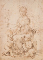
This drawing is related to the Belle Jardinière in the Louvre. It's a fine drawing, but I don't think it's a Raphael. Peronnet summarises its critical history; it was doubted for most of the nineteenth century, but has more recently been favourably received. Peronnet catalogues it as 'Raphael or Timoteo Viti', and I'd go for the latter, although I might be misled by its over-cleaned condition. I suspect the degree of damage and restoration in drawings is less widely understood than in paintings. One Raphael drawing in Chantilly is a wreck - the Madonna of Humility. But another, the Study for the Disputa (below) is beautifully preserved, especially compared to a related study in the Ashmolean. Some highlights are slightly oxidised, but the contrasts from varied dark washes to disciplined white highlights are superb - especially contrasted with other studies in similar technique that have suffered greatly from abrasion and exposure to light.
Picture: Musée Condé
Then there are the fascinating, wonderful and problematic red chalk drawings. A group of these masterpieces is debated between Raphael and his studio, especially Giulio Romano, who produced his best drawings in Raphael's studio and then abandoned the medium in favour of ink, but also the enigmatic Giovanni Francesco Penni, who was Raphael's business manager, running his large and prolific studio in Rome. Two drawings are catalogued by Peronnet as by Raphael or his studio, which is a fudge but an honest acknowledgement of the uncertainty around these drawings. 
JPEG - 30.2 ko
Picture: La Tribune de l'Art
Porter Carrying a Table, a study for the Vatican fresco Fire in the Borgo, is dazzlingly beautiful, but on closer inspection has faults that are inconsistent with Raphael's finest drawings. Paul Joannides is especially critical:  "the contours are stiff and inexpressive, registering nothing of the physical tension of the action. The legs are heavily hatched, but three-dimensional relief is not created, and in the chest, especially, modelling is entirely lost except for an attempt made at articulation by laying a few light lines over the surface of the hatching - a literally superficial method, which mocks Raphael's deep structures. This draughtsman is more successful with features like the feet, then hands and the hair, but they seem like still-life details within a whole which is not organic" (Paul Joannides The Drawings of Raphael with a complete catalogue Berkeley: University of California Press 1983 p. 104). Peronnet notes that the anatomical accuracy, treatment of light and lively hair speak for Raphael's authorship. It may be a copy of a lost drawing. As Peronnet notes, even if the studio was substantially responsible for the fresco, and even if students were involved in the planning and design, it's hard to accept that Raphael would have delegated the preparation of such a key figure. Again condition is an issue; subsequent application of wash has dulled details. 

My immediate response was sceptical. "Not Raphael!" I wrote, but I also noted that it didn't quite look like Giulio. The shading struck me as too even and too ponderous, the limbs defined by line rather than volume. But the quality is very high, and the articulation of details like the knee is effective and very like Raphael. It could well be a copy of a lost drawing, but the thesis that it is a Raphael diminished by damage is certainly plausible. My view is that it is not by Raphael, and I am cautious of attributing it to Giovanni Francesco Penni. Penni is an enigmatic figure to whom scholars attribute drawings that differ wildly in quality. He is something of a wastepaper basket for drawings that don't quite fit.
Picture: Musée Condé
The other problematic drawing is this study for the Three Hours in the Villa Farnesina loggia, which Peronnet gives to Raphael or his studio, and Joannides rejects, admiring the depiction of folds and hatching on the stomach of the central figure, but regarding the rhythms as lumpy and the expressions dull. He gives it to Penni, or perhaps Giulio. Perronet acknowledges that it is inferior to the incomparably wonderful Three Graces at Windsor, but notes that the compromised condition affects our judgment. 

The Three Hours is a less immediately stunning image than the Porter Carrying a Table, but I thought it had a better claim to be by Raphael. When I saw it I noted that it was rather worn, but excellent - with varied shading and a better sense of volume. I'm inclined to attribute this sheet to Raphael. 

I'm fascinated by the red chalk drawings produced by Raphael and his studio in Rome. The best of them rank among the greatest works of art ever produced, but even some of the drawings generally assigned to his studio rise to astonishing artistic heights, including Guilio Romano's best graphic work. I've seen enough of this group of drawings to form a reasonable sense of their relative quality, and to have arrived at my own views as to which might be by Raphael himself. I tend towards parsimony, but I might be mistaken. Perhaps I am seeking too much consistency and I am being too harsh in my judgment of works that are almost-but-not-quite masterpieces. Despite intense study by many of the best scholars of old master drawings, there will never be consensus because people have different views of Raphael's character and consistency. 

After the Raphaels, I looked at the fine selection of works by his pupils and followers in the Musée Condé. Giulio Romano is well represented, with a beautiful drawing of a saint, perhaps Saint Blaise, and a large highly finished drawing of The Banquet of Scipio. It's an impressive work, but it pleased me less than the charming Saint Blaise. The other stand-out drawing for me was the Façade of a Palace by Perino del Vaga, a large drawing showing part of a planned exterior fresco cycle. Nothing like it has survived five centuries of exposure to the elements. I quite lost track of time, and had less than an hour to see the pictures. Fortunately I'd been to Chantilly fairly recently and spent a full day in the chateau, but I'm ready to return again! I really recommend it. It's an easy day trip from Paris (train from the Gard du Nord), and the collection is stunning. If you go, do take a torch - it's very badly lit. And when you get to the sign that sends you in opposite directions for the chateau and the museum (which is, er, in the chateau...), take the right turn. 

My visit to Chantilly was last December, but today is an auspicious day to write about it because it is Raphael's birthday. I don't usually go for birthday tributes, but this is a special birthday because it has been chosen as a day to commemorate Hasan Niyazi, a prolific and influential art history blogger and Raphael fan who died at a tragically age. You can see commemorative posts from other bloggers here.