Sunday, 17 November 2013

Warts and All: Samuel Cooper at Philip Mould

Picture: Philip Mould & Company
Warts and All: The Portrait Miniatures of Samuel Cooper (1607/8-1672) Philip Mould & Company, Dover Street 13 November - 7 December 2013

Emma Rutherford, Bendor Grosvenor et al Warts and All: The Portrait Miniatures of Samuel Cooper (1607/8-1672) Philip Mould & Company 2013 £25

I was driven out of the British Museum's print room by another fire alarm last Thursday, so I headed over to the Samuel Cooper exhibition at Philip Mould. The wall text gushes with superlatives, but in this case they're appropriate; he is a far better artist than I'd appreciated, and this is an exquisite and beautifully presented display. 

A great achievement of the exhibition is to bring this miniaturist back into the mainstream of British art history. As the catalogue notes, miniatures are often displayed apart from paintings (in London they're even in a different museum - the Victoria and Albert rather than the Tate or National Gallery), and kept under covers that are rarely lifted. But not only is Cooper part of the tradition of British portraiture, for a while he was its supreme exponent. A major revelation is that Cromwell's famous instruction to paint him 'warts and all' was given to Samuel Cooper and not Peter Lely as has generally been assumed. Lely based his famous painting of Cromwell on Cooper's miniature. 

The temptation with miniatures is to marvel at their meticulous technique, to wonder at the skill of reducing a portrait to minuscule scale. This exhibition shows that Cooper was an excellent painter as well as an excellent miniaturist. The faces are superb and the poses are sophisticated. The influence of Van Dyck is evident, and perhaps also of Rembrandt. And miniatures by Cooper's contemporaries show his influence and bring into relief his exceptional skill.

The catalogue is excellent. It addresses condition and discusses the difficulty of reproducing these tiny masterpieces. There is some important new research, with well-argued proposals on attribution, dating and sitters as well as the newly identified context for one of the most famous quotations in English history. I'm impressed that a small private gallery can produce something so much better than, for example, the Royal Academy with all its resources can manage for its current Daumier exhibition. I hope it gets distributed more widely.

I worry about the ethics of public galleries lending art to private dealers, because I'm a bit prissy about these things. But in this case it's hard to object. The exhibition is serious and scholarly (as well as beautiful and enjoyable - I don't mean to make it sound dour!), it's free and open to all, and the catalogue is a major contribution to our knowledge of Cooper. But there is inevitably a greater barrier to the public when faced with a grand Mayfair gallery where you have to ring a bell to gain entry, and having agreed to lend to one commercial gallery it is hard to resist the pressure to lend to its competitors. The trade is typically more cavalier in art handling than museums, and the risk of loan terms being disrespected is real - how do you refuse a request to handle a loan if it comes from a client who's just spent a million in your gallery? But these risks are equally prevalent when lending to other museums who are beholden to sponsors and donors. A degree of pragmatism seems appropriate and I think museums were right to lend to this show.  

Magnifying glasses are available and much appreciated - something more museums should provide too. Unfortunately many of the miniatures are set too far back in the case for them to be very effective, but it does provide some enhancement. The accompanying muzak is the one real disappointment. We know it's a commercial gallery, but it's still a shame that they have to impose piped music like a department store. Still, this is one of the best exhibitions mounted in London in recent years. Do try to get along before it closes early next month.

New Ingres?

Picture: The Art Tribune
The Art Tribune reports a new Ingres discovery, a version of his famous La Grande Odalisque. It's on view in Paris for the next few days; I do wish I could go! The Art Tribune is a reliable source with a record of scepticism on new attributions and it seems to have a good chance of being right. 

Ingres made a number of small versions of La Grande Odalisque, including one in Angers and another in the Wrightsman Collection that will perhaps find its way to the Metropolitan Museum of Art in due course (Jayne Wrightsman is of the Met's greatest patrons, and recently donated some Ingres drawings). 

Monday, 11 November 2013

Velazquez and the Family of Philip IV


One year before his death Velázquez created this portrait of the eight-year old Infanta as well as that of her little brother Philip Prosper (Inv.-No.
Picture: Kunsthistorisches Museum
Velazquez and the Family of Philip IV at the Prado until 9 February
Javier Portús (ed) Velázquez: Las Meninas and the Late Royal Portraits Thames & Hudson 2013 €40

Velázquez's late portraits are among the absolute highlights of European art and some of the pictures in this exhibition are breathtaking. There are just thirty pictures, which is enough to sate the appetite without overwhelming the senses. It opens with portraits from his stay in Italy 1649-51, including a version of Pope Innocent X from Apsley House. The prime version in the Doria-Pamphili in Rome is simply the greatest portrait ever painted (Mona Lisa? Pah!). These Italian portraits are surprisingly engaged and individual, reminding me of Rembrandt's late portraits of almost exactly the same date - his portrait of Jan Six was painted three years after Velázquez left Rome.
infanta
Picture: Alain Truong
The next section sets Velázquez's portraits of the royal family alongside versions by Juan Bautista Martínes de Mazo. Their doll-like visages and inbred identikit Habsburg features are more aloof than the earlier Roman portraits. Infanta Margarita in Blue (pictured top) is amazing, with a dazzling range of effects in the blue dress, which is animated throughout. His technique varies from liquid effects from applying dilute paint to the dress, to dry scumbling of white highlights in the brocade. Opposite is an almost identical version in green from Budapest by Mazo (above). The Mazo is an excellent picture, but it doesn't approach the brilliance of Velázquez's. Mazo animates certain areas by applying highlights whereas Velázquez makes the whole picture come alive. You get a great appreciation for their relative quality seeing them together in this show.

Velázquez's studio turned out many variants of his royal portraits, many of high quality. The exhibition includes two portraits of Philip IV, an undisputed masterpiece from the Prado and a contested attribution from London's National Gallery that is here given to Velázquez. Scholars agree that the London picture is of particularly high quality, but note that the torso is weak and the gold chain less well depicted than in Velázquez's best work. Given how little we know about how his studio operated and how well artists like Mazo could reproduce his work, I find it hard to take either side with much confidence, but I'm inclined to see it as a studio work, insofar as we can distinguish Velázquez on a bad day from his studio on a good day. 
La infanta Margarita de Austria
Picture: Prado
The picture above was celebrated as one of Velázquez's greatest works until comparatively recently, but is now securely attributed to Mazo. The white highlights on the dress look like spray-on snow, gaudy decoration quite alien to Velázquez, whose animated brushwork articulates structure. The rich reds point forward to later court portraits that can be seen in the final room of the exhibition. It's now hard to see how it could be mistaken for Velázquez, but rather than mocking earlier connoisseurs I see it as an opportunity to realise how our perceptions of great artists change over time. In future generations I suspect people will will be astonished by some of the attributions that we took for granted.

Mazo's reputation has suffered because he hewed close to Velázquez without equaling his brilliance. That said, he's a really good artist and a number of pictures long given to Velázquez have been reattributed to Mazo (most notably the View of Zaragoza) The re-assessment of Mazo in this exhibition is judicious. Miguel Morán's catalogue entry describes the difference between Mazo and Velázquez as the difference between excellence and genius, which seems right to me. Mazo's version of Las Meninas was disappointing; perhaps inevitably it cannot measure up to the original, and I sense that he was dispirited by the obvious gap. The portrait of his own family (below) has long been recognised as his masterpiece. The debt to Las Meninas is clear, although he struggled to replicate its articulation of space. But the figures are excellent, and the range of technique and variety of expression comes closer to Velázquez than even his close copies. It is somewhat abraded, and the reds have particularly suffered, but its excellence is conspicuous, undiminished even by proximity to some of Velázquez's best pictures.

File:The Family of the Artist by Juan Bautista Matinez del Mazo.jpg
Picture: Wikipedia
The final section shows the continuation of Velázquez's style after his death. Juan Carreño de Miranda stars with his more sumptuous royal portraits. But it's hard to appreciate their quality after Velázquez and the final room is redolent of decadence and decline. A catalogue essay by exhibition organiser Javier Portús reminds us that Spain's political and economic decline was already advanced by the 1650s, which was a golden age only in the cultural sphere. His essay provides fascinating context, explaining links between painting and literature. 

The pictures are superb, but that alone doesn't make a great exhibition. It's the meaningful comparisons between similar works, the quality of the interpretation and the scale that makes this show special. We see pictures that are certainly fully autograph works by Velázquez alongside more debatable attributions and works by his best students. The wall text is brilliant, giving useful background without being overwhelming, and inviting you in to consider the questions that art historians debate, focusing on technique and pictorial quality. It's not difficult to understand, and it doesn't presume any prior knowledge, but it treats everyone as capable of engaging in the same conversation. For me the most rewarding aspect of an exhibition is the opportunity to explore relations between objects rather than being instructed in the curators' latest theories. This exhibition helps us understand these great pictures brilliantly through the intelligence and thoughtfulness of its selection, display and interpretation.

I have just a couple of niggles. The failure to discuss condition is unfortunate; it's mentioned neither on the wall text (forgivable), nor in the catalogue (inexplicable). Velázquez's virtuoso technique is susceptible to damage, and a range of states of preservation was evident.  The Infanta Margarita in Blue was rediscovered in the Kunsthistorisches Museum in 1923, and it's better preserved than the other Kunsthistorisches loans - perhaps because the others were over-cleaned before 1923. Even in reproduction the difference between the bright white of the Felipe Prospero and the subtle greys of the Infanta Margarita is striking.

The Apsley House portrait is glazed with low-grade glass that gives off a nasty reflection, which is particularly unfortunate because it's hung opposite a wall with the exhibition title in large white text, which means you can see the word 'Velázquez' reflected across the picture. Given the costs involved in mounting an exhibition like this, surely it would have been possible to re-glaze it so we could see it properly. 

I went twice. Friday afternoon was quiet and wonderful. First thing Saturday quickly became an unbearable scrum with as many as ten people per picture, making a mockery of the timed entry. It's such a shame that the Saturday visitors couldn't get to appreciate the carefully choreographed contrasts, because the view from one picture to another was obscured. Still, it's an enormously rewarding exhibition that's worth a trip to Spain - but go on a weekday. It's really one of the best exhibitions I've ever seen.

Sunday, 10 November 2013

The King's Pictures by Francis Haskell

Picture: Amazon
Francis Haskell The King's Pictures: The formation and dispersal of the collections of Charles I and his courtiers Edited and introduced by Karen Serres with a forward by Nicholas Penny, Yale University Press 2013 £30

Haskell begins by taking us on a tour of Charles I's London, pointing out the palaces of art and enumerating their treasures. He describes a shallow art world in England, based around only a handful of aristocratic collectors. English art collecting collapsed after the civil war dispersal, and didn't fully resume until the dispersal of continental collections after French Revolution and subsequent wars. But for a short period some of the world's greatest art treasures could be seen in a small area of London.

Francis Haskell died in 2000, but the text of his Paul Mellon Lectures has been edited by Karen Serres for this new book. Nicholas Penny's introduction notes areas that Haskell would doubtless like to have developed further, but despite its brevity and its lacunae this is a superb book; well-written, beautifully produced and erudite. Although some areas could have been further developed, it is more comprehensive than some heftier studies because it provides better context, situating Charles I's collection alongside those of his courtiers, and their collections of paintings alongside their collections of sculpture and drawings. It is in the field of drawings that Britain has benefited most from Carolean collecting. The great collections of Renaissance drawings not only stayed in the country, but inspired and instructed Britain's artist-collectors like Sir Peter Lely, Sir Joshua Reynolds and Sir Thomas Lawrence. 

Much of Charles I's collection was parceled up and handed over to syndicates of his creditors, which meant that tailors and drapers came briefly to possess masterpieces by Raphael and Correggio: 
"we have been witnessing what is perhaps the single most extraordinary episode in the history of English art collecting, or indeed that of any other nation. Great masterpieces painted by Correggio and Titian, by Raphael and Holbein, by Rubens and van Dyck, for kings and princes, cardinals and courtiers were now to be found in small houses scattered through London and the countryside belonging to haberdashers and glaziers, cutlers, musicians and painters. It is hard not to be reminded of the surprise felt in these very years by English travellers when they saw how widespread was the distribution of pictures in Holland ... The English market was not so democratic, but neither was it aristorcratic, or even oligarchic. It did not, however, last for long." (pp. 146-151)
Haskell's subject was the consumption of art rather than its production. He wrote about patrons rather than artists, and focused on collecting rather than connoisseurship. But he was an art historian as well as an historian, and this book is particularly sensitive to the taste and connoisseurship of Charles I, the Earl of Arundel and the Dukes of Buckingham, Northumberland and Hamilton. He discusses their fondness for the Bassano family, and Charles I's surprising disdain for Veronese - in contrast to Arundel and Buckingham. He discusses their quest for Leonardo, noting that only Charles I was successful in obtaining St John the Baptist. Readers in 2013 will of course be aware that he had a second Leonardo, the recently rediscovered Salvator Mundi, oddly not mentioned by the editor even as a footnote.

Haskell enthuses over the Vendramin Family portrait more than I would, and I wondered if the caption on the plate ('Titian and Workshop') was subtle editorialising (if so, I approve!). It was bought by the National Gallery from the Duke of Northumberland in 1929; I'd sooner have had Bellini's Feast of the Gods, sold by the same family just over a decade earlier. On the other hand, the St Margaret in Vienna is listed as Raphael in the credit; it's surely more a studio piece than the Vendramin Family. But now I'm just nitpicking. 

This is a wonderful book: short, sumptuous and readable, and provocative, rigorous and serious. Highly recommended.
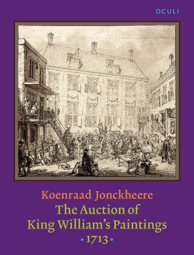
A related book worth looking at is Koenraad Jonckheere The Auction of King William's Paintings 1713: Elite international art trade at the end of the Dutch golden age John Benjamins 2008, which is particularly strong on the network of dealers and advisors, and has some interesting information about details like how pictures were transported and how auctions were publicised and managed. Not as spectacular as the Commonweath sales, but another fascinating story of the international art trade in the subsequent century, and this is a book that deserves to be better known. 

Saturday, 9 November 2013

Mantegna Drawing sold

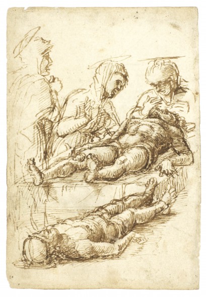
The new Andrea Mantegna drawing that I reported recently has been sold for €420,000 at Farsetti, nearly double the high estimate but still a fraction of what a Mantegna would make on the open market, without Italian export controls. I went to look at the Mantegna drawings at the British Museum and the Courtauld Institute this week. I haven't seen the original of the new drawing, but I'm increasingly convinced by it - although I've heard some cogent dissent. It is possible that it will prove to be a forgery, hewing close to the related drawings rather than trying to create something completely new. But David Eskerdjian points out that the inscription matches one on the related drawing in Brescia that was only discovered when it was removed from its mount in 1992, so it would have to have been forged recently (after Hebborn was working), or for the inscription to have been faked separately. It seems to me absolutely typical of Mantegna and an impressive piece that displays the master's own nervous, experimental energy.
Screen Shot 2013-10-22 at 23.45.32
Picture: Vivante Drawings
The upper image of Christ frozen in his final death-agony is more dramatic than the related British Museum drawing (above). In the BM drawing, Christ's right hand rests limply on his leg, the fingers of his left hand clenching at the ground and his left arm tensed as if pushing himself up. The new drawing is more fully resolved, with better defined feet and knees, the right arm more confidently positioned and with a great contorted torso instead of the ambiguous position of the chest in the London drawing. The heaving chest is not entirely plausible in an Entombment scene - more like a dying Christ than a dead Christ - but it's a terrific image and a fine contrast to the inert body below. It's a tremendous discovery - few drawings survive from this period, and we now have three related studies by one of the greatest early Renaissance draughtsmen. Any more out there?

It's ironic that Italy has such strong laws against exporting art, but makes it so hard for people to see what it has. You need a letter of introduction from Mantegna himself to get access to some print rooms in Italy, whereas I just turned up on the doorstep at the British Museum and got to see the greatest collection of Mantegna drawings anywhere. And an appointment at the Courtauld required no more than an advance e-mail.

Tuesday, 5 November 2013

Knox Wrecks Fitz

Picture: Fitzwilliam
The Fitzwilliam Museum's newish director Tim Knox has outlined his vision, and it's deeply depressing. He seems to think it's unwelcoming, which I've never found before but suspect I will in future. And he thinks - wait for it - flowers in the galleries are what's needed. That's harmless enough, but next he wants to do away with 'surplus' Do Not Touch signs. I don't care much either way about the signs, but I care deeply about the ethos. Quite simply, people shouldn't touch fragile and irreplaceable works of art. If that's 'unwelcoming', tough. The first job of a museum is to preserve its treasures for people who want to see them, but too many museums are happy to allow their collections to deteriorate through handling if people fancy fondling them. Why does Knox find the signs so objectionable that their removal is central to his strategy? What kind of ethos is he trying to instill? I expect guards will now think twice about challenging visitors poking paintings or sculptures. It was at the Fitzwilliam, incidentally, that a visitor smashed three vases to smithereens - pictured above. 

Knox has grand plans for bringing conservators into the gallery so people can watch and 'participate' in conservation. Think that Titian's a bit dirty? Roll up your sleeves and grab a brillo pad. The Fitzwilliam becomes an integrated participatory experience - poke a hole in a picture, then restore it yourself. Smashed a vase? Don't worry, have a go at sticking it back together. I mock, but seriously - what can we make of the bizarre suggestion, arrived at after six months' thinking, that people should 'participate in conservation in action'? I suspect (and rather hope) that he means just watching, but it's a sign of how far simply looking has come to be stigmatised in museums that Knox cannot even say the word. It has to be spun as a 'participatory' experience.

Then, like every museum these days, he's initiated a building project. Museum directors seem to prove their worth by the extravagance of their building projects and the degree of disruption imposed. The Fitzwilliam has already gone through a vast construction project to give a 'proper shop and cafe', which some museums seem to think more important than their collections.

Finally, inevitably, he's allowing photography. I've written about this before, and I'll say more on the topic in a later post, but to raise just one crucial point: once photography is allowed, it is impossible to prevent flash photography. Flash is an intolerable distraction that makes looking at art impossible, and socialises everyone into the norm that museums are there only for the taking of pictures and not for looking at pictures. 

A wonderful museum that I greatly loved is being crushed by the juggernaut of bland mediocrity, the managerial ethos that insists on all museums looking the same and invites you to admire the cut flowers and take selfies instead of simply being inspired by great art. Knox wants to 'make it sing', but he presumes that it is Tim Knox that will make it sing, rather than Rubens and Titian and Poussin. 

Thursday, 31 October 2013

Notes from Madrid

Picture: Wikipedia
I went to Madrid last weekend to see the Velazquez show, which I'll review separately (short version: fabulous exhibition, go!). But there's lots else to see too.

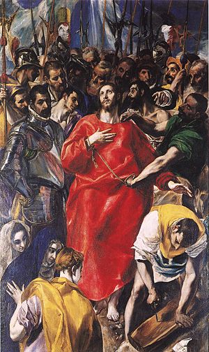
El Greco's great El Espolio (above) is on loan from Toledo. It's just been cleaned and restored at the Prado, and it's shown alongside full sized x-ray and infra red photos. I saw it in Toledo a year or so ago, where it was rather dirty and badly hung in the Sacristy. It now looks fabulous. The impasto is well-preserved, showing a much livelier surface than survives on many other El Grecos. It's an overwhelming picture, its daring, dramatic composition undimmed by its well-deserved fame. 

The Prado had three other exhibitions on:
  • An 'Acquisition in Focus' display about Mengs Portrait of José Nicolás Azara - nice picture, well displayed with interesting contextual material.
  • Rome in your pocket: Sketchbooks and artistic learning in eighteenth century Rome. Wonderful small exhibition including sketchbooks by Goya and Reynolds. Most of the exhibits are not masterpieces, but the exhibition effectively illustrates how young art students reacted to and learned from Rome.
  • Captive Beauty: Fra Angelico to Fortuny - a small exhibition of pictures whose only common feature is that they're small. Pointless, confusing and confused attempt to sensationalise the permanent collection by turning part of it into a spurious 'special exhibition'. Some dubious attributions, no wall text, worse context than in the main galleries where missing pictures are replaced with little captions telling you they're in the exhibition. Utterly daft.
I was last in Madrid less than a year ago for the Young Van Dyck exhibtion, but I just can't get enough of the Prado. It's an amazingly concentrated selection of masterpieces by my favourite artists (Raphael, Titian, Velazquez, Rubens, Poussin). 
San Jerónimo
Picture: patrimonionacional.es
When I'm in Madrid I always go to the Prado (obviously), and usually to the Thyssen, and then I go to one or two of the many other attractions. This time I went to the Royal Palace for the first time. It's a rather shocking example of eighteenth century bling. There are some great things, like the Goya portraits and the Tiepolo ceilings, but some rather ghastly rococo decoration too. At the moment there's an exhibition drawn from El Escorial, which I've never visited. I was glad of the chance to see some of the greatest pictures I've never seen, including the only major Titians that I haven't seen before, but this haphazard and poorly-displayed show was a great disappointment. The first few rooms contain little of interest. Then they have the great Titians crammed together in a small room together with some arbitrary loans from the Prado and National Gallery London. I'm disappointed that they would lend to such a frivolous exhibition.

I flew from City Airport, which is currently trying to prove that it can be as awful as Heathrow. Last week they decided that they needed to search about one bag in three, just because. Madrid airport  is much better, with smooth connections to central Madrid. The tube wasn't running when I returned to London. Just as well I had a spare bike at the office, because the recommended alternatives involved trains to places I've never heard of and suspect don't exist. I think they just make it up to confuse tourists. Still, we're so lucky to live at a time when travel is so cheap and easy. I saw some wonderful things; Madrid is so good it even makes London airports worth bearing.