Thursday, 31 October 2013

Notes from Madrid

Picture: Wikipedia
I went to Madrid last weekend to see the Velazquez show, which I'll review separately (short version: fabulous exhibition, go!). But there's lots else to see too.

El Greco's great El Espolio (above) is on loan from Toledo. It's just been cleaned and restored at the Prado, and it's shown alongside full sized x-ray and infra red photos. I saw it in Toledo a year or so ago, where it was rather dirty and badly hung in the Sacristy. It now looks fabulous. The impasto is well-preserved, showing a much livelier surface than survives on many other El Grecos. It's an overwhelming picture, its daring, dramatic composition undimmed by its well-deserved fame. 

The Prado had three other exhibitions on:
  • An 'Acquisition in Focus' display about Mengs Portrait of José Nicolás Azara - nice picture, well displayed with interesting contextual material.
  • Rome in your pocket: Sketchbooks and artistic learning in eighteenth century Rome. Wonderful small exhibition including sketchbooks by Goya and Reynolds. Most of the exhibits are not masterpieces, but the exhibition effectively illustrates how young art students reacted to and learned from Rome.
  • Captive Beauty: Fra Angelico to Fortuny - a small exhibition of pictures whose only common feature is that they're small. Pointless, confusing and confused attempt to sensationalise the permanent collection by turning part of it into a spurious 'special exhibition'. Some dubious attributions, no wall text, worse context than in the main galleries where missing pictures are replaced with little captions telling you they're in the exhibition. Utterly daft.
I was last in Madrid less than a year ago for the Young Van Dyck exhibtion, but I just can't get enough of the Prado. It's an amazingly concentrated selection of masterpieces by my favourite artists (Raphael, Titian, Velazquez, Rubens, Poussin). 
San Jerónimo
Picture: patrimonionacional.es
When I'm in Madrid I always go to the Prado (obviously), and usually to the Thyssen, and then I go to one or two of the many other attractions. This time I went to the Royal Palace for the first time. It's a rather shocking example of eighteenth century bling. There are some great things, like the Goya portraits and the Tiepolo ceilings, but some rather ghastly rococo decoration too. At the moment there's an exhibition drawn from El Escorial, which I've never visited. I was glad of the chance to see some of the greatest pictures I've never seen, including the only major Titians that I haven't seen before, but this haphazard and poorly-displayed show was a great disappointment. The first few rooms contain little of interest. Then they have the great Titians crammed together in a small room together with some arbitrary loans from the Prado and National Gallery London. I'm disappointed that they would lend to such a frivolous exhibition.

I flew from City Airport, which is currently trying to prove that it can be as awful as Heathrow. Last week they decided that they needed to search about one bag in three, just because. Madrid airport  is much better, with smooth connections to central Madrid. The tube wasn't running when I returned to London. Just as well I had a spare bike at the office, because the recommended alternatives involved trains to places I've never heard of and suspect don't exist. I think they just make it up to confuse tourists. Still, we're so lucky to live at a time when travel is so cheap and easy. I saw some wonderful things; Madrid is so good it even makes London airports worth bearing.

Hasan Niyazi

?service=asset&action=show_preview&asset=96818
Picture: National Gallery of Art
Saddened to hear that Hasan Niyazi of 3PipeProblem, doyen of art history bloggers, has died at the age of 37. Hasan was the model of the modern public intellectual, an amateur art historian whose command of his sources was greater than many professionals. He was passionate about opening up art history, and his blog posts were admirably clear and concise as well as rigorous and scholarly. Hasan was a consummate networker who was in touch with everyone, offering advice and encouragement and enriching the art historical community. I shared Hasan's passion for Raphael, and I hope that his Open Raphael project can live on and be completed. He will be greatly missed.  


Thursday, 24 October 2013

Facing the Modern at the National Gallery


I wanted to like this exhibition. I'm glad the National Gallery avoided a formulaic blockbuster ('Klimt, Schiele, Kokoschka', 'Treasures from the Age of Freud'?). I'm sure uncritical critics would have cooed over a group of secessionist masterpieces, whereas many were nonplussed by this show. Unfortunately it doesn't work. 

The idea is to capture Vienna in 1900 rather than focus on the most famous modern masters. But it's all rather incoherent. The earlier Viennese painters like Makart and Amerling don't tell us much about Kokoschka or Klimt and the arrangement is very odd. Wildly different artists are hung together in rooms with themes like 'children', with wall text of glittering generality that tries to tell us something about the role of children in Vienna around 1900. Trouble is, the role of children in Vienna around 1900 isn't particularly distinctive. So we learn neither about the art nor about the social and historical context.

In intellectual history there is a school of research that seeks to recover the context in which political ideas were formed, looking for the meaning of, say, Thomas Hobbes by immersing themselves in seventeenth century English political debate rather than understanding the text itself and its impact on subsequent political thought. I sense that they tried to do something similar here, but the problem is that  late nineteenth century Viennese art is not the most meaningful context for the Vienna Secession. The catalogue juxtaposes Kokoschka's Portrait of Hans Tietze and Erica Tietze-Conrat with Rembrandt's Jewish Bride, which makes more sense than setting him alongside Amerling and Waldmüller.

The pictures themselves are mixed. Some are simply dreadful; Schönberg's Self Portrait below is the worst picture I've ever seen at the National Gallery. Others are great, like the Kokoschka, and there are lots of interesting paintings by less well-known artists - a fine portrait by Amerling, and a self-portrait by Franz Eybl, an artist I'd never come across. None of these artists are well represented in British collections, and it's a treat to see them together. But frankly I'd skip this exhibition and see them properly in Vienna. NG exhibitions are quite expensive, and flights relatively cheap. In Vienna the display is better and there's more to see. You can get a proper sense of the distinctive qualities of nineteenth century Austrian art and of the Viennese Secession. 

Incidentally the new Titian is now on display at the NG, listed as 'Possibly by Titian' - more cautious than the Burlington article, but I think it's the right label. Condition is poor, but even in its present state the loose brushwork in the drapery looks Titian-esque rather than Titian to me. If you focus in on the man in red at the centre, that part does look good. We can only guess what it was like when freshly done, so I'm cautious of ruling out Titian entirely but it does seem a bit of a stretch. I'm more convinced by the Girolamo Frascatoro. It's an unlovely image, also very damaged, and the attribution has met much scepticism. But I still think it's right, insofar as one can tell in its ravaged state.

Tuesday, 22 October 2013

New Mantegna

Picture: Artslife.com

Exciting new discovery of Andrea Mantegna drawing is reported by Artslife (in Italian - English summary on ArtDaily). Mantegna is one of the greatest draughtsmen of the early renaissance, but his drawings are scarce. Ronald Lightbown's 1986 Mantegna catalogue lists just twenty, with some more added at the 1992 Mantegna exhibition at the Royal Academy/Metropolitan Museum of Art. This small double-sided sheet is related to three others that were included in the RA exhibition, probably studies for this engraving of the Entombment

My first thought was that this is too good to be true. Not only a new Mantegna, but what a perfect Mantegna! He is celebrated for his skillful foreshortening, most famously in the Dead Christ in Milan's Brera. This sheet fits (too?) perfectly between a study of Christ alone in the British Museum, and a more developed study of the upper group in Brescia. But it does seem right. The paper and the handwriting on the inscription match the related drawings, and it has a nervous energy characteristic of Mantegna, which would be hard to replicate. It seems too good and too characteristic of Mantegna to be other than by Mantegna or by a forger.  

The estimate of €140k-€220k is oddly wide and oddly low, presumably because it's subject to Italian export restrictions. I can't find the online catalogue entry on the auction site
Picture: Artslife

Sunday, 20 October 2013

Art as Therapy

Picture: Amazon
This might be the most ambitious book ever written about art. Botton and Armstrong argue that art is valuable as a tool to address psychological needs rather something to be cherished for its own sake. They think through the consequences of that approach for the way museums are organised, the way art history is researched and taught, and the way art is traded. Then they offer their recommendations for remaking the world economy (really!). Unfortunately their reach exceeds their grasp. It's a bad argument that leads to worse policy. 

The solace of art
The claim that art meets psychological needs and provides solace is true but banal. The substance, and also the weakness, of the argument is in the specificity of its advice. B&A aren't really finding anything in art. They are bringing things 
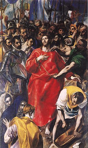
to art. The formula is to take a B&A homily, illustrate it with an old master and tell us that it's the old master's idea. For example, in a Poussin landscape: "the message from Poussin is that most worthwhile work, administrative positions, ambitious commercial enterprises or creative endeavours - irrespective of how they are seen from the outside - do not feel or look glamorous from the inside". None of that highfalutin stoicism here, thank you Professor Blunt! Poussin's intellectual contribution is reduced to the anticipatory plagiarism of an earlier book by, er, Alain de Botton.

Take a closer look at the content of the idea and it becomes more insidious. For me art offers the chance to go beyond myself, to experience a sense of wonder, to sample the greatest creations of the human spirit from across cultures and times. For B&A, it's about reconciling us to limits, making us satisfied with what we've got rather than giving us a glimpse of something greater: "Art can do the opposite of glamourizing the unattainable; it can reawaken us to the genuine merit of life as we're forced to lead it". Life as we're forced to lead it has many merits, but for me the merit of art is that it transcends the petty limitations of daily life.

The book is packed with superficially attractive ideas that fall apart after even cursory consideration:
many outcomes are determined by how much [optimism] we bring to the task. This flies in the face of the elite view that talent is the primary requirement of the good life, but in many cases the difference between success and failure is determined by nothing more than our sense of what is possible and the energy we can muster to convince others of our due. We might be doomed not by a lack of skill, but by an absence of hope. Today's problems are rarely created by people taking too sunny a view of things; it is because the problems of the world are so continually brought to our attention that we need tools that can preserve our hopeful disposition.
This is careless, confused and wicked. It is careless in jumping between success and the good life, assuming that one is a continuation of the other. It is confused in asserting that it's an 'elite' view that talent is the primary requirement for the good life (who says that?). But it's also wicked. It's wicked to blame people's failure on the wrong state of mind, rather than acknowledging the role of ability, motivation and sheer luck. And it's wicked to imply that the ills of the world arise because we're too negative (I think exactly the opposite - and if I were to argue the case in a book, I'd at least do my readers the courtesy of providing some evidence for that thought). But is it even true that art can 'cure' a negative disposition? I generally find that it re-enforces my innate negativity; those of a sunny disposition may find the opposite.

Everyone is an idiot
B&A are weakest when they extend the trivial claim that art can provide solace to make the stronger claim that everyone else in the art world has failed to understand that, and they must therefore do everything differently. Two unsavoury implications are first that everyone else is a fool, and second that not only does art provide solace, but that it all that art can do - because once we've remade the world to suit B&A, there's not much room for anything else.

They open with the tired trope about curators who "can't remember what it was like to share the assumptions of an ordinary member of their society" before criticising wall text for talking about art rather than self-help maxims. Then they get really weird, suggesting that the Tate should cease building up a representative collection of schools of art, and instead "be guided by an analysis of the nation's collective psychological frailties". Instead of addressing gaps in the collection of cubists or surrealists, "they might take the view that they were strong on works that addressed loneliness but short on art that helped people form better relationships." The problem is that even if you accept that some works of art are especially suited to 'address loneliness' (do the subjects jump out of the frame to chat over a cup of tea?), it's not the only thing that art does. Those of us who want to learn more about art, to situate works in a context that would make sense to their creators, will simply be bamboozled by such a display. Individual works of creativity will be reduced to stage props to illustrate the nostrums of pop psychology. 

Their criticism of academics is crushingly philistine, suggesting that we already know enough about art history and just need to communicate it better. They complain that university courses fail to ask 'what do these works mean to me?', and instruct that "scholars should study how to make the spirit of the works they admire more connected to the psychological frailties of their audiences. They should analyse how art could help with a broken heart, set the sorrows of the individual into perspective ..." - in other words, they should all become self-help gurus. 

My favourite bit is when they tell art dealers what to do:
The task of the private gallery is a serious one: to connect purchasers with the art they need. The chief skill required for running a gallery should therefore be not salesmanship, but the ability to diagnose what is missing from the inner life of the client. The art dealer should strive to identify what kind of art a person needs to rebalance themselves and then meet that need as efficiently as possible. 
The key activity of a dealer would be to conduct consultations sessions that would reveal the state of the client's soul. Before one can know what someone should buy, one has to know who they are, and more importantly, what areas of their psyches are vulnerable. The role of the art dealer would overlap with that of a therapist. The standard layout of a commercial gallery would evolve to include a therapy room, which one might need to pass through before getting to see any works for sale. Thus the dealer would operate as a matchmaker, bringing together an inner need of the client with a work best able to assuage it.
I'm amused by the image of Mayfair's art galleries with couches in the front room. "Freud or Lacan with your Gainsborough, sir?" The absurdity is funny, but it's also a sign of the unseriousness of their argument. 

It seems cruel to continue, but let's finish by looking at their recommendations for remaking the global economy:
What we are aiming for is enlightened capitalism: a system within which businesses remain sufficiently attuned to economic reality to be profitable and to sustain and increase their own activities without needing outside support, but also stay focused on providing optimal goods and services. It means a business culture devoted to  what is genuinely worthwhile and admirable as well as to the many disciplines required to flourish in a competitive marketplace.
They can aim at enlightened capitalism as much as they want, but if all they can do is espouse vacuous homilies about niceness they'll miss the mark. 

To thine own self be true
An underlying problem is the thinness of the book's philosophy. They think that art can help us become better versions of ourselves. There's much talk about the 'self' and the 'authentic self'. This example can stand for many: "Growth occurs when we discover how to remain authentically ourselves in the presence of potentially threatening things". But what is this 'self'? Selfhood is a problem that philosophers (and theologians, psychologists and even artists) have wrestled with for millennia. B&A cut through this great exciting jungle of ideas with a banal 'commonsense' notion derived from self-help books. Is my 'authentic' self the one I wear to work or the one I take to the pub? Is it the kindly one self that pets kittens, or the hard-nosed self that reviews bad books? When we're unsure how to behave, how do we know which self is true? And should we be true to our 'own selves'?

Shakespeare was mocking Polonius when he had him tell Laertes "To thine own self be true". Laertes got everyone killed! We all learn to subordinate our own desires to social demands. What do we do when the desires of the 'authentic' self conflict with our responsibilities to others? The possibility isn't even considered here. They promise to "outline what might be happening in our inner depths when we say that works of art are good or bad", but they never do. The book is stuck at platitudes, hinting at bigger ideas about the self, invoking big concepts about love and nature, but never telling us anything beyond the commonplace

I think they're getting at a more superficial problem of reconciling conflicting desires where we have to discipline ourselves and suppress immediate wants to achieve longer term goals. It's not a problem of the 'authentic self' but a problem of motivation, the staple of the self-help industry. I don't share the snobbish disdain for motivational therapy; there are snake-oil merchants out there, but much of it is well-meaning and well-grounded. The problem is that Botton and Armstrong have ideas above their station. They repackage common nostrums with a few footnotes and call it philosophy, then add a few pictures and think they've reinvented art history. It's just Oprah Winfrey without the charm. 

But what's this got to do with art anyway? When I visit a museum I don't want to be directed to contemplate my 'inner self' (a dark place indeed!). I like that art takes you beyond yourself, sometimes to enjoy uncomplicated beauty without thinking too deeply, or sometimes to contemplate bigger things and selves more interesting than mine. I don't go to an art gallery to be analysed and I'd resent bombardment with therapeutic platitudes. There are more things in heaven and earth, Alain, than are dreamt of in your philosophy. 

This book is not just bad; it's obviously bad. Its badness isn't disguised by dense prose and it doesn't hint at hidden depths. Criticising the quotations above is almost superfluous. To quote is to refute. Books this bad are generally best left alone; reviewing them feels like bullying. But it's called for here because of the unearned attention it had already garnered. The truly scary thing is that museums are so timid and so unconfident of their own authority that they pander to this hokum. The National Gallery has invited Alain de Botton to speak, and the Art Gallery of Ontario is even organising an exhibition around this fatuous nonsense. The best riposte I've seen was from Tiffany Jenkins on Twitter: "I would hate to visit an art gallery with Alain de Botton - take[s] all the joy and beauty out of it". Indeed.


Monday, 14 October 2013

At the Barber Institute

Picture: Meet in Birmingham
I think of Birmingham's Barber Institute as my alma mater. I grew up in Birmingham, and although the City Art Gallery was nearer home I always felt a stronger affinity to the Barber. The plain exterior gives no hint of the riches inside. It's a fine and well-balanced collection, with a few duff works and a few supreme masterpieces (Degas, Rubens, Murillo). Their Landscape is one of my favourite Rubens, less showy and spectacular than his great large landscapes in the National Gallery, the Wallace or the Pitti, but a work of understated genius. I especially value the more unusual works at the Barber: an unlovely but fascinating Beccafumi, Mazzoni's Three Fates on the end wall of the gallery above, and still lifes by Baschenis and Bonvin.

I returned on my way back from visiting the Bowes Museum a couple of weeks ago, and I found the gallery much busier than it used to be. Since Richard Verdi's directorship they've made great efforts to attract a wider public. It's to their credit that they have achieved popularity without populism, attracting a diverse audience without sacrificing the Barber's special ambiance.

The Barber has made excellent acquisitions with a depleted budget in recent years, buying pictures that complement its own collection, but also focusing on areas that are poorly represented in other British galleries. Until 1997 there was just a single still life in the collection, by Heem. Dutch still life is already very well represented in other British collections, so the Barber added a French and an Italian example. There's now a fine group of nineteenth century landscapes by Bidauld, Brett, Dahl and Fearnley and a magnificent pastel by Rosalba Carriera.
Copyright Trustees of the Barber Institute of Fine Arts, University of Birmingham
I was delighted to see its latest acquisition, a great late Reynolds Maria Marow Gideon, and her brother William. There are good reasons not to have bought this picture. Reynolds is already well represented in British collections, there were already three at the Barber and its condition isn't great. But they were right to set aside those concerns. It's a kind of portrait not previously represented at the Barber, and it's a nice tribute to a previous Barber director, Ellis Waterhouse, who was a Reynolds specialist. Reynolds' pictures have generally suffered as a result of his experimental techniques, and this is better than many. It's escaped the darkening that's ruined the effect of some of his pictures. Above all it's simply an excellent painting that towers above the other Reynolds at the Barber and provides a great focus for its English portraits.

It's best not to be too formulaic in developing a collection; enhancing an area of strength can be better than a spacefilling approach of trying to ensure broad and comprehensive representation. I don't suppose they set out to acquire a second Rubens or a fourth Reynolds, but they were quite right to have seized the opportunities. 

There have been a few attribution changes since my last visit. The Ugolino is now rightly downgraded to school (on the wall text - 'attributed' online) and the Botticelli studio work is ambitiously upgraded to autograph. It's good, but not that good. There are also some interesting loans, including Manet's Madamoiselle Claus and a fine early Lely. And the Barber's website is much improved. I like this collage of works on the same page, which works with a small collection like this and makes navigation really easy.

I had a couple of niggling concerns. A room off the main galleries had a sound installation accompanying three pictures from the collection, Sonic Voices: New electroacoustic music inspired by art. I didn't like the sound or the installation. The emotive power of music inevitably imposes a particular mood and constricts our engagement with pictures. It apparently does encourage people to look more closely and for longer, but it also enforces a particular kind of response. At least this exhibition was in a separate room and didn't intrude on the main galleries.  

The Barber used to have handouts available in each gallery with details about the works. They've been replaced with conventional wall text, which I think is a shame. The old handouts gave you a souvenir of your visit, and I thought it encouraged engagement with the pictures because you didn't have to run backwards and forwards to look at the edge of each picture. I also liked its distinctiveness. Sharing 'best practice' is all well and good, but museums seem to be increasingly homogeneous and I yearn for a little more eccentricity. Still, the Barber continues to provide a fabulous space for enjoying art.

Sunday, 13 October 2013

At Tate Britain

Picture: Winchester Cathedral
Yesterday I went to Tate Britain for the new exhibition Art Under Attack: Histories of British Iconoclasm, and while I was there I caught the Lowry show just before it closes.  

Iconoclasm is worth a trip to see the English religious art that was desecrated in the reformation, a tantalising hint of what's been lost. The sculpture fragments from Winchester Cathedral are terrific; the picture above is of one not in the exhibition. But the show loses focus and becomes simply daft when it starts to imply that desecrating art can be a creative act. Jonathan Jones wrote an insightful critique of their 'studious ambivalence' towards more recent acts of destruction. 

Carl André's Equivalent VIII (the bricks) is included because a visitor threw vegetable dye over it, a moronic gesture best ignored rather than memorialised in an exhibition. I was amused by the wall text, which described it as 'admired by some and misunderstood by others', as if that exhausts the range of responses. You'll have to put me down as 'misunderstanding' then. 

It gets worse when we reach contemporary art (doesn't it always?). Here in its unedited glory is the wall text for three of the Chapmans' No Longer Loved series:
These reworked historical portraits are part of a series in production since 2006. The artists purchase historic portraits and paint over their subjects to portray them in states of decomposition. The sitters are 'no longer loved' because their portraits have been sold and reworked. The Chapmans describe their response as one that 'improves' or 'rectifies' the work, an action that subverts traditional portraiture's aim to capture the likeness of the sitter in life. It also questions the pretensions of historic painted portraits made to immortalise the elite, who still die like everyone else.
Despite the inverted commas, I think we're supposed to agree that the Chapmans have improved these old pictures with their juvenile repainting. The text is pompous and ridiculous. And it shows a shallow grasp of art history in its implication that the Chapmans are the first artists to reflect on mortality - any guesses about what the skull in the portrait below might refer to?
Picture: Barber Insittute
Lowry was worse than I'd feared, and I was never much of a fan. I went straight to the end to see the large late pictures that critics had enthused over. Industrial Landscape 1955 (below) is described as "the most formal and geometric of the five panoramas, but in many ways the wildest and grimmest. The sky is a glacial tour de force." Really? The sky seemed to me an ugly, thickly-painted mess.

Picture: Tate
Far from the pinnacle of his art, I thought the large paintings made his inadequacies most obvious: his weak perspective (especially aerial perspective); undifferentiated application of paint that fails to convey variety of texture (compare his snow scenes to Monet's in the National Gallery) and weak composition (compare Bruegel's landscapes on a similar scale in Vienna, Prague and New York). 

Brian Sewell's short review is more insightful than the whole catalogue plus wall text. Neither Lowry's pictures nor his biography can sustain the weight of interpretation offered by some critics. John Berger's claim that this parochial tory was criticising imperialism is ludicrous, and the Berger quotation in the wall text is itself anachronistic (implicitly referring to the Gallagher-Robinson thesis then in vogue). 

For all that, I still have a soft spot for some of Lowry's smaller, wittier pictures. They're not high art, but shorn of the professors' pomposity they can be enjoyed as folksy souvenirs of Britain's industrial past.