Thursday, 27 June 2013

Masterpiece London

Picture: Dickinson
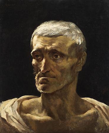
Masterpiece is London's major art and antiques fair and I saw some wonderful things at yesterday's preview day. Its focus is more on antiques and decorative arts, but there are some good pictures too. The powerful Gericault above attracted me. I thought I'd seen it before, but when I looked it up I think I'd confused it with a version in Besancon. It's with Dickinson at £1.3m. Gericault attribution is rather fraught - the quality of autograph works varies and there have been many imitators. I'm certainly no expert, but this one looked right to me. It's such a great illustration of that period of Romantic art - a portrait study of a rude mechanical conceived in the heroic Roman idiom.

 thumb
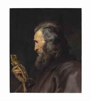
As with collectors, the best dealers reveal consistent but not homogeneous taste. At this grand fair it's nice to get a chance to see well-curated displays of things that don't altogether appeal to me, and which I might not otherwise see. It feels a bit incestuous to praise Philip Mould's display, given my fondness for Bendor Grosvenor's blog. But their stand had a great range from major works by famous artists to more unusual, but also very fine pictures by less familiar artists. There's a new Van Dyck (as we've come to expect - starting to get blase about seeing new Van Dycks with Philip Mould) and some excellent miniatures. Bendor pointed out this striking self-portrait by Henry Wyatt, a student of Lawrence's. This impressive picture is priced at £28,000, which seems terrific value to me. Obviously you're paying a big mark-up when you buy from a dealer, and the overheads at these fairs are huge. But less fashionable pictures like this still seem very reasonable by most yardsticks. 

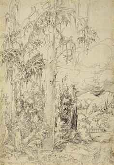
Decorative art is the main focus of the fair, and I particularly liked a lot of the English furniture on display. This rare early desk at Mallett was one that I wanted to take home. But the real surprise for me was the quality of ancient art at the fair. I'm more of a tourist in antiquity, but a number of things just leaped out at me. My single favourite object in the whole fair was a Greek vase - a kylix by the Oedipus Painter with Charles Ede. Even if you know nothing about ancient art, its quality is really striking. The dealer didn't want me to put a picture online, so hurry along to the fair to see it! 

Wednesday, 26 June 2013

Contemporary Sales: hasn't the blue line done well?

Picture: The Onion
Some of the breathless commentary about the contemporary art sales this week reminds me of the classic article from The Onion, Blue Line Jumps 11%. Says The Onion: "Ecstatic investors are comparing the blue line to the left side of a very tall, steep blue mountain". The Wall Street Journal thinks the Sotheby's sale 'proves' that the market is out of recession. I wasn't aware the market was in 'recession', but you can't prove such broad assertions based on the sale of a few dozen lots that are different from the few dozen lots sold at the previous major sale. Big-ticket art sales seem to generate especially frenetic journalism. Calm down dears!

Sunday, 23 June 2013

BP Portrait Award

Picture: Evening Standard
I don't see nearly enough contemporary art, partly because my heart is in the past, and partly because I so heartily dislike the 'official' art promoted at places like Tate Modern and Art Basel. Even the BP Portrait Award had become deadened with tedious and repetitive photo realism, to the point where I didn't even go last year. But today I was heartened by this year's award show. There were some really good pictures, and even many of the less successful portraits were still interesting.

Take Ewan McClure's Self Portrait, pictured above. The thick impasto, broad visible brushstrokes and bold highlights speak to a tradition reaching from late Rembrandt through Lovis Corinth and Lucien Freud. McClure hasn't slavishly imitated. He's used a red ground, visible where he's scratched through the red paint, in contrast to the red highlights added at the end by Rembrandt. It's a bold an innovative attempt at a technique that's tricky to get right, but it's not one of my favourites. In great artists like Rembrandt and Hals the outward form of broad and seemingly random brushstrokes depicts the substance of solid three-dimensional forms. McClure's picture doesn't fully capture the recession of the cheek, and the highlights reflect light rather than personality. It's still an interesting picture, and much more rewarding than the superficial virtuosity of photo realism. 
Picture: BBC
Paul Oxborough's Ved Mehta (above) is an accomplished portrait that stands out for its intrinsic quality, without trickery or self-conscious engagement with history. Ved Mehta is a writer I greatly admire. I especially commend his book of interviews Fly and the Fly Bottle: Encounters with British Intellectuals. 
Picture: FAOA Blog
My two favourites don't reproduce well, but I urge you to go and have a look at Daniele Astone's Self Portrait (above) and Sophie Ploeg's Self Portrait with Lace Collar (below). These two pictures really stood out for me. Astone's large self portrait is wonderful. On a technical level, it's superbly painted. But it's also an extraordinary image, a large but vulnerable figure set in an eerie studio/stage - Watteau's Pierrot for our times. Ploeg has beaten the photo realists at their own game. This painterly picture captures surface and texture much better than a camera, but above all it's an arresting portrait. I want to see more of Astone and Ploeg. 
[selflacecollarss.jpg]
Picture: Sophie Ploeg Blog
There were other pictures that I liked less, and some that I didn't like at all. But for once I'm going to accentuate the positive. I'm aware that part of my excitement is from confounded expectation of mediocrity. But I think that some of the critical comment that I've read about this year's BP Portrait Award arises from unrealistically high expectations, comparing a selection of portraits from a single year against the curated highlights from a thousand years of art history. Sometimes there is an emphasis on trickery to cover up a lack of technical ability, and I want to return to write more about the tragic diminution of art schools today. The loss is real. But this exhibition shows that some artists have risen above that, and there are some fine pictures in this show.  

More on auctioneering

Interesting comments emailed by a reader with direct experience of negotiating with auction houses as a dealer and also discussing Sotheby's results with their Investor Relations department. More evidence that if you're selling at auction you should try to negotiate a seller's premium of zero at most, and get a kickback from the buyer's premium if you can:

Sotheby’s doesn’t spell it out in their filings but they actually provide you with some very helpful data.  For 2012 they provided the following figures ($ in mm):
Reported aggregate auction sales:  $4,473.6
Net auction sales: $3,809.7
Auction commission revenues: $622.4
Private sales: $906.5
Private sale commissions: $74.6
The first thing we can see is that commissions on private sales are roughly half (8.2%) that of auction sales.  Part of that is explainable by the higher average sales price on private sales, but given that the minimum buyer’s premium is greater than 12% for an auction sale, private sales still bring a much lower commission.  Of course, there is also less expense involved for the auction house.  The private sale commission rate has ranged from 7.5%-9.0% over the last decade.
The auction numbers are where you can have more fun playing with the numbers.  You rightly point out that the average commission last year was 16.3% (622.4/3809.7), the denominator representing “net auction sales”, aka hammer price.  What about that “reported aggregate auction sales” figure, though?  That number represents the hammer price plus buyer’s premium.  The difference between it and net auction sales represents the aggregate buyer’s premium paid.  That figure is $663.9M, or $41.5M more than the reported auction commission revenues. Why? 
I walked through the math with Sotheby’s investor relations, and got them to admit to me that the aggregate “seller’s premium” is negative.  In other words, Sotheby’s gives back more of the buyer’s premium to big-ticket sellers as a concession to win their consignments than it takes in as seller's premiums from the small fry.  This was always positioned to me as a “revenue opportunity” by the IR division, but the fact is the trend has been getting worse, not better (-0.4% of net auction sales, on average, over the last 5 years, vs. +1.1% over the previous 5 years).
The moral of the story is that seller’s commissions are for suckers.  They’ll always give you a line like “well, we can give you our dealer rate of 4%”, but the fact is I haven’t paid a seller’s commission in two years, and neither should anyone else.
As a final side note, the filings also provide a small window into the dealer world, since they break out the results of Noortman Master Paintings separately.  Excluding inventory writedowns (which have been substantial over the past few years), gross margins have been 25-30%, surprisingly low given the standard dealer practice of asking twice (or more) what they paid for a painting.  On an operating basis, the business is basically breakeven.

Wednesday, 19 June 2013

Explaining the Buyer's Premium, and a handy auction calculator

Picture: Artinfo.com
The buyer's premium is the fee added to the hammer price at auction, but don't be fooled by the term - it's really paid by the seller. Buyers decide how much they want to pay, and take off the premium to work out the maximum hammer price they're willing to bid. If the buyer's premium increases, they compensate by reducing the hammer price they are willing to pay. If a dealer is willing to pay £20k for a picture bought directly from a collector, they're not going to pay £25k for the same picture from auction because there's a 25% premium - the dealer can't sell for a higher price just because they had to pay a buyer's premium.  

The seller is paying for the auction house for its services. A higher buyer's premium means that the seller will receive less of the proceeds - so if you're selling through an auctioneer, focus as much on the buyer's premium as on the seller's premium. Over the past few decades there has been a shift from charging seller's premium to charging buyer's premium. Indeed, the average premium income at Sotheby's (buyer's premium plus seller's premium) was just 16.6% in 2011 and 16.3% in 2012, according to their annual report (p.25). Sellers sometimes even pay a negative premium - i.e. they will receive a share of the buyer's premium. Christie's doesn't publish these data because it is privately owned, but I suspect theirs is a bit higher because they sell more lower-valued lots that attract a higher premium. 

The shift to buyer's premium has been driven by competition to win consignments. Buyers can't negotiate - it makes no sense to agree a deal where the buyer pays a low premium, but the underbidder would have been charged the full premium. Negotiation takes place with sellers. But auctioneers don't make it easy for buyers to see what they're paying. Estimates reflect only the hammer price, but results include commission, making it hard to compare. Premiums are on a sliding scale, with different rates applied at different price points (e.g. 25% on the first £37,500 at Christie's, then 20% to £750k and 12% thereafter).

As the old master sales are approaching, I've made this handy Excel calculator, currently covering only Sotheby's and Christie's in London. You choose the venue from the drop-down box and enter the hammer price, and it will calculate the total price including commission, and also with sales tax on top of the commission. Some lots attract sales tax on the hammer price as well - you're on your own there I'm afraid! I can't embed the calculator in the blog (probably technological incompetence on my part), but email me at michael dot j dot savage17 at gmail dot com and I'll send you the sheet.

Auction Premium Calculator
VenueSotheby's
Hammer Price£100,000
Price including premium£122,500
Price including premium and tax£127,000

And the other way around, this one calculates the hammer price from the premium:

Auction Hammer Price Calculator
Venue Sotheby's
Total Price £122,500
Hammer Price £100,000

Sunday, 16 June 2013

Taken to the cleaners

 
Picture: Sunday Times via Artwatch

Final installment of Michael Daley's devastating indictment of the Sistine Chapel cleaning is now available on the Artwatch blog. It's only online at the moment, but I do hope it gets published to ensure a permanent record. The research is meticulous and the argument simply overwhelming.  As he says of the details above:
if the after-cleaning state (as shown above right) had truly recovered the original appearance as left by Michelangelo in 1512, there could be no plausible explanation of how the painting might then have progressed towards the greater degrees of finish, modelling and sharpness that were seen (left) to have existed underneath the dirt immediately before the “cleaning”.
Scholars, curators and journalists were carried away by enthusiasm for the new Michelangelo who emerged from the cleaning. Tragically they weren't seeing a new Michelangelo, but rather the ravaged ghost of the old Michelangelo, wrecked by an aggressive programme of scrubbing that obliterated fine details and destroyed tonal relationships. Daley documents the vituperative attacks on the restorers' critics, and the argumentative acrobatics of their defenders. The reputations of some great scholars, like John Shearman, will forever be tarnished by their foolish support for this destructive restoration.  

Artwatch's uncompromising stance has won it many enemies, and even sympathetic observers have regarded it as somewhat bombastic. But, to borrow a phrase of Churchill's, you can't compromise between the fire and the fire brigade; there is no reasonable middle ground here. As Artwatch warned from the start, this restoration has wrecked one of the greatest monuments of human culture.

Wednesday, 12 June 2013

Window Shopping at Christie's

Head of a bearded man in profile holding a bronze figure
Picture: Christie's
I went to Ancient/Modern Masterpieces at Christie's at the weekend. It was billed as a 'curated exhibition', but was mostly just the most expensive upcoming lots from the major summer sales. It's a great way to see some of the best things on the market including some from categories I'd never usually see, like these unusual neo-classical candelabra.  

My favourite is this Rubens, pictured above, which was extended by Jan Boeckhorst.  I've seen it previously at the Ashmolean - it's a wonderful spirited head study.  The still life by Willem Claesz Heda is a good example of its type. They've often suffered badly from time and excessive restoration; this one had a landscape painted over the background at one stage. The meat pies that you often see in these pictures have often deteriorated to the point of illegibility.  The toast in this one makes a much better impression.  
Hannibal crossing the Alps on an Elephant
Picture: Christie's
This Poussin is widely illustrated, but not often seen. I saw it a few years ago when it was on loan at the Frick Collection. It's not a great Poussin - a big funny-looking elephant dominating the composition. But as a Poussin freak, I was glad of the chance to see it again. Don't think I'll buy this one, though. It's interesting to trace the depiction of elephants through the seventeenth and eighteenth centuries. From time to time they were seen in Italian menageries, and drawings of these live specimens must have been passed around widely. There are good examples from Raphael's school - Giulio Romano, for example - and there's one by Stefano della Bella in the Christie's Old Master Drawings sale.  In this Poussin, the head is reasonably elephant-like, but it looks like he just made up the body.  Maybe he saw something like this drawing now at Christ Church, which only shows the head, and in which the body does appear to slope like the Poussin.
Picture: MS

I suspect the clash of old and new in the exhibition - Basquiat and Rubens, for example - tends to confirm prejudices rather than open eyes to new things. I like Modigliani and Kandinsky, but I think they suffered next to the old masters.  And the price differentials are so bizarre.  There are lots of things that I wouldn't even hang in my bathroom that are estimated at multiples of the Rubens.  

A wooded landscape with a town beyond a bridge and distant mountains
Picture: Christie's
From the drawings sale, this Danube School landscape seems impressive, and strikes me as good value at its estimated range of £50k-£80k.  Quality and rarity are offset by anonymity, which may deter some buyers.  It would be a good purchase for a museum, which ought to be more concerned with intrinsic quality.  I'd recommend it to the Barber Institute - they have a drawings gallery where they stage regular exhibitions from their collection, so it would be seen widely.  The Barber has bought quite a few unusual things over the past couple of decades, focusing on areas poorly represented in British collections - this would be a perfect addition.  It wasn't in the Masterpieces exhibition, which was a shame - it would have been nice to see some of the more unusual and interesting lots alongside the most expensive bling.  But not long to wait - the main auction viewings are coming up soon.